We believe our themes are so easy to use that you can build lots of different sites even barely having any web design experience. Pepper, our free and newest theme, is no exception to that. In this posts series I’ll take you to the backstage of building Pepper’s demo pages so you can get the most out of your new theme.
I’ll show you today how we built this homepage that can serve any digital agency. If you walk with me step by step, by the end of this post you’ll have a fully working homepage on your site. And by the end of this series you’ll be a Pepper master.
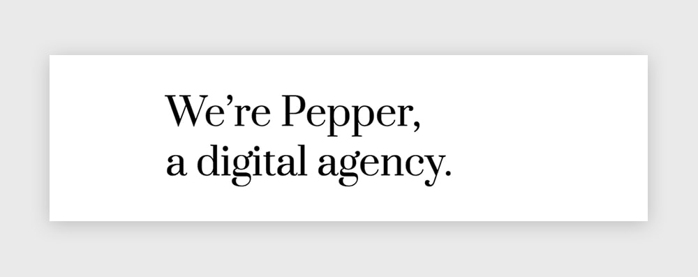
This is the page we’re going to build.

So how we built it?
The first thing you’ll need to do is create a new modular page. The page where we’ll be adding our modules. For that:
1. Go to Pages » Add New, and insert a page title.
2. Select “Modular Page” as the Template.
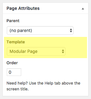
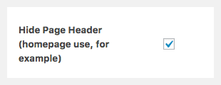
3. Check “Hide Page Header” option (we don’t want to show the title of this page).
4. Click Publish.
Now it’s time to add some modules to this page.
How to create a new module?
To create a new module simply go to Modules » Add New on the left menu of your WordPress dashboard. Once the new module is created, insert a title and select the type of module you’re going to use (Blog, Canvas, Gallery, Slogan, Modules Columns or Modules Wrapper).
Let’s go module by module for this one.
1st module: Slogan
The Slogan module is a great tool when you need to add a neat, impressive headline. It can be used anywhere and for many purposes (you’ll see that later). But for now we’ll use it in the most conventional way: as a welcome phrase to introduce the visitors to what the site is about.
In this case we’re going to use the Slogan module with the following options:
– Slogan Size: Regular
– Content Align: Left
– Animation: FadeIn Up
For the text we’ll use a Heading 1 (select the text and choose Formats » Headings » Heading 1), and we’ll color it with a black color.
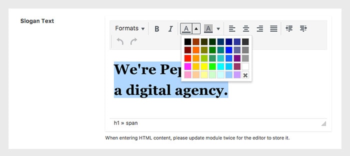
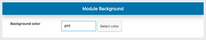
Finally, on the Module Style tab we’ll scroll to the Module Background section and select a white color as the background.
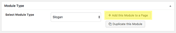
That’s is. Let’s Publish this module. And then “Add This Module to a Page“.
Once you click on that button, a popup window will open with the modular pages you’ve created on your site. Select the one you created before and save it.
2nd module: Two Canvas inside a Columns module
The Columns module is a super useful module that will let you group other created modules and arrange them according to different layouts. By doing that it’ll provide you with an incredible power to do almost everything and play with the grid of your site like a boss.
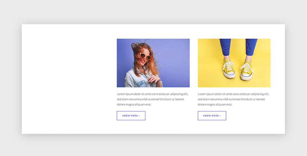
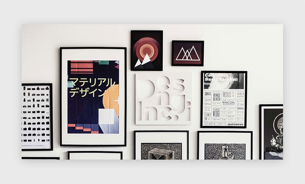
So let’s first create the modules that will go inside the Columns. In this case both modules are simply Canvas modules. As you can see in this screenshot, we’ve just put an image followed by a text and a link.
Then we created another module like this one, with a different pic, text and link.
[Pepper Tip]
How to convert a regular link into a button-like link in Pepper?
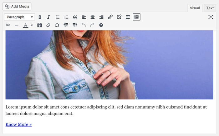
If you want to give your link a button look, you just need to add the “qbtn” class to it. For that, select the Text mode in your editor, and insert this class to your link. It should look like this:
<a href="http://google.com/" class="qbtn">Know More</a>
Once you’ve created and published these two Canvas, let’s move to create the Columns module.
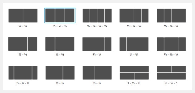
We’ll use the second layout, the one with the 3 thirds. And as you probably already noticed, you don’t need to fill every column of the layout, which gives you even more freedom. We’ll just insert one Canvas module inside the 2nd third and the other Canvas inside the 3th third.
That’s it. Go to the Module Style tab and select white as the module background.
Publish the module and then add it to your modular page.
3rd module: Slogan without text [hack alert!]
Here’s a great example of how to use the Slogan module for another purpose. We wanted to insert a big image that occupies the whole screen’s width between other two modules. For that, you can actually use the Slogan module without any text. Just leave the editor empty, and choose Giant as the Slogan Size option.
Then go to the Module Style tab and scroll down to the Background section. The settings used there are:
– Use Picture as Background: Checked
– Image Background (upload one please)
– Dark Background Overlay: Disabled
– Fixed Background: Checked
That’s it. Publish your new module. Then Add it to your page.
4th module: Canvas inside a Columns module
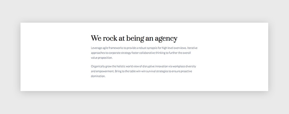
Another Canvas module used inside a Columns module to achieve a different layout. This time we’ll create one Canvas module with a simple text (the title uses a Headings 1 format). Once you’ve published it, create a new Columns module with this layout selected:
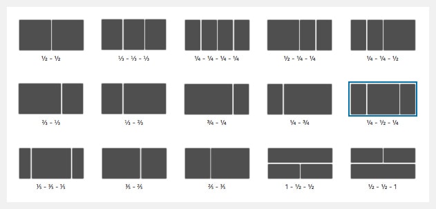
And we’ll insert our Canvas module into the 2nd column.
Publish and add this module into your modular page.
5th module: Blog
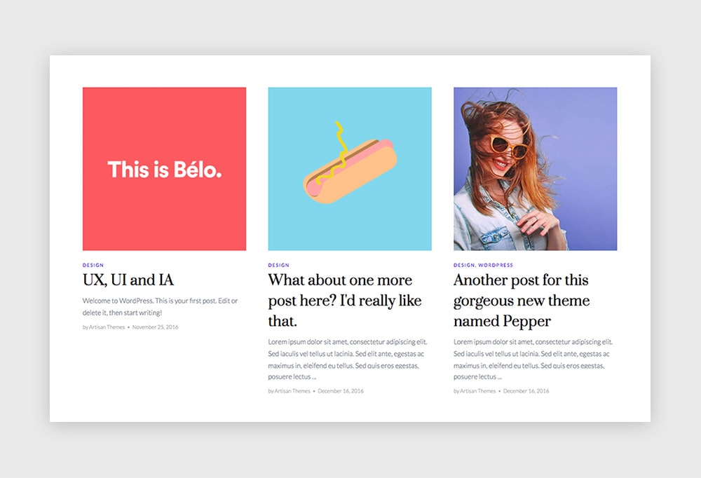
Let’s show your agency’s latest posts on the homepage. Three posts sound like fun, doesn’t it?
Create a new Blog module, in this case with a Masonry Style. These are the settings we’re going to use:
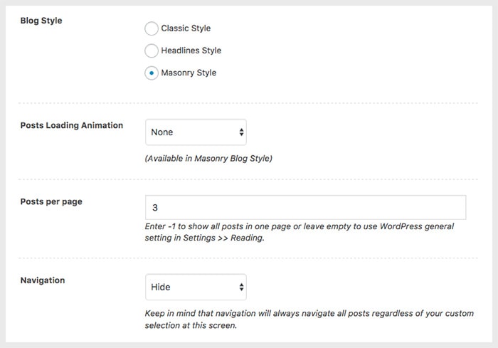
Regarding the What to show? option you can leave All Posts selected (it’ll bring you latest posts) or create a query of your own (by category, format or custom selection).
6th module: Slogan
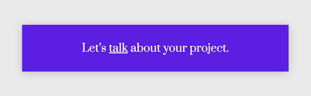
Again, a Slogan module. Thanks to being able to use both different text elements inside it as well as different options for size and content aligning, it becomes a really versatile and useful module.
In this case we’ll use it as the final call to action on the page.
The settings for this module are:
– Slogan Size: Regular
– Content Align: Center
The tricky part in this module is that the text has a word with a link inside. The way to do that is to write the text like you’d do in HTML, with the < a > tag for the link. Something like this:
Let's <a href="http://google.com">talk</a> about your project.
If you do that and publish your module, you’ll se in the preview that the < a > tag is displayed on the front. But if you go back to your module you won’t see it in the editor anymore (but it’s still there, believe me). Update your module and that’s it. The link on the front should work fine.
Now, select the whole text in the editor and choose for it a Heading 3 colored with white. Coloring a text with white inside the WP Editor may be confusing, because it wont be visible for you unless you select it. But don’t worry. Again, it’s still there.
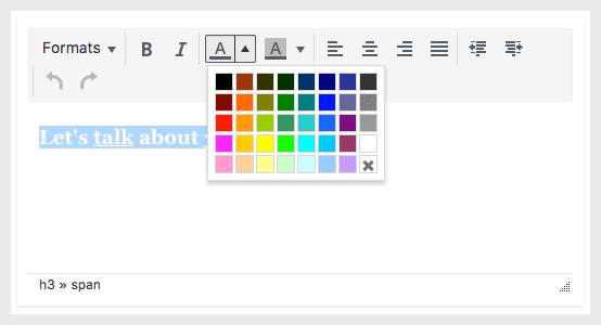
One more little thing you can do, if you’d like, is to underline the word with the link. For that, just select the proper word and hit cmd+U or ctrl+U in your keyboard.
The last thing left to do is to choose the colored background. Go to the Module Style tab and insert #5b1ee1 in the Background color option.
Go and add this last module to your modular page.
And that’s about it. You now have a neat homepage for your new site. Congratulate yourself. You deserve it.
Have any questions? Let me know in the comments below!
Haven’t you download Pepper theme yet? Please, oh please, do it here and share the word.