When you have lots of stuff you’re working on it’s not always that easy to also find the time to post about the stuff you’ve been working on.
Sound familiar?
We often prefer to keep working hard before we use our time to talk about the stuff we do (yep, kind of behind-the-scenes people over here).
And, by the way, we know it’s wrong. We should be publishing everything we do. We do know it. Being a very small team it’s hard to keep up with everything, even if you know all the things you should be doing.
But this time we said to ourselves -there’s no way we don’t publish this.
In the last couple of months we added a lot of stuff to our themes and we wanted to give you a detailed view of all that’s been done, so you know what new cool things you can do now.
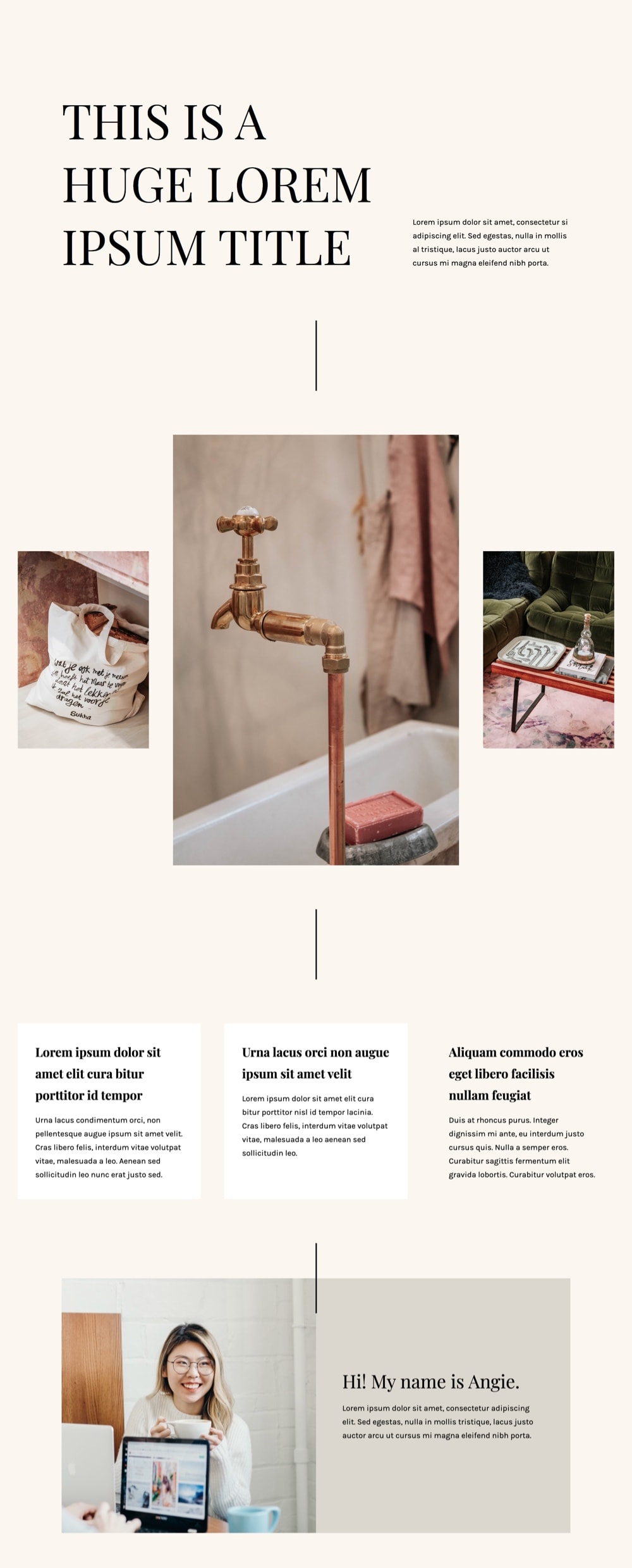
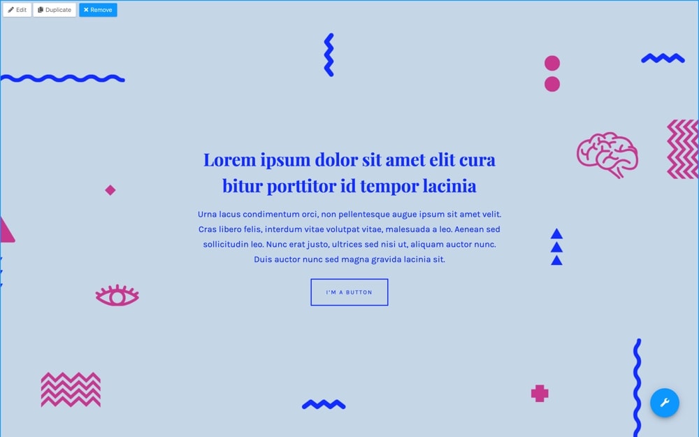
Before we dig deeper into these new features, here’s a quick mockup of some of the things you can do now with these additions:
Most of this stuff has been added to all our themes, and you’ll find them in their latest releases. That is:
- Pepper+ v1.2.8
- Indigo v1.5.8
- Modules v1.6.8
- Binder PRO v1.9.8
- Nayma v2.8.8
Ready? Let’s start.
✔️ New Advanced Options for the Columns Module
One of the biggest things we did for this update is a complete refactoring of our Columns module.
This refactoring happened at the code level, so any Column modules you had on your pages before won’t get affected by this at all. But it did let us add some very cool features that we believe will give you a lot of new possibilities to create layouts with this module.
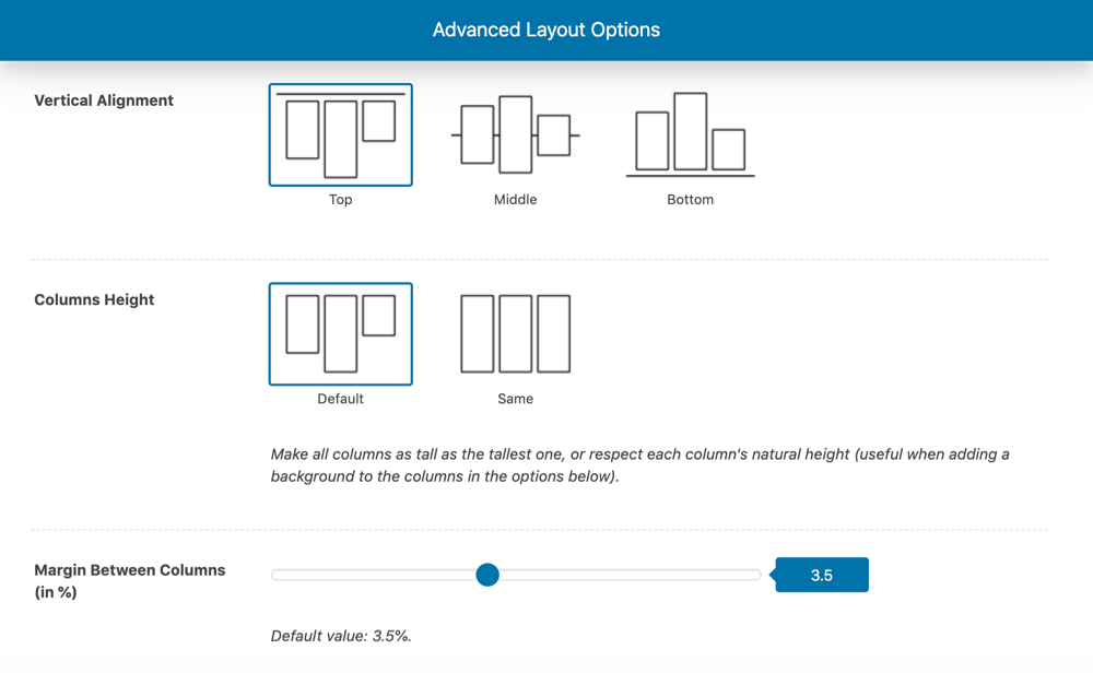
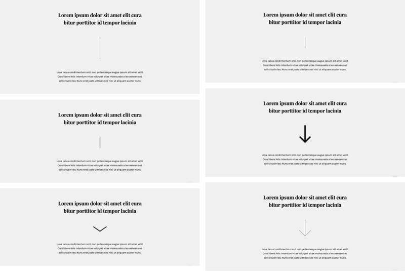
First, you can now set the Vertical Alignment of your columns: top, middle or bottom.
So, for example, you can now create a section like this very easily by using an Image module next to a Canvas module and aligning them to the middle.
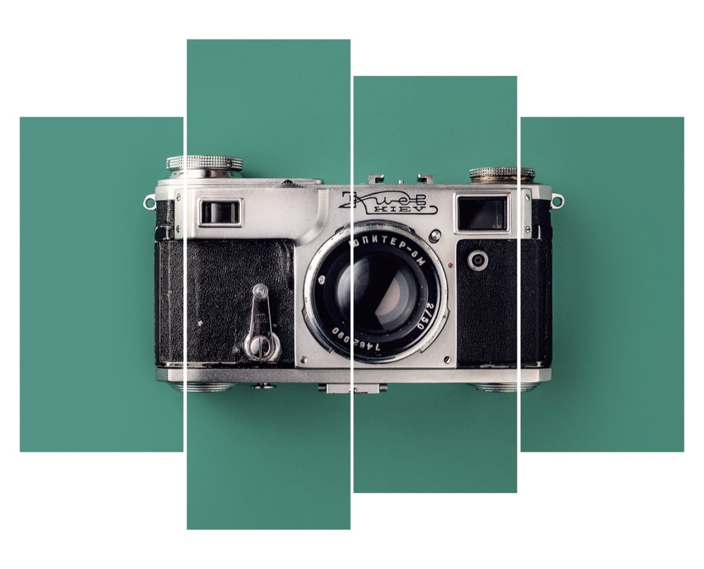
Or put several Image modules together and make them look like this:
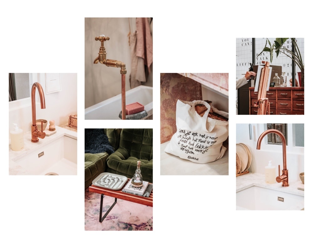
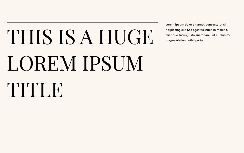
But also just take two simple modules (Slogan and Canvas) and put them together like this:
Or like this:
Another cool addition is the Columns Height option, which basically says to the columns: “Hey you guys, can you please have the same height no matter the amount of content you have inside?”
This one is especially useful when you combine it with the new background option. But more on that in a moment.
Let me first tell you about the third new layout option in this module: the Margin Between Columns.
If you ever felt like your columns could use some extra space in between, or the opposite, if you felt like they would look great without any spacing… now you can do that too. Just use the margin option for that.
Now, the Columns Inner Padding option will let you define a smaller or bigger space around the column’s content…
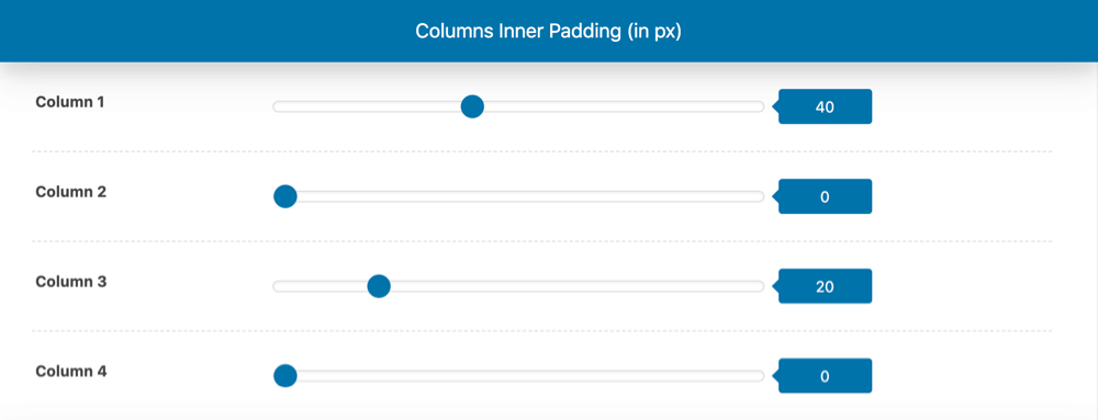
…which is great if you’ll use a color Background for the columns (also new).
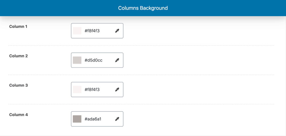
These two last options work independently for each column of the module, so you can actually have a column with background and padding and the others without. Or have different background colors for each column if you’d like.
Pretty cool, uh?
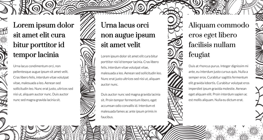
Here’s one last example – using paddings, backgrounds, height, custom margin, and alignment:
✔️ New Effects Options for the Image Module
The Image module got a nice refresh as well. From now on, you can play with several new options to achieve pretty interesting effects, like making a photo black and white, sepia, more/less saturated, or even more/less transparent.
You can also add a border-radius to create a rounded image, for example. What’s even more fun: you can play with each corner’s border-radius independently too.
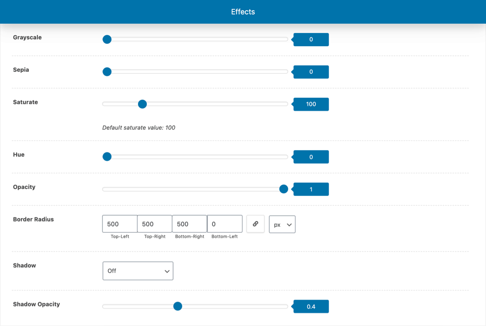
Besides that, you can now add a shadow to the image as well and select its intensity.
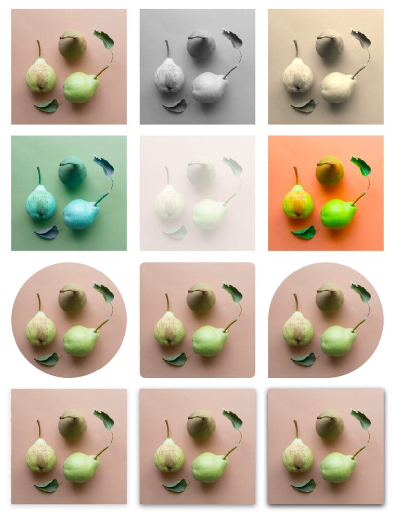
Here are just a few examples of all the things you can do by combining the new options (the image in these examples is always the same image):
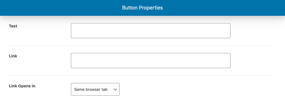
✔️ Call to Action Module Opens New Tab
This one is a quickie.
Now you can choose whether you’d like your call to action link to open in a new tab.
Small but veeeery useful.
✔️ New Background Image Options (In Artisan Advanced Styles Plugin)
Oh, I like this one.
Before this update, when you uploaded an image to use as a module’s background, the image got automatically placed at the center of the module both vertically and horizontally.
It was also set to not repeat itself and to cover the entire module’s area.
From now on, you can adjust all those parameters yourself for each of your modules, and have more control over how the background image of the module behaves.
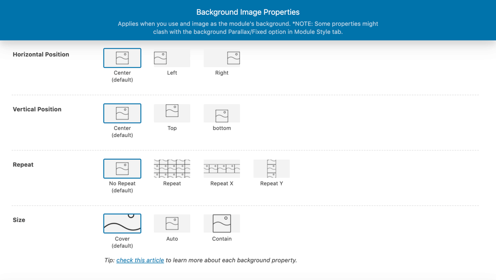
If you don’t change any of the default settings, any background image will keep behaving as usual. But if you’d like, here are some cool things you could do now:
- You could upload a smaller image and decide to use it in a repeat mode as a pattern, throughout the whole module.
- You could decide that you want to display your background image starting from the top of it, and not from the middle.
- You could upload a smaller image and only use it on the left side of the module.
- You could upload a smaller image and only use it at the bottom edge of the module, while repeating it on the X axis.
You’ll find these new options on the Advanced Styles tab in each module. (Remember the Artisan Advanced Styles plugin has to be active for that tab to show up.)
If you’d like to read more about how all this works, here are the detailed instructions.
✔️ New UI for Module Dividers AND New Dividers (In Artisan Advanced Styles Plugin)
If the previous feature got me excited, this one has me smiling-face-with-heart-eyes emoji. (This one, of course: 😍)
We rebuilt the dividers selector so you can have a preview of each divider or separator right there in the module’s options. Now it’s a lot easier to choose the right one for your module.
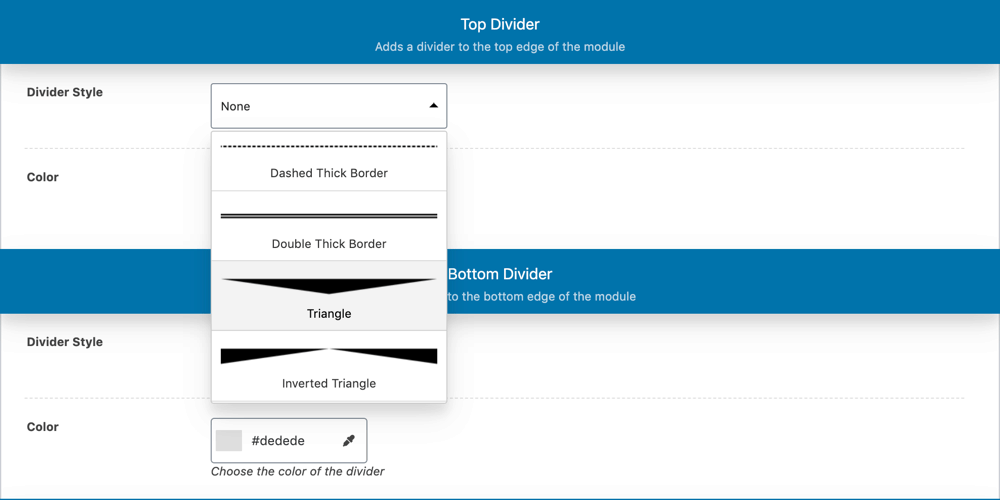
But not only that.
You also got 10 new dividers. They’re small separators, especially useful for when you want to connect two pieces of content.
These are a few examples:
✔️ Font Awesome Got Updated to Font Awesome 5
This one was long overdue.
The magnificent team behind Font Awesome, the -no pun intended- awesome icon font that comes with your theme, did a major overhaul of the whole script that loads the icons (and the icons too) a while ago.
While this meant a perhaps boring but relatively easy process if you were to manually update it on your own, providing you were using the font by yourself in your site, having it update automatically for you is a bit of a more complex process and it took more time for us to get to it.
We can gladly say that now your icon font is perfectly up to date, your icons look sharper than ever, and you have more icons to pick from when you need ’em.
Technically, two things have changed. First, the actual library that we use in the theme is different and newer. Now, the complex part about it is that they changed the classes (the names, basically) you have to use to call the icons, too.
So here’s what you’ll experience now:
When you update to the theme’s latest version, you’ll see a notice in your Dashboard letting you know about this change, and informing you that we’ve enabled for you an option named “Font Awesome Upgrader” in Theme Options » Design (if you just started using the theme from this version on you won’t see the notice and there’s no need for this option).
This newly added option upgrades your old icon names to use the new library, while the option’s enabled. You can choose to leave it on, or if you know that you’ve updated your icon names you can disable it. And if you’re in doubt, you can simply disable it and see how your icons look to check whether you can disable it for good.
This change affects mostly your brand icons (icons for Facebook, Instagram, Spotify, etc.), since most of the other icons will still work even while using the old name. And again, you can leave it on without causing any trouble to your site.
You can read more about this here.
With this upgrade we’ve also improved the way you search for icons, by adding a category filter next to your search box:
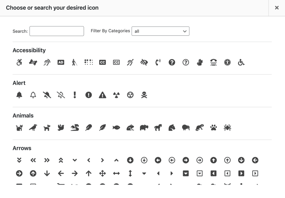
✔️ New “Remove Module” Button on the Front-End Editor
By now you surely know you can create, edit and duplicate modules right on the frontend of your site.
The news are you can now also easily remove a module from a page right there too. Yes, you could do this before too, but you had to enter the Arrange Modules window for that.
Now you’ll see a button for that right next to your “Edit” and “Duplicate” ones.
This makes it a lot easier to try things around on your page and then remove the modules you don’t want there.
A quick heads up:
The “Remove” button will take the module off the page you’re editing but it won’t delete it from your site’s backend. So if you’d like, you can add it again anytime you want, or you can go to your site’s backend to delete it permanently as you would delete any post or page.
✔️ New Header Button Option (in Pepper+, Indigo and Modules)
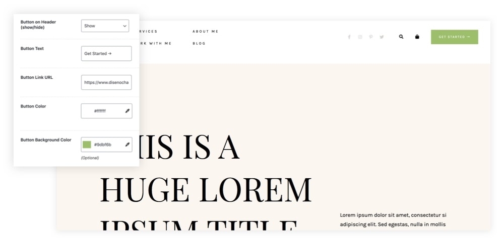
If you need more conversions on your site (and who doesn’t?), this new feature will help you greatly.
You may want your website to have a call to action right on the site’s header to encourage users to take an action and boost conversions.
Like: “Try for free”, “Get started”, “Download now”, “Donate”, “Sign up”, “Join our family”, “Request a call”, “Let’s talk” or “Book now”.
If you’re using Pepper+, Indigo or Modules theme, now you can have that too. Just go to Theme Options » Layout tab » Header Button Options and set your button link and colors.
That’s it.
✔️ New Body Text Color Option (in Pepper+)
A lot of you requested this over our support forums, so now there’s an option for this too.
You can now change the default body text color in Pepper+ –which is kind of grey– by going to Theme Options » Typography tab » Colors.
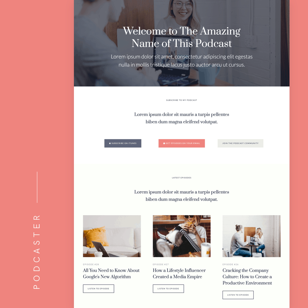
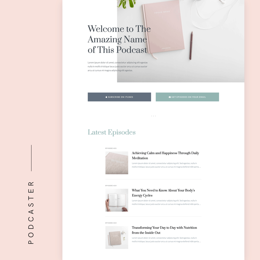
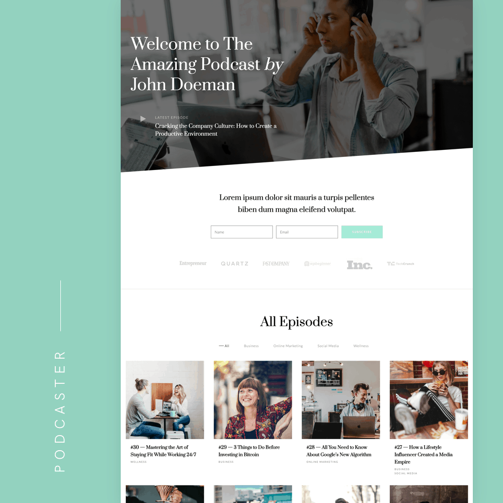
✔️ New Homepages for Podcasters Ready to Import (in Artisan Pages Plugin)
Last but not least, our Artisan Pages plugin got updated with 3 new ready-to-use pages you can import and use in seconds.
These are 3 homepages for podcasters, featuring latest episodes, the show’s host and more – with 3 beautiful and unique styles.
Here’s a quick preview of them:
So, that’s about it.
Update your theme if you didn’t already and start playing with the new features. And pretty please, share with us what you did with these new tools ❤️
Have a question? Ask in the comments!
Beautiful illustration as featured image by icons8.com
You’re amazing!!! 🙂
It is all absolutely stunning!