Artisan Themes is not only a theme shop, but also a community of great people doing inspiring stuff. We want to bring our theme’s users to the front page to show how they do what they do. And learn from them too.
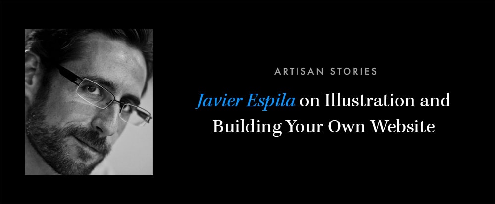
Today we have an interview with Javier Espila, also known in the artistic world as “Monigotez”. He draws amazing illustrations on request and not too long ago he set off to build his own website.
Read on..!
Tell us a bit about yourself: where are you from, how is the city you live in, what do you do for a living, what do you do in your spare time?
First of all, thanks for this space and thanks for your time. Though my artistic nickname is “Monigotez”, my name is Javier, and I’m from Spain. I live in Malaga, a beautiful and sunny city in the south area, washed by the Mediterranean sea.
Since close to a year ago I’m a full time freelance illustrator, doing both work for businesses and personalized designs for one-time buyers. Now that I successfully do what I love for a living I almost don’t draw on my spare time anymore. I mostly read and enjoy spending time with my family.
What do you love about your work?

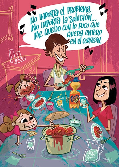
Illustration by Monigotez
What do I love about illustration? Almost everything! To begin with, to be able to mix work and passion is practically a luxury. But besides that, every gig that I take gives me a chance to learn and move forward. To grow as an artist.
Also, on a more “human” side, the works that I did for personal clients have given me some nice surprises. Most of those orders are for gifts that carry a huge emotional load, which means they will get a special place in the life of the ones getting them. To realize that is extremely satisfying.
What’s special about the way you work?
The way I work is not much different from the way other freelancers do, I guess. Although, because of a series of circumstances and thanks to the fact I don’t need a lot of money (I prefer to enjoy life instead of enjoying expensive things) I try to give each work the time it deserves.
I hate hurries. I’ve learn with the time that rushing through things is a very harmful way of working and going through life in general. So now I dedicate more time to listen to every client carefully and patiently, and try to give more than what they ask for when they order an illustration.
I’m not saying I’m slow on my work. I simply try to not get myself carried away by other people’s rush, making me accept insane timeframes in the process.
Why did you need a website and why did you choose one of our WordPress themes for it?
In my personal case having a website was essential. Being my work as visual as it is and not using a physical location to showcase it on the street (I work from home) I knew it was a yes from the beginning. My website serves as a hub to connect all the social networks. Those are great to find new potential clients, but on the same time they lack the connection needed to go deep into my work.

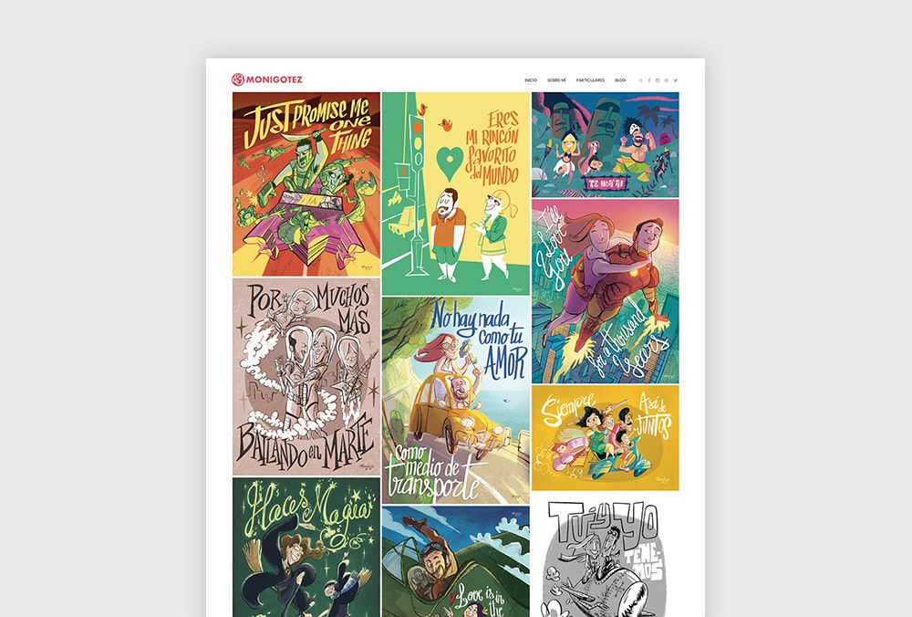
monigotez.com – Homepage
Besides that, a website enables you to create your own content and then distribute it on the different social networks. That enables me to own my own content, instead of giving them full ownership of my published news or content.
I decided to use Artisan Themes’ Modules theme for WordPress because of its versatility and because I didn’t wanted to depend on some third party to manage my website. To be on hold for two days waiting for someone to fix a typo or add a new illustration could be maddening.
How was the experience of working with Modules WordPress Theme on your site? Can you tell us about the process of building with it?
The building process was extremely rewarding. As I moved forward structuring my content the theme always offered every solution I needed at each moment, and even more.
To be able to create modules and re-order them to build sections, activate or de-activate them, and even re-utilize them on different pages without having to manually add all the same content twice has allowed me to craft my own website in such a short time I could have never achieved anyway else.
Which was the most challenging part about building your site?
On a structure level, the most challenging part of my website is that it needed to communicate with two very different audiences without neglecting one or the other. I decided to put a gallery at the top part of the homepage to let my work speak for itself as soon as you enter the site.
Businesses looking for illustrators usually just want to check your style and quickly get all the contact information if they’re interested. On the other side, independent buyers usually find me after they’ve seen an illustration posted on a social network, or because a friend recommended my work. So, when they get to the site and see the gallery I can quickly broaden what they think of what I do.

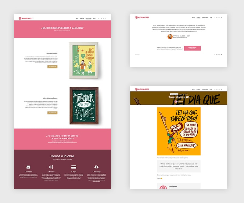
monigotez.com – Inside pages
The information I decided to add for independent buyers was crucial because it summed up a whole year of frequently asked questions. I used the “Services” module to handle all this information on a useful way, and it let me present it in a very light way.
How did Modules WordPress Theme facilitate the process? Is there anything that particularly surprised you?
Thanks to Modules I went in only a couple of weeks (spending mostly my spare time between work and work) from a very simple and static website to a full professional site, with relatively small work and without having to touch a line of code.
It surprised me a lot I could get in touch with actual people in the support team, which turned out to be really useful.
What can you recommend to someone starting a website? Any tools or tricks you wouldn’t want to miss?
First, as with anything in life, think. Dedicate a lot of time to think. Think about the content, the structure, the audience your site is going to get. Take notes of everything and translate it to what your visitors ask for. Then you need to get out of your comfort zone and explore similar websites. Check out how they layout their content and take special note on the sites that offer better solutions, to learn from them.
With all that information gathered you can then structure your message to make sure information is clearly presented in an open and sincere way (I can’t stand those sites that try to sell their services by using lots of empty, pre-made statements).
If you can, hold on to the old “three clicks rule”. Every important piece of content on your site should be findable by clicking no more than three times, so that everything shows up and you can expose your message to more people without having to explain anything prior to that.
Oh! And don’t get crazy with all the possibilities. Modules has a whole lot of fantastic resources that can be tempting to use as soon as you discover them. A website’s design should be attractive but it should also respond to a bigger goal. Every element that doesn’t get you there should be removed.
Lastly, how can people get in touch with you?
On my website: monigotez.com you can find all my contact details but, since it’s still only available in Spanish, you can also write me in English to monigotezilustrador@gmail.com.
Thank you!
If you haven’t checked Javier’s illustration just yet, you definitely should. They’re amazing and they’re a great way to convey emotions and a whole lot of meaning into a beautiful piece of content. Check’em out here.

Whow – you so wise as well as talented! And all so true about the rushing – not thinking and to many module choices – LOL! thank you for the great advice it is inspiring and productive! Stunning artwork!