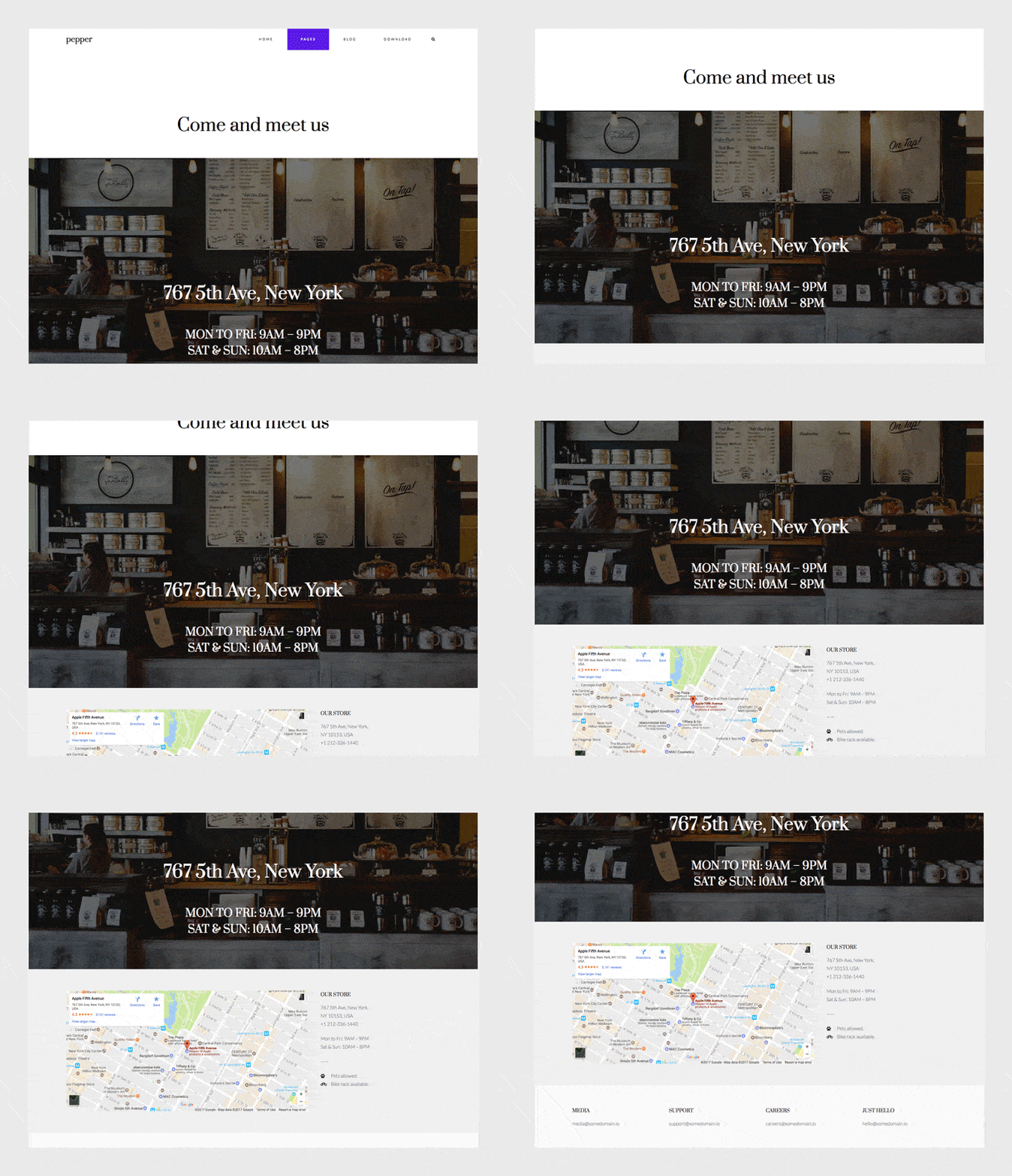
We believe our themes are so easy to use that you can build lots of different sites even barely having any web design experience. Pepper, our free and newest theme, is no exception to that. In this posts series I’m taking you to the backstage of building Pepper’s demo pages so you can get the most out of your new theme.
You’ve already seen how to build many different home pages and about pages with Pepper WordPress theme. Now, I’ll take you behind the scenes of how we built a contact page that can be used for any local business or an office. Including opening hours, store details, contact addresses and a map.
This is the page we’re going to build today. Follow the easy steps to get a beautiful and modular contact page in minutes.
So how we built it?
The first thing you’ll need to do is to create a new modular page. The page where we’ll be adding our modules. For that:
1. Go to Pages » Add New, and insert a page title.
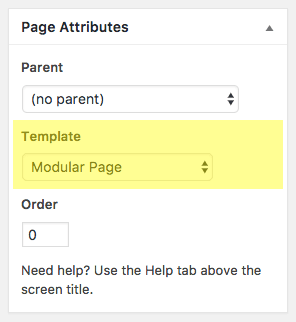
2. Select “Modular Page” as the Template.
3. Click Publish.
Page Header
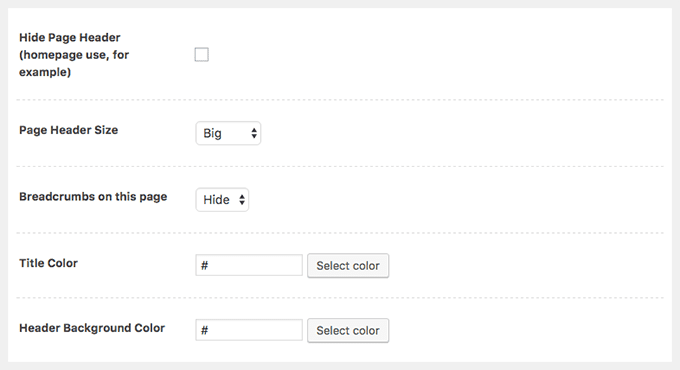
In this case we want to show the page’s title, so we won’t check the “Hide Page Header” option. And because we want the page header to be bigger, we’ll select Big in the Page Header Size menu. We’ll use the default options for title color and background color. So this is how your Page Options settings should look like:
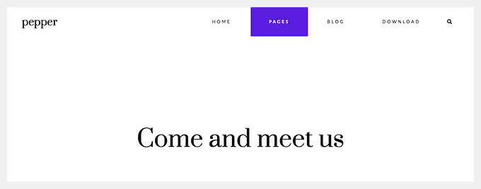
Update the page. It’ll look like this now:
How to create a new module?
To create a new module simply go to Modules » Add New on the left menu of your WordPress dashboard. Once the new module is created, insert a title and select the type of module you’re going to use (Blog, Canvas, Gallery, Slogan, Modules Columns or Modules Wrapper).
Let’s go over each module.
1st module: Slogan
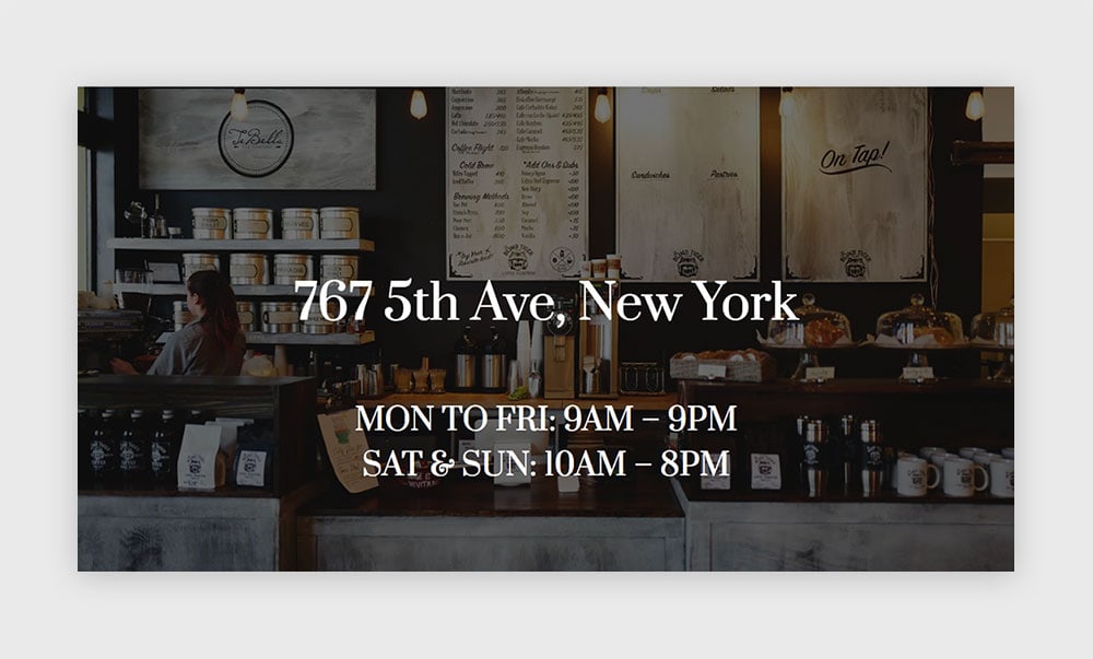
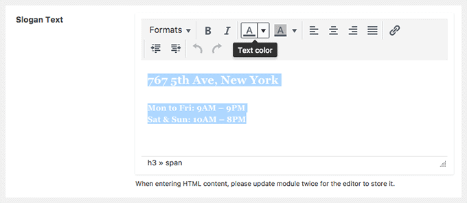
Create a new module and choose Slogan as the module type. Write your text inside the Slogan editor. We’re using Heading 3 for the big address and Heading 5 for the opening hours. We’ll color both headings with white.
Choose Giant as the Slogan Size and Center in the Content Align option.
Now, let’s add a nice background for this Slogan. Go to the Module Style tab and scroll down to the Background section.
We downloaded a really cool picture from Unsplash by Drew Coffman and uploaded it for this module’s background. But, of course, here’s the place to add a picture of your own place if you have one.
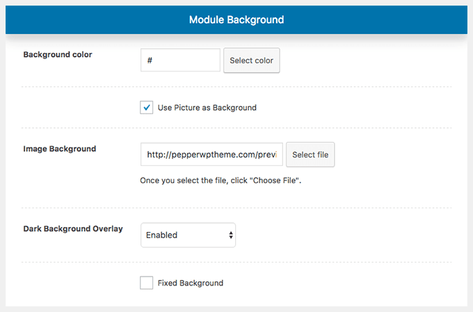
Set your background with the following settings:
That’s it. Publish this new module and add it to the modular page we’ve created before.
2nd module: 2 Canvas modules inside a Columns module
The Columns module is a useful module that will let you group other created modules and arrange them according to different layouts. And by doing that it’ll provide you with an incredible power to do almost everything and accommodate the grid of your website to your own needs.
So let’s first create the modules that will go inside the Columns.
The first Canvas module (for the map):
Create a new Canvas module.
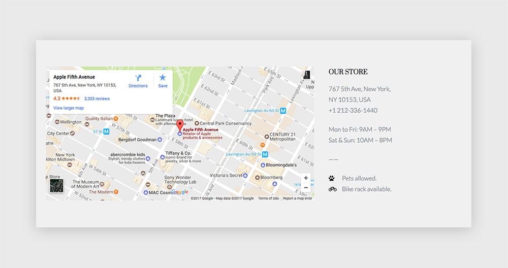
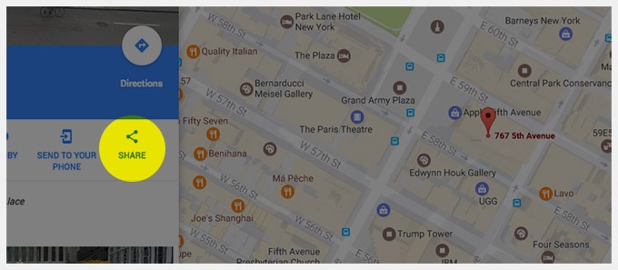
Go to Google Maps and search for your address. Once you have it on the map, click on the Share button.
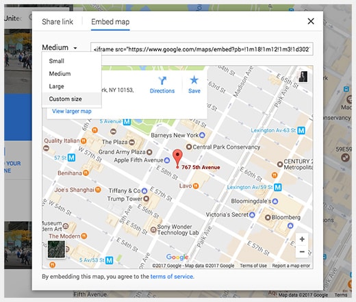
Inside the popup window choose Embed map and select a custom size. We’re using here 800 for the width and 400 for the height.
Copy the iframe code and paste it inside the Canvas editor while being on Text mode instead of Visual.
Publish this module.
The second Canvas module (for the contact details):
Create another Canvas module and use the editor on Text mode instead of Visual so you can add a little bit of HTML for the icons at the end. This is the code we’re using:
<h5><span style="color: #000000;">Our Store</span></h5> 767 5th Ave, New York, NY 10153, USA +1 212-336-1440 Mon to Fri: 9AM - 9PM Sat & Sun: 10AM - 8PM ------ <span style="display: inline-block; color: #000000; width: 30px; margin-right: 5px;"><i class="fa fa-paw"></i></span> Pets allowed. <span style="display: inline-block; color: #000000; width: 30px; margin-right: 5px;"><i class="fa fa-bicycle"></i></span> Bike rack available.
You can choose different icons if you’d like. The icon font integrated in Pepper is the cool Font Awesome, so you can check their icons out and choose some from the list (the icons in this example are at the end, being called with the < i > element).
Publish this module.
The Columns module:
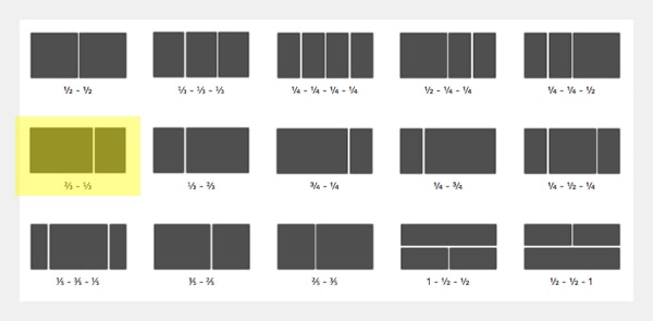
Let’s wrap the 2 Canvas modules in one nice section. Create a new Columns module and select this layout:
Insert the Canvas with the map in the first column and the Canvas with the contact details inside the second column.
Finally, choose a light grey color background for this module by going to the Module Style tab. We’re using #f0f0f0.
All we have to do next is Publish and add this module to the modular page.
3rd module: 4 Canvas modules inside a Columns module
This is very similar to what we did in the previous section.
In this case we’ll have a Columns module with a 4 columns layout, and inside each column a very, very simple Canvas module with a title and an email address.
Let’s start with the Canvas modules:
These Canvas modules will all look the same. So once you create one, you can simply duplicate it by clicking on “Duplicate this module” as many times as you need and just change the copy in the new ones.
Inside the Canvas editor we’re using Heading 5 for the title and a regular paragraph for the email address. To stress the title even more, we’re coloring it with black.
That’s all. Publish the first Canvas. Then duplicate it to create the other three and adjust the copy for each one.
The Columns module:
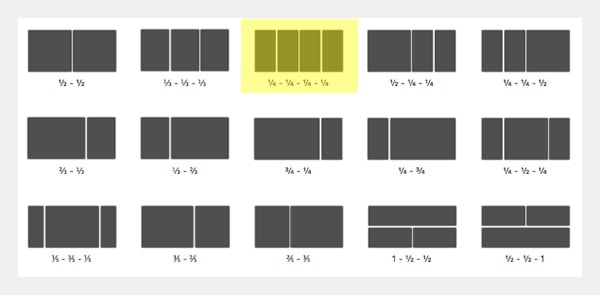
Create a new Columns module and select the third layout with 4 even parts. Insert each of the Canvas modules we just created inside each column.
Publish it. And Add it to your modular page.
There you go. You have now a fully working contact page for a local place or an office.
Have any questions? Let me know over the comments.
Haven’t you download Pepper theme yet? Please, oh please, do it here and share the word.
