Ever wondered why that image that you’re using for the background of a section on your website doesn’t look exactly as you expected?
Why it feels like it’s getting cut, or zoomed-in?
Perhaps you uploaded a beautiful photo of your dog, but when you use it for that hero section with your welcome message, the only part of the picture that you see is her drooling mouth, and hey… that’s not her best feature. Where did her lovely eyes go?
If you’re not an HTML and CSS expert this can be a tricky thing to -fully- understand.
But don’t worry. There’s an easy explanation and I’ll go over it step by step in this post.
Don’t miss the final summary!
HTML img vs. CSS background-image
The first thing we need to talk about is the difference between an image as an element and an image as a background or, in other words, an HTML img vs. a CSS background-image.
An HTML img is what you use to add an image to your website by using the tag < img >. For example:
<img src="https://yoursite.com/yourimage.jpg">
And this is true whether you add that code manually, or whether your theme adds it on its own.
So… you could have a page with a heading, a paragraph, an image, then another paragraph, then another image. The images in this case are actual content, just like any of the other content elements you added.
Now, a background image is not an element you add -per sé- but rather the styling of another element on your site.
One of the most common scenarios being: you have a section on your website and you want it to have an image as its background.
In that case, you’ll add this background through a CSS declaration applied to the element’s selector. For example:
.section {
background-image: url("yourimage.jpg");
}
Of course, if you’re working with a WordPress theme, you won’t be coding this yourself. But this is how it’ll probably work backstage anyway.
So why should this matter to you?
It’s important that you know the difference between those two mainly because of these two reasons:
- So you know which of these you should use for each case
- And so you know what to expect from each of them in terms of how they behave (this is CRUCIAL!)
The main way to know which one to use is by asking yourself what’s the purpose of that image.
As we saw before, HTML is for structure or content while CSS is for styling. That should give you a big hint already.
Is that image part of your content? Do you need the image to deliver important information? Think: product images, an infographic, a gallery, a catalog, a portfolio, etc.
Or are you using it to support/style something else? Think: backgrounds for other types of content like a headline, a testimonial, a quote, a whole section, etc.
Now, having picked one of the two, the next thing you need to do is adjust your expectations accordingly.
And let me clarify this: although there are ways to cause HTML images and CSS background-images to behave alike, they actually act a lot differently.

If we need to display a product image, then we obviously expect it to be shown in its entirety. For it to not get deformed, to get resized as the screen gets resized, to be shown in full opacity, to not have any content on top of it that may confuse or cover parts of the product.
But if I want to put a picture of my brand new restaurant behind a big title that says “We’re open, come visit us in SoHo”, then my expectations will be for the image to sit in the background of that headline, so that it gives a general sense of the place. Also, probably, I’ll want the photo to be a bit darkened so the headline is 100% legible. And also to be responsive, so that my headline is always backed by it.

However, I won’t care whether every little detail of the picture -like the glasses on the right table- makes it into the visible area, because it’s all about the vibe and the styling for the headline section (which is actually the most important part here).
Now we are getting to the climax of this post.
How do background images actually work?
(The subtitle for this should be: “And why is it that when I use an image for the background of a section on my website it looks like it is getting cut?“)
Let’s tackle that once and for all 🙂
The 3 size options of an image background
The thing that defines the way an image background will behave when covering a section on your website is the size property.
And it gives us 3 main options:
- Cover
- Contain
- Fixed width/height (like Width 100% + Height 100%)
Cover tells the browser to make sure the image will always cover the entire section, even if it has to “cut” a little bit off the edges. (It doesn’t actually cut the image though, it’s just that parts of the image are not visible inside the section area.)
Contain tells the browser to always show the entire image, even if the section is not entirely covered by the background.
Width 100% + Height 100% forces the image to take the same size of the section, which means it’ll cover both the width and height entirely without cutting any parts of the image and without leaving any part of the section with no background. BUT, the image will get distorted as it most likely doesn’t have the same aspect ratio as the section it needs to cover (this is even more true -especially- in responsive/fluid websites).
Sounds complicated, but it’s actually pretty simple. Let’s take a look at a couple of examples to make it clearer.
See it in action
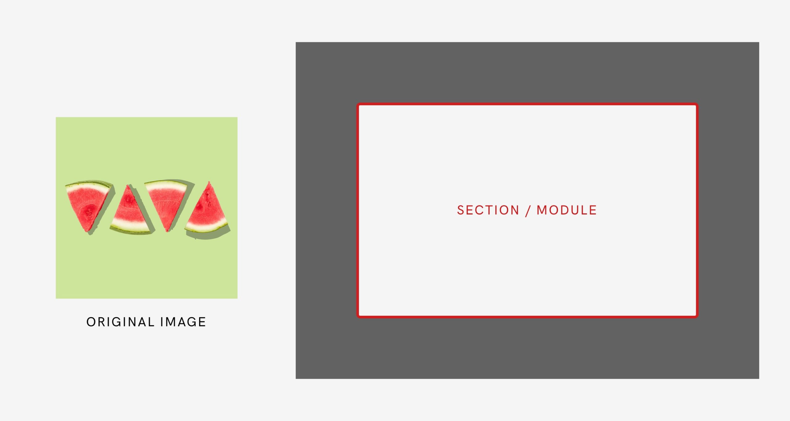
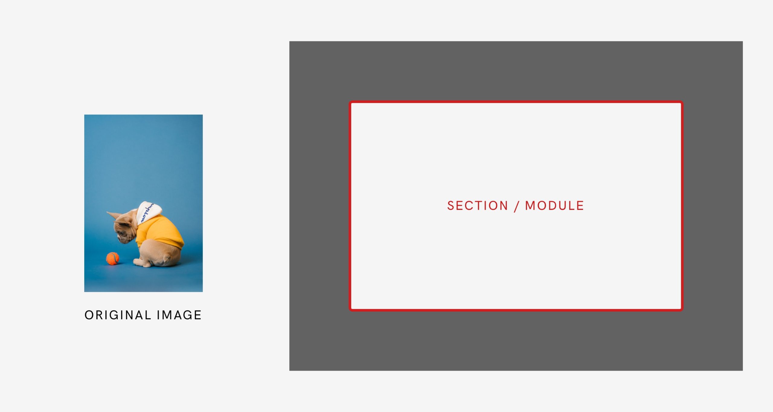
Suppose this is the image we want to use for the background of the section on the right. The red frame marks the limits of the section (so anything that’s outside the frame won’t be visible).
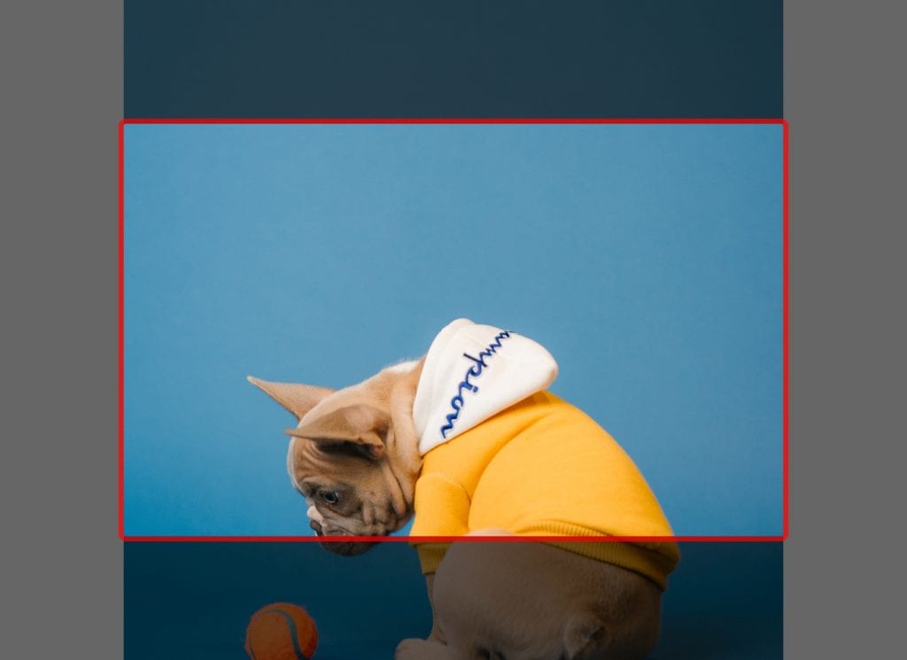
If we choose the cover option, this will be the result:
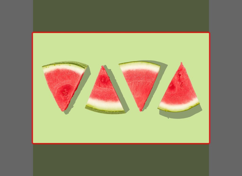
As you can see, the entire section is covered by the image. The aspect ratio of the image is the same as in the original picture, even if enlarged, and parts of the image on the top and on the bottom get cut.
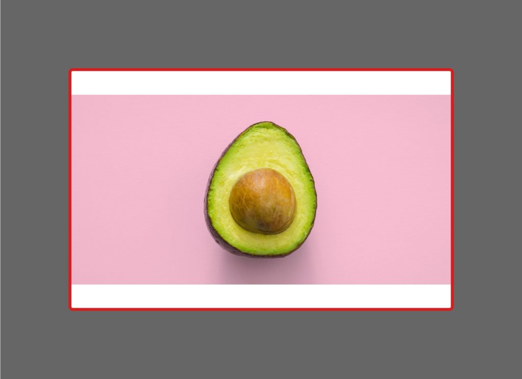
If we choose the contain option, the result would be different:
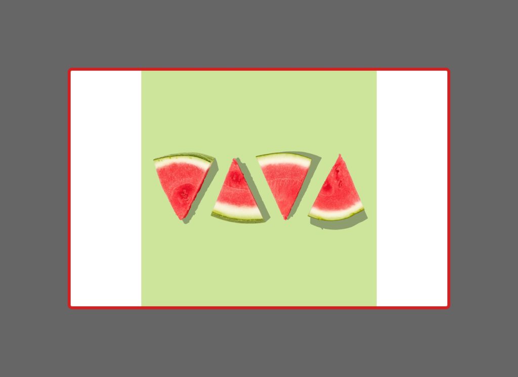
The whole image is visible, the aspect ratio is maintained, BUT there are parts of the section that are not covered by the image.
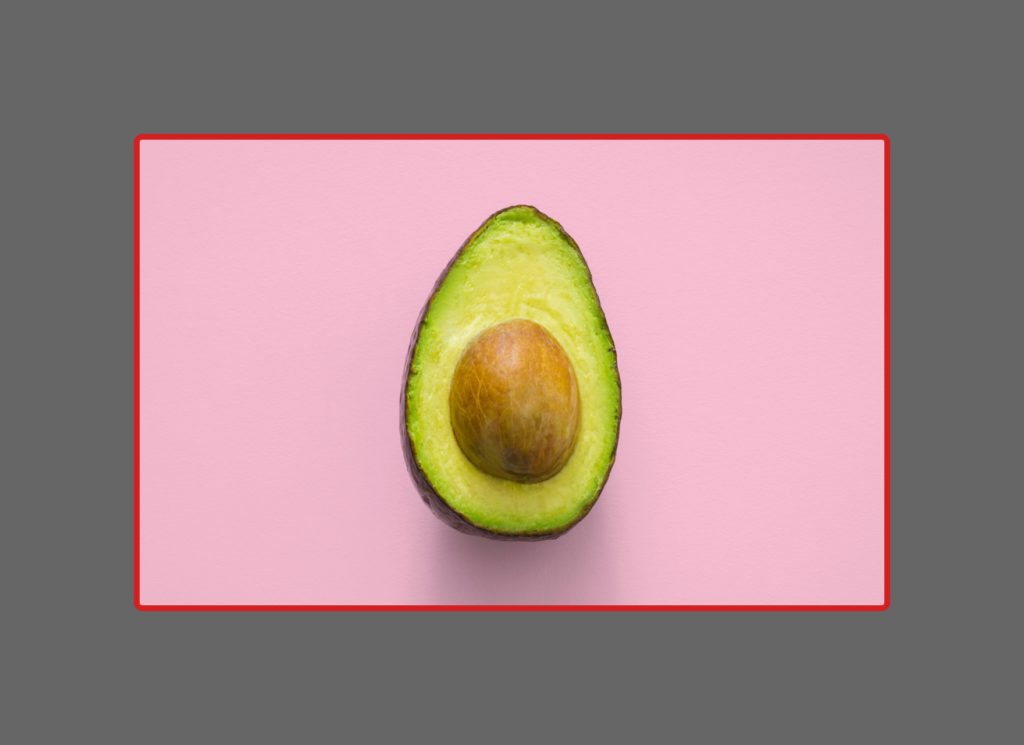
And if we make the image the same width AND height of the section, it’ll get us this…
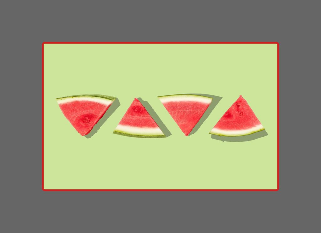
The entire section is covered, the image is fully visible, BUT it gets distorted.
Can you see the difference?
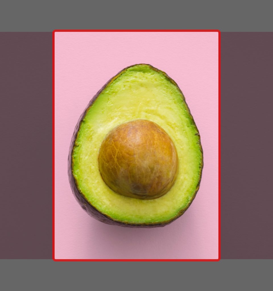
This is how the three options would look on mobile, where this section is more narrow:
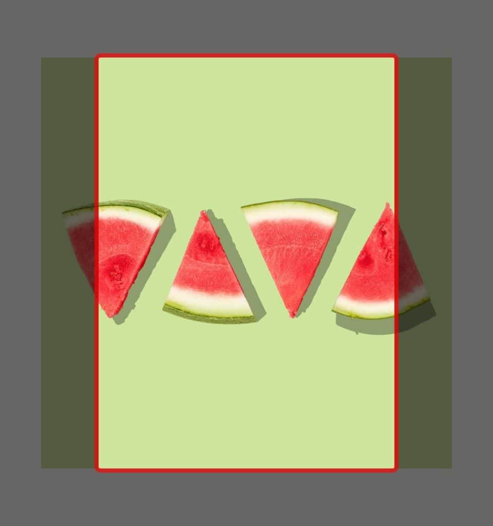
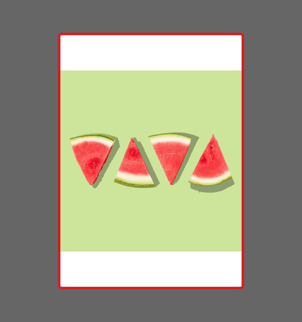
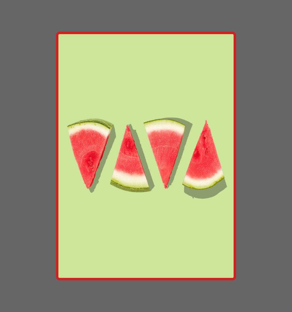
Let’s take a look at two other examples.
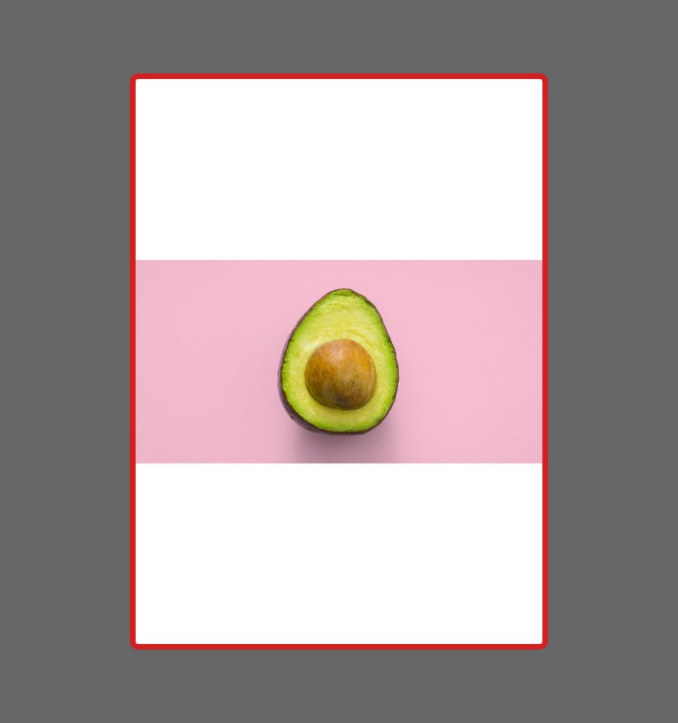
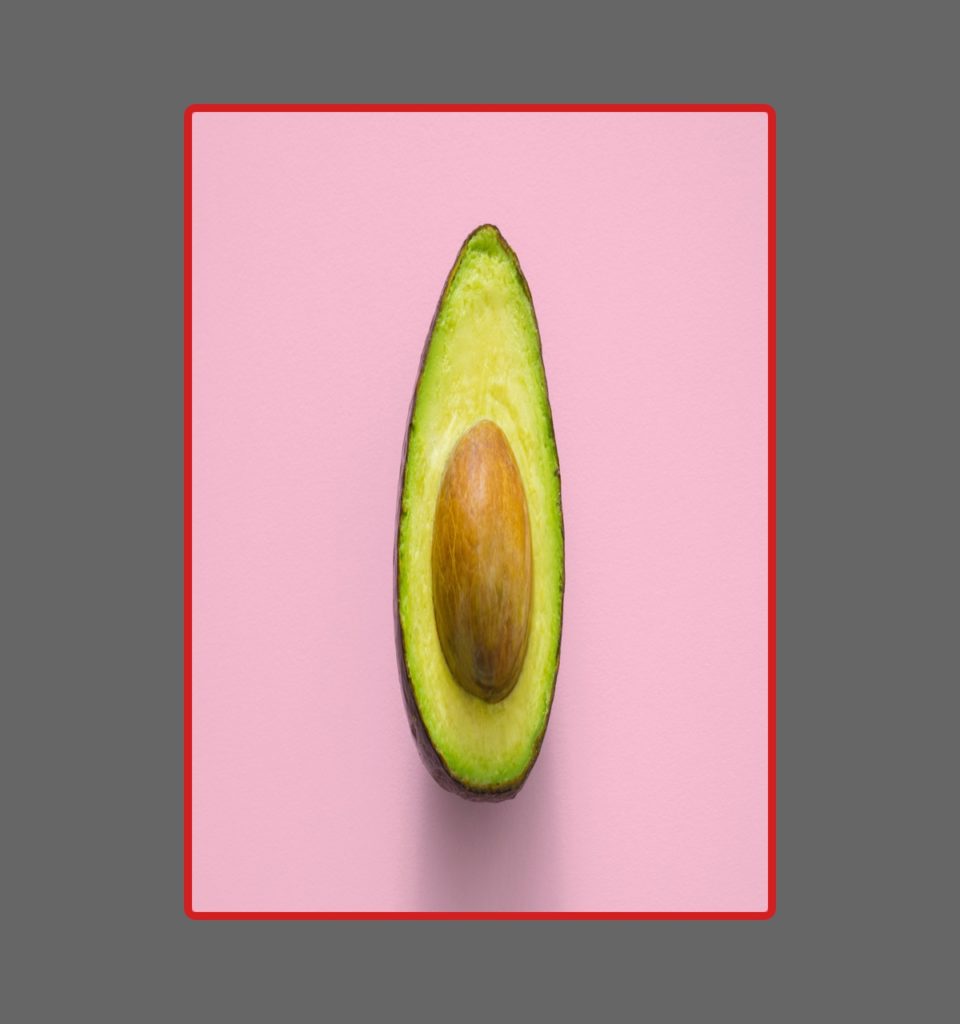
Example n.2
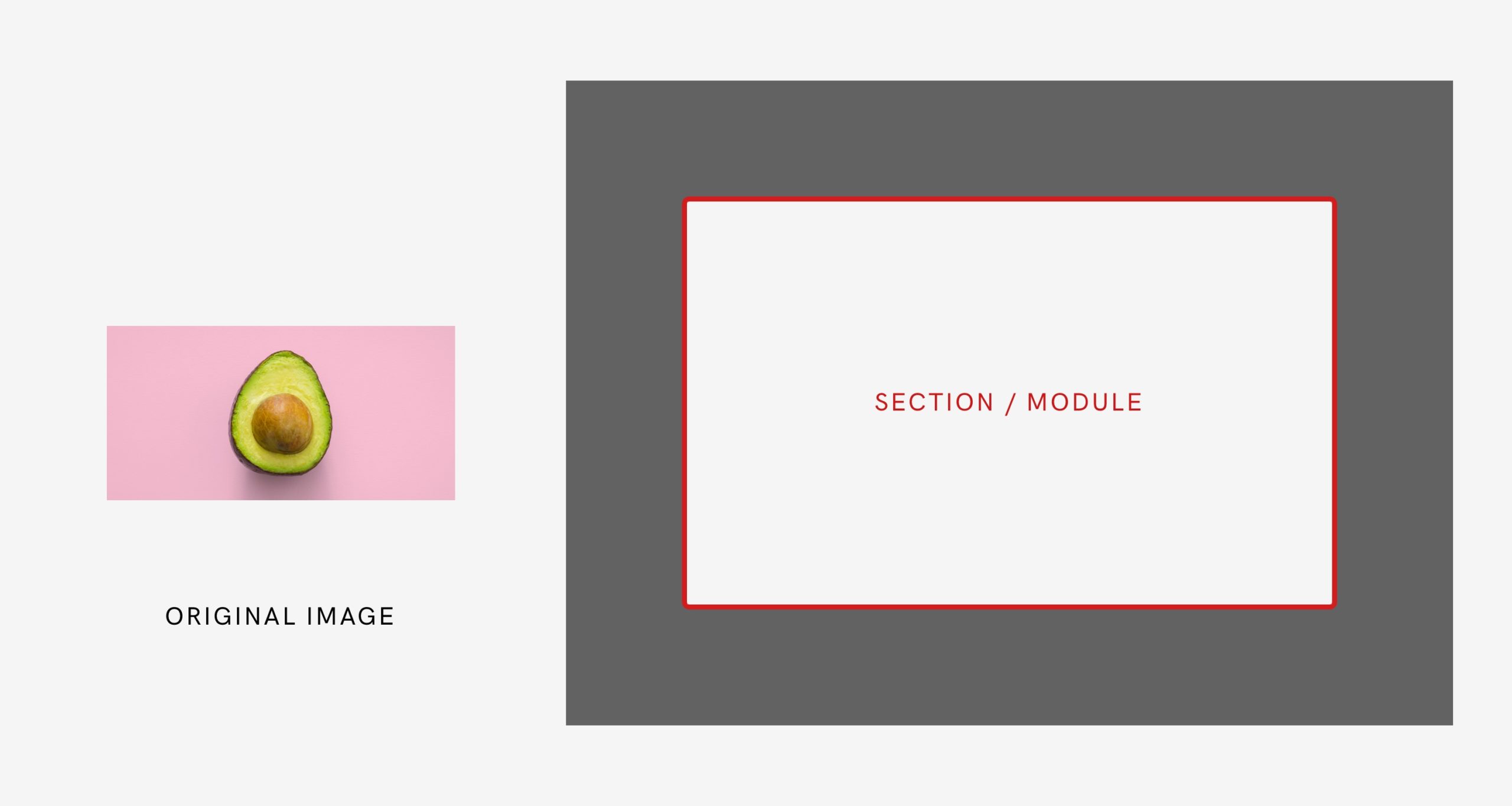
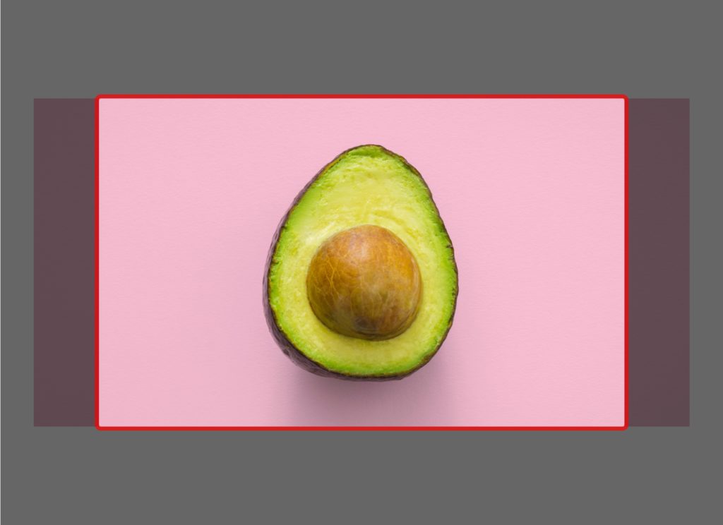
And in mobile (or when the window gets narrower)…
Example n.3
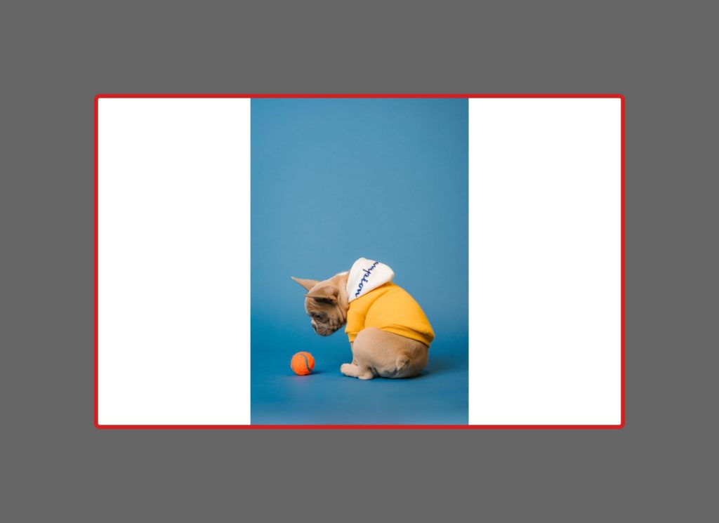
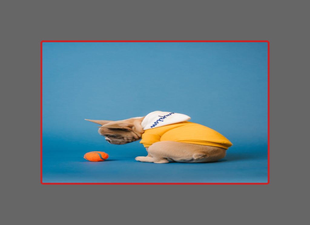
As a side note:
You probably noticed that I’m always centering the image background both vertically and horizontally inside the section. In this last example it becomes pretty evident that with the Cover option the main part of the image is not making the cut. And that’s probably not how you’d like it to be.
So, in this case, you may want to align the image to the bottom edge of the section instead of to the middle. If you’re using an Artisan theme, you can change the vertical position for a background image easily in the Advanced tab of the module (here’s how). If you’re custom coding your site, the CSS property that would handle this is background-position-y: bottom;.
Back to our example, in mobile it’d look like this…



As you can see, the Cover option is the only one that will let us cover the whole section without deforming the image. And we want to cover the entire section because that’s basically the whole purpose of that image being the background of a piece of content.
To fully illustrate this, here are some examples of Cover vs. Contain, when there’s text over the images:
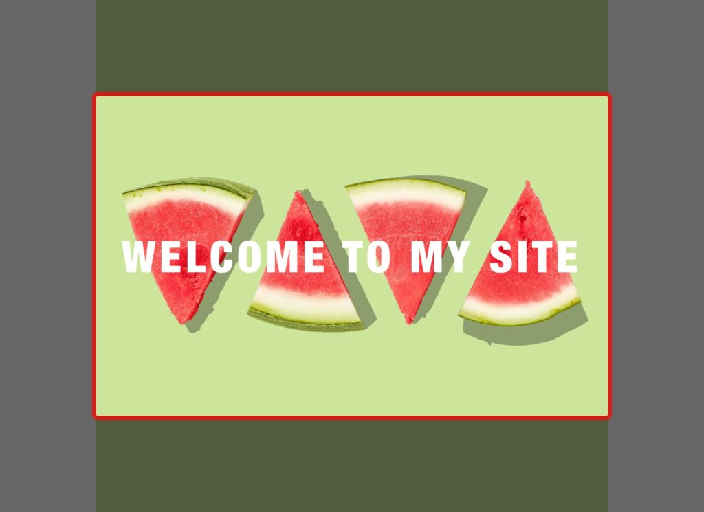
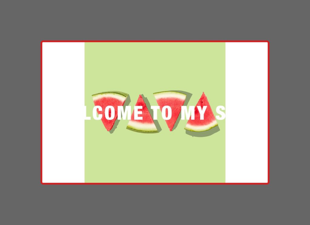


Notice how parts of the text “disappear” over a white background in the Contain mode when they are left without a proper background image. That’s why it’s important to be aware of which of the elements here is our actual content to know which one we should preserve the most.
To sum up…
Let’s take a look at a final table summarizing the 3 options and their behavior.
| Cover | Contain | Width 100% + Height 100% | |
|---|---|---|---|
| The whole section is covered by the image | Yes | No (Parts of the section are left with no background) | Yes |
| Image is shown in full | No (Some parts may get left out) | Yes | Yes |
| Maintains image aspect ratio | Yes | Yes | No (Most likely the image gets distorted) |
| CSS code | background-size: cover; | background-size: contain; | background-size: 100% 100%; |
As you can see, each option has 2 Yes and 1 No results, so it’s up to you to choose which “No” you prefer to avoid.
There’s absolutely no way to get the 3 Yes (cover the entire section + show the whole image + maintain image aspect ratio) WHILE keeping that section fluid (not fixed-width).
For me, Cover is in 99.99% of the cases the best option.
Images should never be distorted, and I prefer the whole section to be covered by the image, even if I lose parts of the image on the sides.
After all, they are a background for something else.