We believe our themes are so easy to use that you can build lots of different sites even barely having any web design experience. Pepper, our free and newest theme, is no exception to that. In this posts series I’ll take you to the backstage of building Pepper’s demo pages so you can get the most out of your new theme.
If you’re first time reading this, you might also want to check other posts in this series.
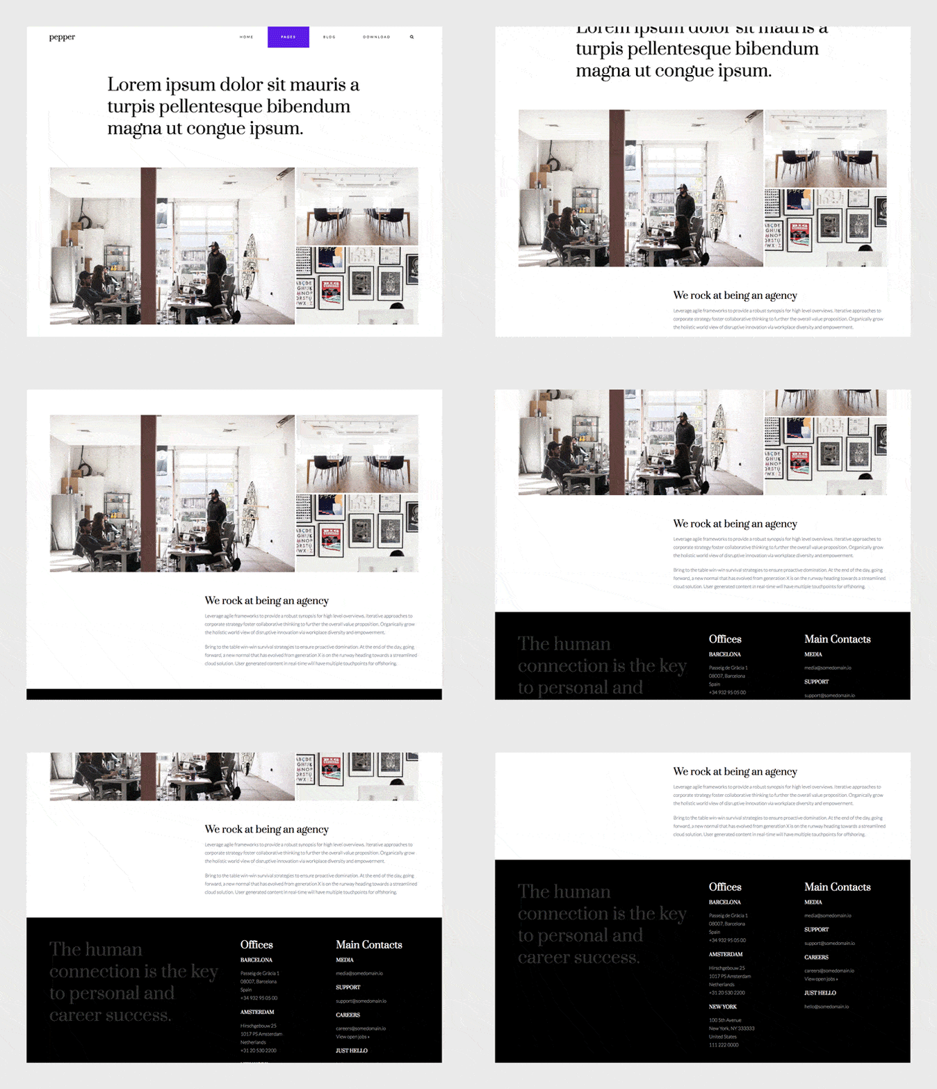
Today I’ll go with you over the steps to create a minimal about page with Peper. This is the page we’re going to be building.
So how we built it?
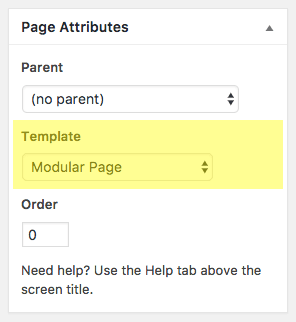
The first thing you’ll need to do is create a new modular page. The page where we’ll be adding our modules. For that:
1. Go to Pages » Add New, and insert a page title.
2. Select “Modular Page” as the Template.
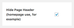
3. Check “Hide Page Header” option (we don’t want to show the title of this page on this one).
4. Click Publish.
Now, time to add some modules to this page.
How to create a new module?
To create a new module simply go to Modules » Add New on the left menu of your WordPress dashboard. Once the new module is created, insert a title and select the type of module you’re going to use (Blog, Canvas, Gallery, Slogan, Modules Columns or Modules Wrapper).
This page has only 4 modules, but two of them have actually other modules inside. Let’s go module by module.
1st module: Slogan
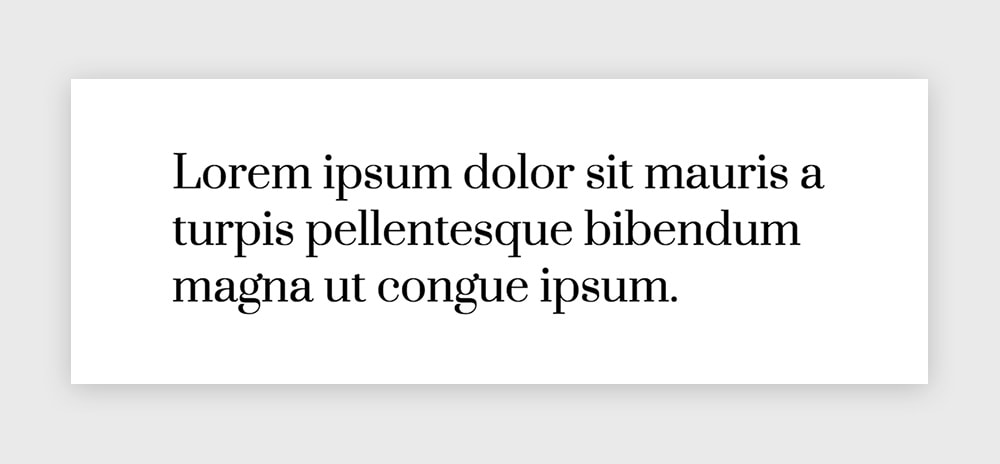
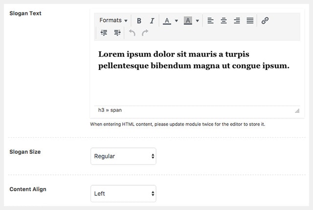
A simple introduction for this page made with the Slogan module. Create a new module and select “Slogan” as the Module Type.
Insert your text inside the Slogan editor. Then select it and choose Heading 3 format and a black color.
The settings we’re using here are:
– Slogan Size: Regular
– Content Align: Left
Now, let’s go to the Module Style tab and select a white color (#ffffff) as the module’s background.
Publish this module and add it to your modular page.
2nd module: Gallery
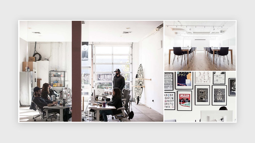
Create a new Gallery module and upload your pictures by clicking on the “Select Gallery” button next to the “Create Gallery” field. Once the Media Library popup is open, click on “Create Gallery” on the left menu. Upload and/or select the images that will be included in this gallery, then click on “Create a new gallery”. Review your images (you can add captions to each image), and click on “Insert Gallery“.
Your gallery shortcode should now be visible inside the “Create Gallery” field.
Choose Mosaic as the Gallery Style and select Layout 3.
You can choose the images to open in a lightbox or not. Remember you need to install the Responsive Lightbox plugin which is integrated with our themes if you’d like that functionality in your galleries.
Choose a white background for the module by navigating to the Module Style tab.
Publish it. Add it to the page.
3rd module: Canvas inside a Columns module
The Columns module is a super useful module that will let you group other created modules and arrange them in different layouts. But it’s also a good option when you just want to play with your site’s grid and place one module in a different way, so that it doesn’t fill the whole screen’s width.
This is what we did here:
The Canvas module:
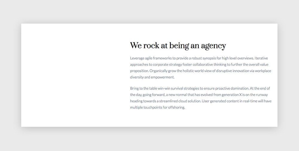
First, create a new Canvas module and write your copy inside the editor. You can use different headings, paragraphs, colors, you name it.
Publish it.
The Columns module:
Now create a new Columns module and select the layout with “⅖ – ⅗”. Leave the first column empty, and in the second one insert the Canvas module you’ve just created.
Now go to the Module Style tab, scroll down to the background section and set a white background color (#ffffff).
That’s all. Publish this Columns module and add it to your modular page.
4th module: Different modules inside a Columns module
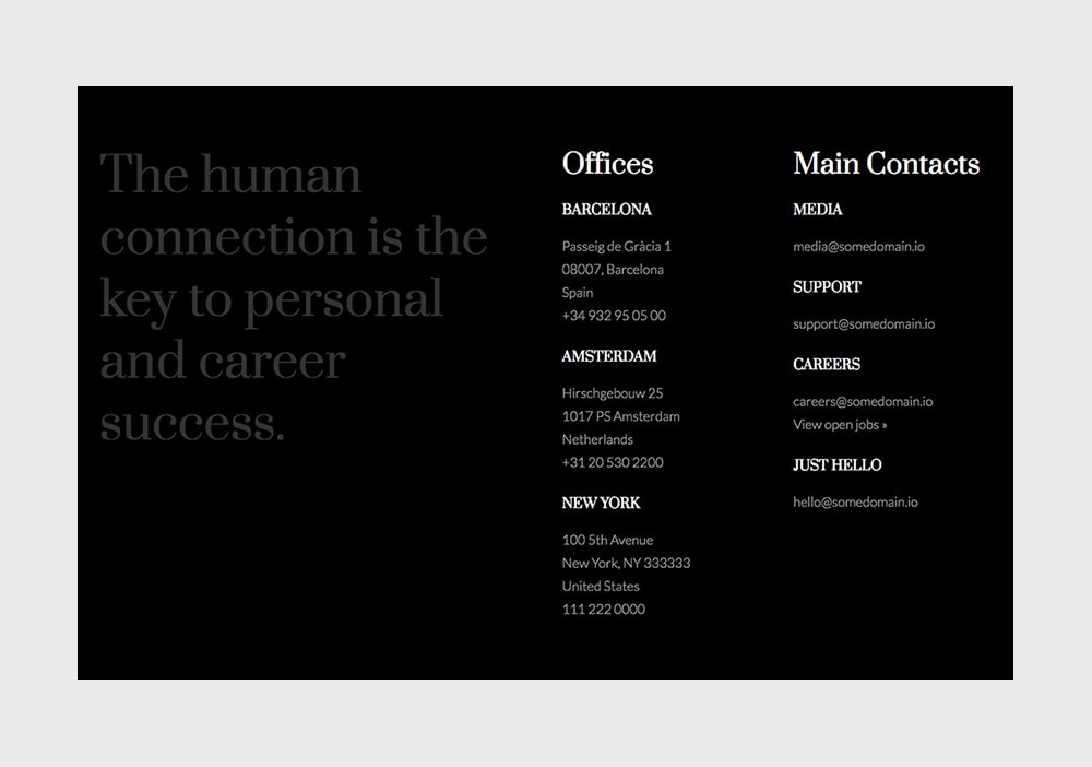
Again, a Columns module meant to group 3 different modules: a Slogan module and two Canvas modules.
Let’s start with the Slogan module:
Pick a nice quote and insert it inside a new Slogan module. We thought “The human connection is the key to personal and career success” is a pretty good one 🙂
The text should be a Heading 3 and have a dark grey as color, so you achieve the low contrast effect in the final Columns module.
Set the size to Regular and the align option to Left.
Publish it.
The Canvas modules:
You can start with one Canvas module and when you finish crafting it duplicate it and just adjust the copy on the second one.
So, create a new Canvas module and use the editor to insert the text. We used here a Heading 2 for the big title, and a Heading 5 for the subtitles. All the headings are white, while the paragraphs use a light grey color (remember they’ll be on top of a dark background in the final module).
Something like this (Text view):
<h2><span style="color: #ffffff;">Offices</span></h2>

<h5><span style="color: #ffffff;">Barcelona</span></h5>
<span style="color: #999999;">Passeig de Gràcia 1</span>
<span style="color: #999999;"> 08007, Barcelona</span>
<span style="color: #999999;"> Spain</span>
<span style="color: #999999;"> +34 932 95 05 00</span>

<h5><span style="color: #ffffff;">Amsterdam</span></h5>
<span style="color: #999999;">Hirschgebouw 25</span>
<span style="color: #999999;"> 1017 PS Amsterdam</span>
<span style="color: #999999;"> Netherlands</span>
<span style="color: #999999;"> +31 20 530 2200</span>

<h5><span style="color: #ffffff;">New York</span></h5>
<span style="color: #999999;">100 5th Avenue</span>
<span style="color: #999999;"> New York, NY 333333</span>
<span style="color: #999999;"> United States</span>
<span style="color: #999999;"> 111 222 0000</span>
Publish it.
Now Duplicate it to create the second Canvas module, make your adjustments and publish it.
The Columns module:
So we have now one Slogan module and two Canvas modules waiting to be integrated inside a Columns module.
This new Columns module will use a layout with 1 half and 2 quarters.
Insert the Slogan module inside the first column and the Canvas modules inside the following ones.
Navigate to the Module Style tab let’s set a black background for this whole module (#000000).
Publish the module. Add it to your modular page as the last module.
It’s always a good idea to take good care of the about page on your site. It’s a page that gets clicked almost any time you have a new visitor that gets interested. Now you’ll be ready to rock it. 🙂
Left with a question? Please let me know in the comments below.
Haven’t you download Pepper theme yet? Please, oh please, do it here and share the word.
