Artisan Themes is not only a theme shop, but also a community of great people doing inspiring stuff. We love bringing our themes’ users to the front page to show how they do what they do, and learn from them too.
Today we bring you an interview with Eric de Jong, who has made looking beyond the horizon a permanent way of life. On this post he tells us about the path that took him to his latest project: a platform for sustainable traveling.
Say hi to Eric.
Tell us a bit about yourself: where are you from, where do you live in, what do you do for a living or in your spare time?
My name is Eric de Jong, I was born in The Netherlands, close to the border with Belgium. Secret information: in 1948 😉
I studied electrotechnical engineering and sociology, which was handy in the telecommunications market. As a manager of international telecommunications, I worked in many countries (unfortunately never in South-America).
My jobs took me to the US, Australia, China and many European countries.
After the burst of the dot-com bubble around 2001 I had to sell the company’s international assets. When I was ready, I decided to leave the company with a nice financial arrangement.
With friends I started a small company in sustainable energy in Kenya, which successfully continued until 2016, when we sold it.
As a young boy I already liked cycling and photography and I still do.
What do you love about the things you do?
I like to look beyond the horizon. As a small boy my parents were sometimes desperate when I walked too far from home in my city Rotterdam, discovering new things. And still I like to develop new activities. I am not a person to manage a regular business.
When a colleague told me about something new and exiting, I was instantaneously interested: internet. I spent night after night to get internet working at home and finally succeeded.
In my company I promoted e-mail, but hardly anybody believed in it.
Long ago I surprised my mother with the question “Are you at home? Can you open the door?”. And there I was, standing in front of her with one of the first mobile phones in The Netherlands.
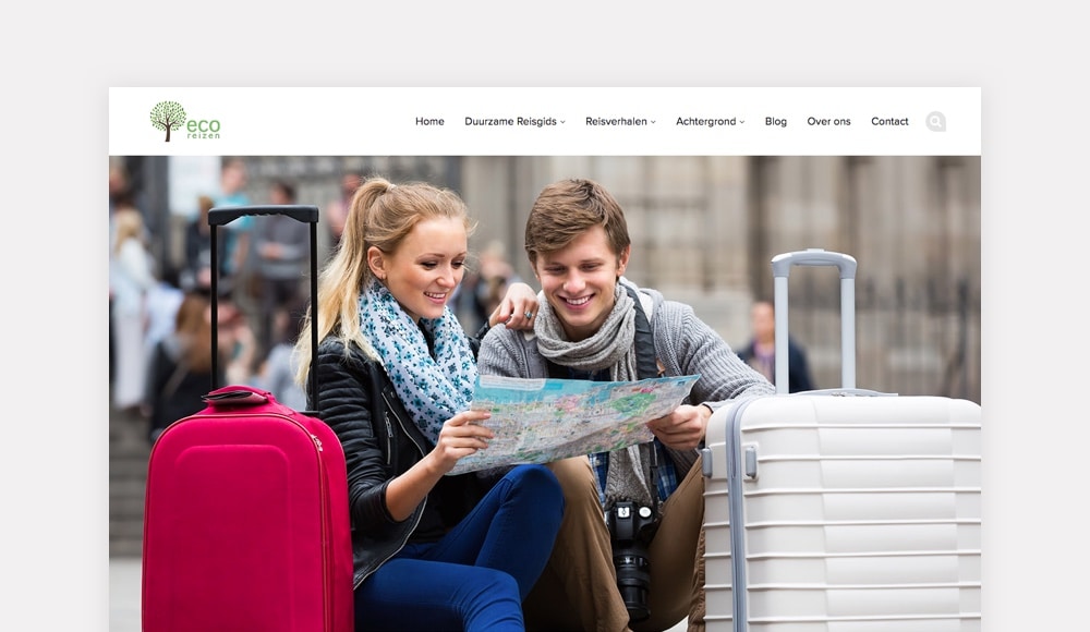
Eco-reizen – Eric’s website
What made you decide you needed a website?
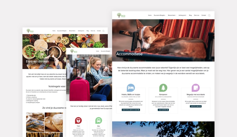
Recently, I decided to spend a considerable amount of energy in setting up a platform for sustainable travelling.
A much younger friend left her job because she wanted to spend her energy for a better environment and climate. We were sitting together and decided to start this ‘platform for sustainable travelling’.
Our goal is not so much to convince people, but to inspire and inform people who say: “OK, I know it is important, but how can I do it? Sustainable traveling is slow, expensive, dull.” We try to inspire people with nice travel stories from others, information about alternatives for flying and showing them that you can enjoy life without flying around the globe.
Of course we needed a website. We started with our initial thoughts early this year and now we are online!
Can you tell us why did you choose to go with an Artisan theme?
When I was surfing the internet to get inspiration for our new website, I found most sites had a layout that was too busy (where you’d get overwhelmed by far too much information), sometimes too over-designed (beautiful lay-out, but where do I find the button I’m looking for?), or just not the right impression for a wide audience (younger, older, etc.).
Then we said hey, why don’t we have a look at that theme we used in Kenya? At that time we got positive feedback from completely different customer groups.
It was a good decision because we get a lot of positive feedback about both the content and the layout of the site now too.
Which was the most challenging part about building your site? Did the theme facilitate the process in any specific way?
Since I am the (amateur) webmaster, I had to dig into how everything works and I had to get used to the modules system.
I like to start and find my way while I am working. But after a day of working this way, I got lost in too many modules. I lost the overview. Javier told me how to organize the modules by giving them a relevant name, which we did from then on. Sometimes it is still a slight problem because I don’t immediately figure out if a module is used on a page or can be safely deleted. So strict module management at any time is key to keep the overview.
Even more important is that we had to get a clear idea of what we wanted to communicate anyway. Setting up the site confronted us with the question: who is our target audience, what do we exactly want to communicate, how do we want to involve people?
We are (and probably will be for ever…) in the process of re-thinking these questions. Also new questions that we are starting to thing about are: Are we in the post-Facebook era? What in addition to Facebook? Do we need short videos? What is the best way to make that happen?
A more strategic question that we also ask ourselves is whether we want to sell travel arrangements via our site, and whether our site is ready for that if we want to?
Do you think there’s a difference in owning your own space in the web versus posting on social media?
Our site and our activities are still very young. We have a Facebook page and are also thinking about other social media. We did not yet do a lot of marketing activities.
So how do we get visitors?
We started a Facebook page to develop a network around us. A new blog post is automatically posted on Facebook when we publish it on our site. Sometimes we will promote a Facebook post, sometimes we inform others about our post (Would this be interesting for your audience?).
Then, when busy Facebook pages re-post our FB-post, we see a direct and huge increase of the traffic to our FB and website.
In other words: Facebook is our billboard. Our website is the place where people go if they want more information, and where they can come back, over and over again, when they want fresh ideas for traveling.
What can you recommend to someone starting a website? Any tools or tricks you wouldn’t want them to miss?
My first recommendation would be to start and experiment. Ask others to visit your site and be critical (better have a critical friend than a lost customer).
Think about your key message. Can you tell it on your front page in two sentences, or even one? If it’s not directly clear, visitors will surf on to the next site.
Keep your site simple (which is not the same as dull).
Ask for assistance when you need it. Sometimes I spent hours trying to find out something, while Javier and Mai could answer it in minutes.
Your website is never finished. Starting is one thing, keeping a site up-to-date is even more challenging. Check the content and the proper working regularly.
If you communicate with visitors, have a dedicated e-mail address with the name of your site. Do not use a general, impersonal gmail address.
How can people find more about you?
People can always send me an e-mail via eric@eco-reizen.nl.
Thanks Eric, for dropping so much wisdom here! If you want to read more stories from our Artisans, check out this other one involving a boat and a website »
