A lot has been going on in our little shop over the last months.
So much that we’re practically turning everything upside down (or downside up?) here. We’ll surely write a post for what this December is bringing with him. But, before that, shouldn’t we give November the credit it deserves? Sure we do.
So, without further ado, let’s recap all of November’s new features.
New Ready Made Sites
In November we’ve added 6 new Ready Made Sites to the collection. You’ll see the additions in your themes by navigating to Theme Options » General tab » Ready Made Sites Import. So if you were about to start a new site, maybe one of these will help you not to start from scratch.
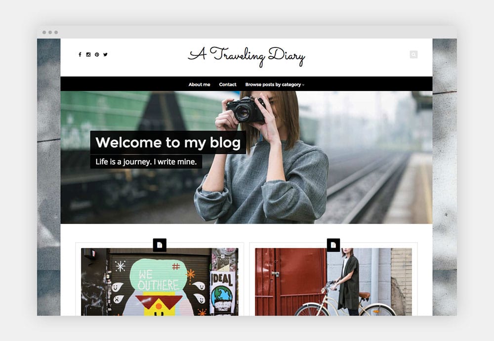
Traveling Diary – Based on Nayma
Young in spirit. Vibrant in ideas. This ready made site is perfect for the traveler who is sharing the journey, whatever it is. With a very personal style, features a blog as a homepage, an about and a contact page. And includes a filter by categories for your visitors to reach all your published content.
Check it out →
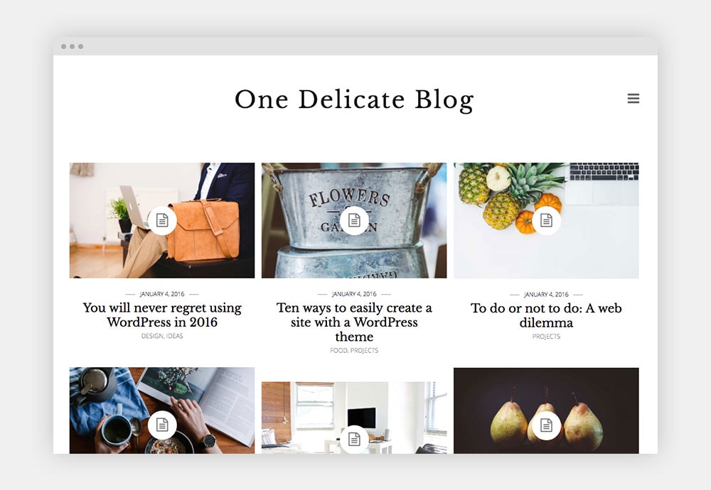
Delicate Blog – Based on Binder PRO
An elegant blog with a clean and delicate style that will definitely make you feel like writing. Includes a homepage with latest posts, two different About pages, a Projects page and a Contact page.
Check it out →
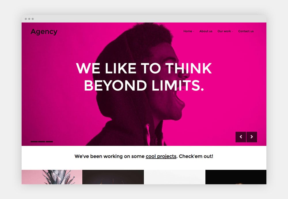
Agency – Based on Nayma
A cool and modern agency site to impact your clients and showcase your work in a bold and colorful way. This Ready Made Site includes two different homepages for you to choose from, two Portfolio pages, an About and a Contact page.
Check it out →
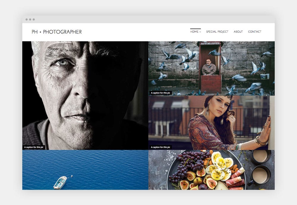
Photographer – Based on Nayma
With 3 different home gallery layouts, an about page, a contact page and a page crafted to tell about a special project, this Ready Made Site can serve any creative in the need of showcase the everyday work.
Check it out →
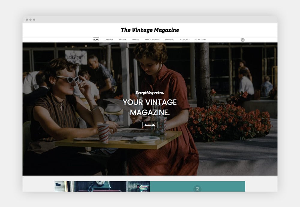
The Vintage Magazine – Based on Nayma
Gary Vaynerchuk says nostalgia is underrated. This Ready Made Site presents a magazine style of site that will connect deeply with your audience in a vintage-y kind of way, but with a refreshing air.
Check it out →
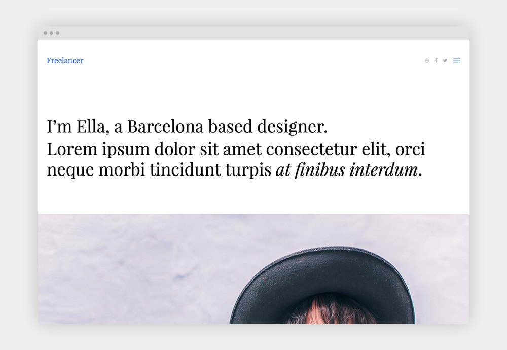
Freelancer – Based on Modules
Your work is curated. Stylish. Solid. You need a website that reflects that. The Freelancer Ready Made Site built with Modules has four different home page options to pick from, plus a Portfolio and a Contact page to get your online presence up in no time.
Check it out →
In case you’ve missed previous additions, you can check out all the Ready Made Sites here.
You’ll find cool sites such as an Outfit App site for Indigo, a Movies site for Indigo too, a Coffee Shop for Nayma. And 30+ more.
Wondering how to install a Ready Made Site in your site? Watch the video here.
New Modules
Not only Ready Made Sites were added in November. You’ll also find in this month’s releases two very cool brand new modules.
Info Box
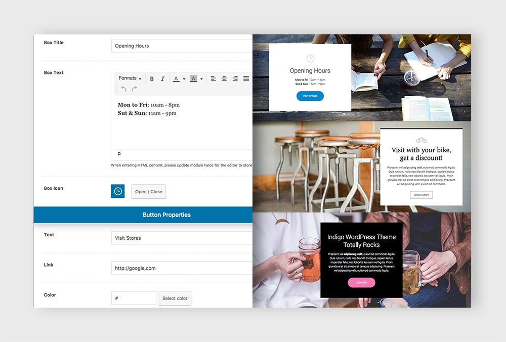
The Info Box module will let you place a colored box with any specific content you need to share. It can be anything: opening hours, a discount offer, a little story, a description for a picture, an introduction to a new service. Really, anything.
And it comes with plenty of options to play with. You can choose to use a title or not, you can add an icon, a button. You can also choose the background color and the text color.
Let me know what you create with it. 🙂
Video & Embeds
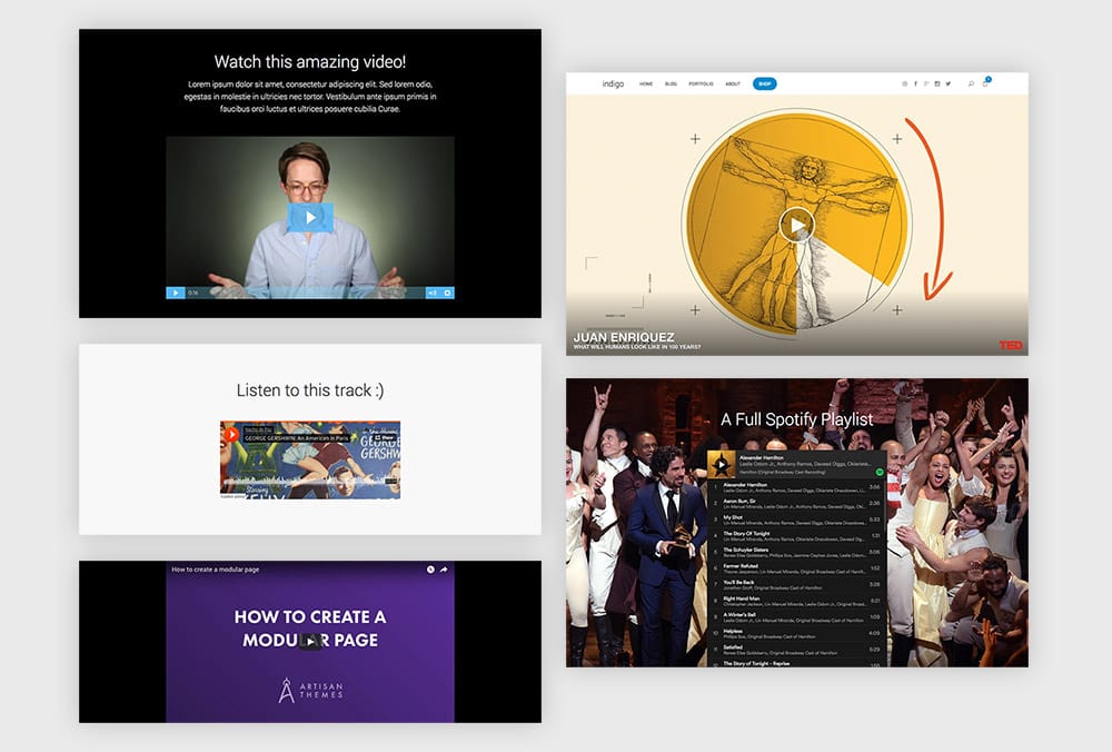
A simple module with a big impact. The Video & Embeds module will let you quickly embed all sort of media from almost every popular service out there.
Let’s say you have a YouTube video you want to place on your site. Just copy the video URL and paste it inside the module. That’s it. Looking grrreat right away!
Inside the module you’ll find options to make the embedded media full width or not, and also to choose between a large, a medium or a smaller size.
A Couple Extra Useful Perks
Dark Overlay Background in Binder PRO and Nayma
Looks like a small option to talk about, but it has a big effect on your design. Binder PRO and Nayma users can now enjoy a feature that was present long ago in our Modules and Indigo themes.
You already know you can upload a background image for each module in your site. But I’m sure many times you found yourself in the situation of having content on the module being not legible enough because of the low contrast with that image on the background. So maybe you opened the image in Photoshop and made it a bit darker to increase the contrast. That task takes time. Lots of time. Now you won’t be needing that.
Right below the Background Image option you’ll find now a setting to enable a dark overlay on your module. When enabled, it automatically adds a semi-transparent black overlay to your background to make it darker. And now your content is 100% visible.
Slogan Size Option in Binder PRO and Nayma
Another option that is now available in Binder PRO and Nayma is the possibility to choose between a Giant or Regular size for the Slogan module. When you choose Giant, the module will automatically take the whole height of the screen and the text will be vertically centered.
Use it with an impressive image as the background and voilà.
New Header Layout in Binder PRO
Binder PRO has been missing this layout for a while now: a centered layout. Inside the Fullwidth Header style (Theme Options » Layout tab) you’ll find a new layout named “Layout 4”.
When using this layout everything in your header will be centered, one element above the other. It’s a great option when using a big image as your logo or a large site title.
Coming next…
December will also be a month with plenty of news. Spoiler alert: a new super duper plugin is coming out, we’re opening the shop on our site and there’re many more features and Ready Made Sites that are being added.
Stay tuned!
Did we miss a feature you’ve been sleeplessly waiting for? Do let us know in the comments.
Featured image credit: Gratisography
