If you’re not a designer but you’re facing the challenge of building your own website, this post is for you.
Building a site with WordPress is so easy that everyone can do it. It’s not only the tool chosen by professional designers but also by all kinds of solopreneurs and businesses building their own websites.
Now, while WordPress solves the technical challenge of it, building a site also implies getting into the world of design and visual communication.
And design can get messy real fast.
That’s scary, isn’t it?
Fear not, dear artisan. I’ve put together a guide full of actionable tips to help you create a solid and professional looking website on your own.
Ready? Let’s begin.
1.
Choose fonts carefully
Working with typography might be one of the trickiest parts of creating a website. There’re so many fonts to choose from, how would you know which one is right?
We could talk about typography for several days. But let’s get into the basics and some practical tips so you can choose the right fonts for your website.
The first thing you need to know is that there are 4 main typefaces categories:
1. Serif
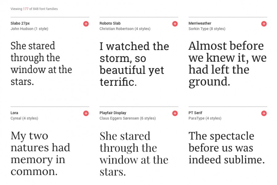
You probably know Times New Roman, right? That’s the perfect example of a Serif typeface.
Serif fonts have little “feet” (AKA “serif”) at the ends of the letters. They are usually used in more traditional, formal or classic contexts, but you can absolutely achieve a modern look with a Serif font too.
It’ll depend on which one you pick and how you combine it with another font.
2. Sans Serif
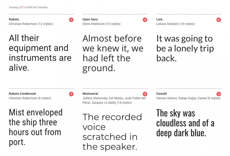
Arial, Helvetica, Calibri, Open Sans, Roboto. Typefaces without those little “feet”. They usually create a more modern and minimalistic impression.
3. Script
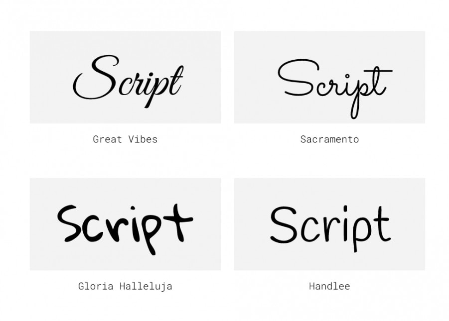
These are cursive or handwriting fonts. There are all kinds of them: elegant, with connected letters, casual, fun, delicate, informal.
4. Display
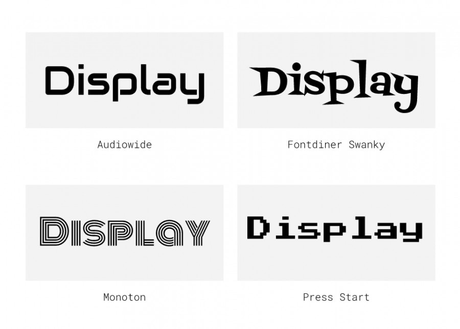
Display typefaces include a variety of fonts with a strong personality. They’re usually used just for big titles and not for body text, as they’re less legible and too dominant.
Serif and Sans Serif are often the more reliable and legible fonts. While Script and Display typefaces give your design such a heavy tone that you must use them in little amounts and with deep care.
I personally recommend sticking to Serif or Sans Serif fonts since they’re the safest choice. But if you choose to go with a Script or a Display font, always combine it with a simpler Serif or Sans Serif for the body text.
Please, never combine two Script or Display typefaces 👮🏼♀️. Trust me. You’ll thank me for this.
Before you choose fonts for your website, browse a fonts catalog and try some out. Then pick the ones that match your brand’s personality, and make sure they have good legibility.
If you’re using one of our themes, you’ll be able to choose fonts to be used on headings and body text from Google Fonts. And if you’re a Typekit user you can also use fonts from their collection.
2.
Don’t use more than 2 fonts
You’ve already chosen a typeface for headings and another one for the body. You could even have only one typeface too. If it’s a high-quality font and it comes in several weights (from thin to black), then you may probably don’t need another one.
But if you do need 2 fonts, then close it there.
Sometimes you might want to have a 3rd one just for small details. And you can. But in order to keep your website clear, 2 fonts and their variations are enough.
There are many strategies for combining fonts. Here’re some of the easiest and most useful ones:
– Combine through contrast. A Serif typeface with a Sans Serif, a Display with a Sans Serif, a Script with a Serif. A modern font with a more traditional one. A playful typeface with a minimal and cleaner typeface.
Combining two similar fonts is not a good idea, it creates competition between the elements of your design and therefore confusion.
– Use different styles of the same typeface. Like Roboto and Roboto Mono.
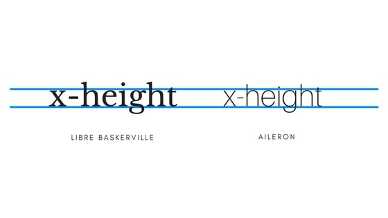
– Combine based on x-height. Meaning, choose two fonts that their lowercase letters have a similar height. That way you can achieve a similar visual weight.
Here are two websites showcasing different Google Fonts combinations. You can check them out to get some inspiration.
3.
Choose a color palette for your website
If your brand already has a color palette, then all you have to do is apply those colors to your website.
Choose which one will be used as the main color, for central elements such as buttons or big areas. And use the rest of the palette for highlighting titles, backgrounds, secondary elements and such.
If you don’t have a color palette just yet, this can be an opportunity to create one. Instead of randomly starting to use whatever color comes to your mind, take a moment to decide on a color palette that will serve your brand and website.
Colors are a big deal. They help bringing focus to certain elements, to differentiate an element from the others. They draw attention and help to organize the information.
They’re also close friends to emotions, cultural associations, psychology interpretations, and are a big influence when it comes to taking an action (like clicking on a button).
Finally, they are an important piece of your brand’s visual identity.
So here are some tips to create a color palette for your website:
✓ Start with a simple 3 colors palette.
One of them will be the main dominant color, used in most places. The other two will serve as accent colors, used in fewer places, but with an essential role as well.
You can follow the 60%-30%-10% rule to get a balanced use of the palette. That means, use the main color on 60% of your design, the second color on 30%, and the third one on a 10%.
✓ Get inspiration for a color palette from a picture.
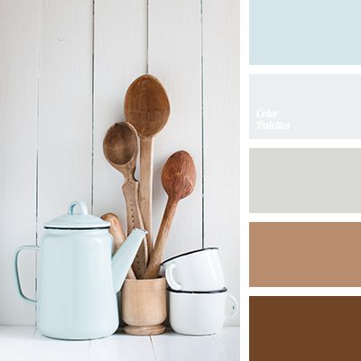
Here you’ll find several ideas ready to be used.
✓ Make sure the colors you choose match your brand’s mood and speak to your audience.
✓ Keep the hex values of your colors at hand, so you’re sure you’re using the exact same color every time through your entire website and not just picking similar colors.
✓ Have extra shades and tints based on your palette
If you need to use more colors than the 3 on the palette, instead of adding new colors, you can always pick different shades or tints based on those same 3 colors. That will help you keep your site cleaner and more consistent.
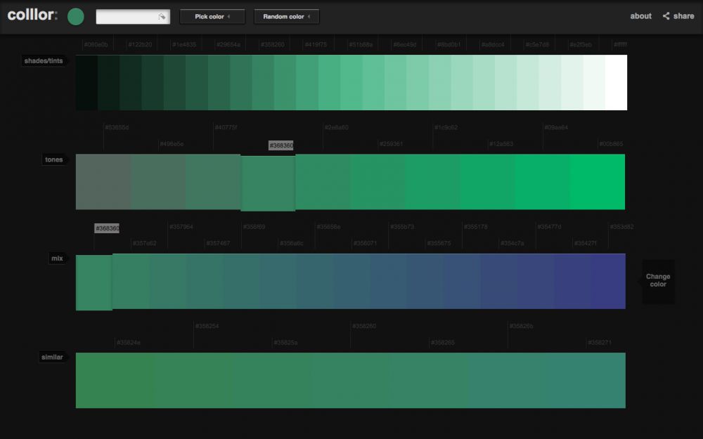
Here’s a great tool to do that: Colllor.
Pick a color, and Colllor will automatically offer you different scales based on it. What I always do is picking some different tints and shades for each color of my palette. So I have lighter and darker versions of each one.
4.
Communication over styling
If you’re building a website it’s because you want to connect with an audience and create a certain kind of relationship with them.
Make your decisions based on communication goals and not on unfounded appearance wishes.
Your message should be clear, that’s your priority. Then, use styles and graphic elements to support that message, not the other way around.
Exclusive Bonus: Make sure your website looks professional by following these 7 steps guide. Get it here.
5.
Seek for good contrast and legibility
You want your copy to be clear and easy to read for your audience.
If it becomes a stressful task, they’ll leave your website right away. Not because they didn’t like what you offer but because they weren’t even able to read it.
While the first thing that will serve good legibility is a well designed –and used– typography, once you’re done with that, contrast is the key.
Each piece of text on your site will be on top of a background. It doesn’t matter if it’s a color background, an image background or even a gradient background, the text on top of it should be 100% neat and clear.
To achieve legibility relay on a nice contrast between background and foreground. If your background is light, use a dark color for the text, and use a light color if the background is dark.
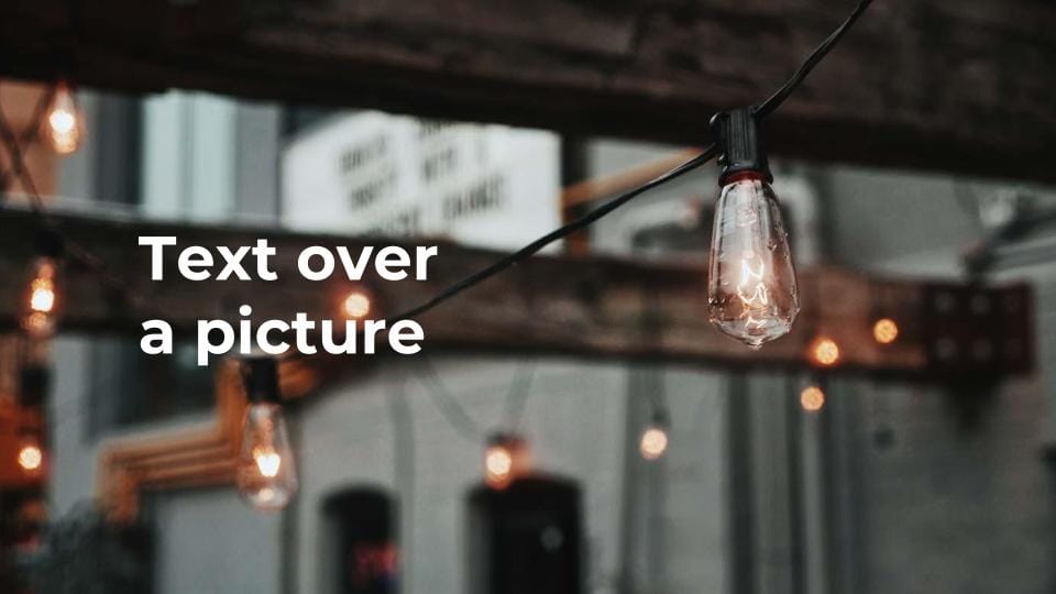
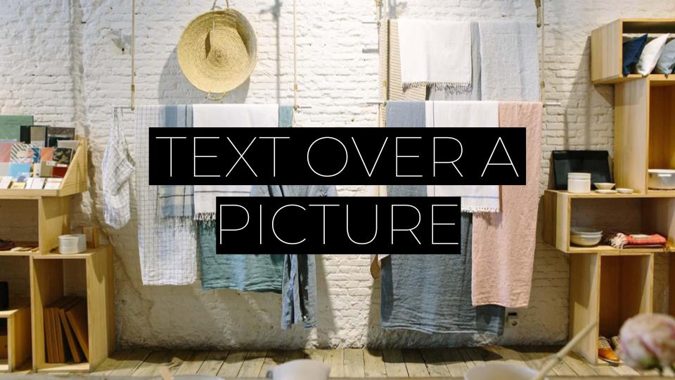
This can be especially tricky when working with an image as the background. How do you make your text legible when it sits on top of a picture?
There are many ways to work with that and it’ll depend on the type of image you’re using.
Here are some ideas:
If possible, use a blurred part of the picture to place the text.
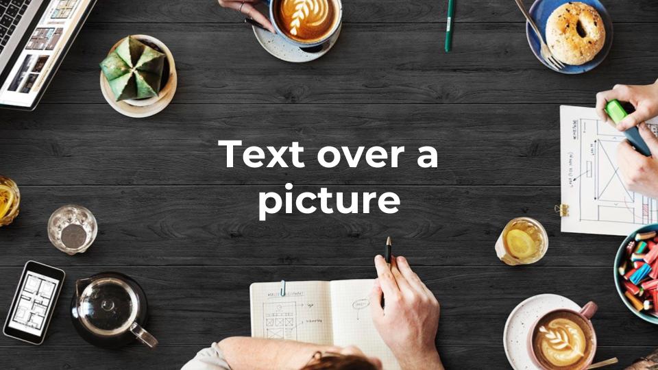
If the picture has a big white space area, use it to place your title on it.


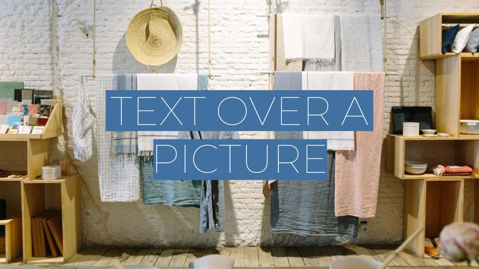
If the image isn’t dark enough to place a white title over it, apply a dark overlay to the picture.
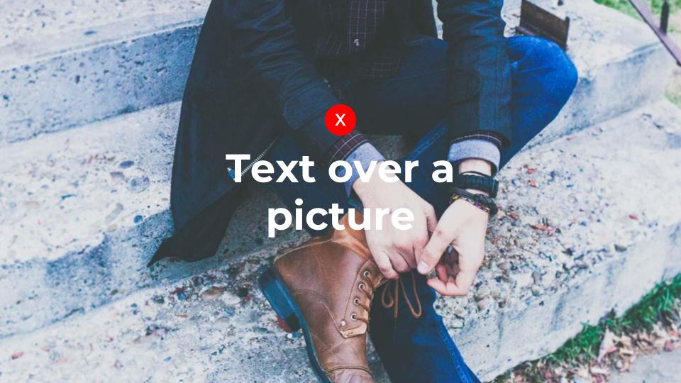
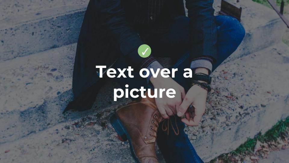
If you’re using one of our themes you’ll find an option to enable a dark overlay on every module of your site. Once you enable it, it’ll automatically add a black layer with a transparency on top of the background image.
If you’re not, you can also achieve that on any graphic design app (like Photoshop or Canva). Just add a black layer with some transparency on top of the image.

The dark overlay doesn’t have to be black, you can insert a colored layer instead.

You can also choose a highlight or fill color for the text.
And again, it doesn’t have to be black. You can pick a color that matches your brand or the image behind.
6.
Keep information clear by using hierarchy and proximity
There are many design principles to follow when it comes to information clarity.
The idea behind is that you should guide the user through your design. In a breeze, and even before they start reading any words, they should understand:
- Where to begin
- What follows what
- What’s the most important piece of information
- What’s related to what
All these key points can be achievable through hierarchy and proximity.
Hierarchy
Hierarchy is meant to prioritize elements and let the user know what’s more important and what’s less important. Where its attention should go to.
Hierarchy Example
It can be accomplished through many different techniques such as size, proportion, contrast, position inside a layout, alignment, colors.
Hierarchy should organize the reading flow. And it will give sense to your design, as a whole and in between its parts.
Proximity
Proximity is all about the relationships between elements. It helps connect or differentiate the pieces of your design by placing them close to each other or rather far away.
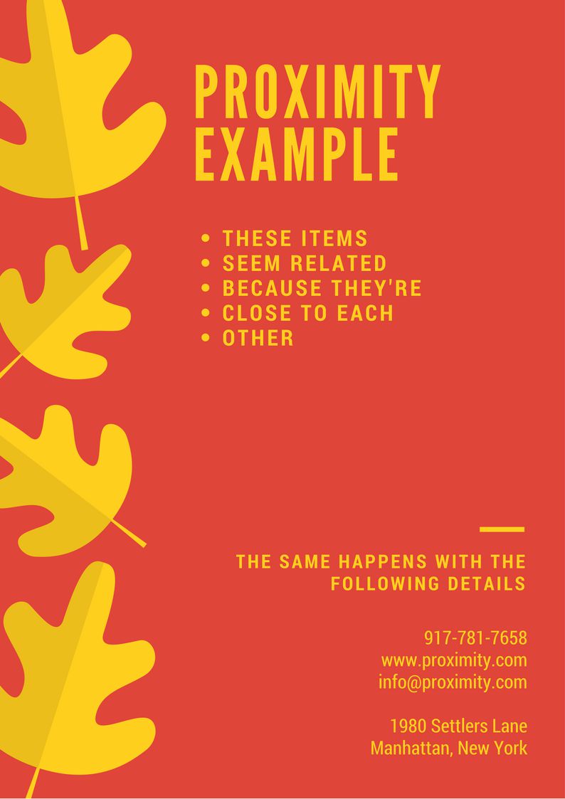
Proximity Example
When elements are close to each other, it creates the impression that they belong together. And when they are at a great distance, you’re telling the user that they’re different kinds of information.
A simple example would be the details of an event.
If you’re promoting an event and giving users all sorts of details (date, address, schedule, how to get there, where to park, the dress code, how to buy tickets, etc.) you may want to keep closer the details that go together and differentiate them from the other ones.
Make sure you place related elements in a logical way regarding distance, so people find what they’re looking for in groups of information that make sense.
7.
Make your design more professional by adding white space
One of the most common errors that happen to a non-designer is creating overloaded designs.
Meaning, putting a lot of elements inside a small space.
This not only makes your design less readable and less enjoyable for the user but it also creates the impression that is less professional.
Space is defined when an element or several elements are placed inside it. What’s not an element, the “non-used” space, is called the white space or negative space. The space that you intentionally leave blank (not specifically in white color, though).
A good balance between positive and negative space will help:
- Reduce noise
- Organize the information
- Clarify the information
- Emphasize the important stuff
- Give your design a brighter and more open feeling
Apple is known for making excellent use of white space. As you can see, it helps to achieve a really modern, professional, and top-level look.
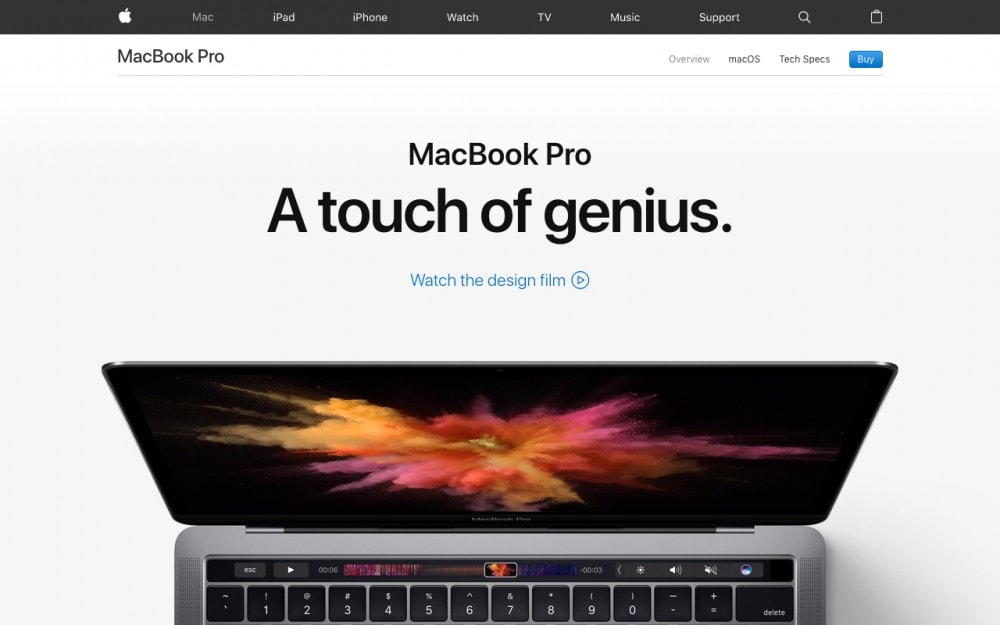
Use of white space – Apple
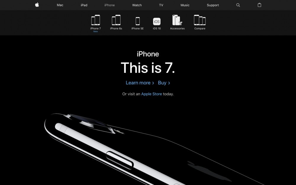
Use of white space – Apple
So, if you’re overloading every part of your website, think of how you can re-organize the elements and make more room for white space. It’ll automatically give your eyes a more pleasant feeling.
* Want 6 more essential tips to make your website look professional? Get them here.
8.
Simplicity over trends or “You don’t need to use elements you don’t know how to work with”
I’ve seen a lot of non-designer entrepreneur friends taking care of their own websites.
Because WordPress is so easy to use, it gives the possibility to everyone to create their own site in no time. Which is great, really awesomely great.
But…
You don’t have to be the next award-winning designer just because you decided to create your own website. Take that pressure off your shoulders.
Your main goal is to create an effective website for your audience.
So you saw a lot of websites using special effects, special graphic elements, layouts, colors, patterns, textures, and so on. That doesn’t mean you need to use them.
Keeping your site cleaner, with only the necessary elements, will assure you a more solid website.
When in doubt, go with the simpler option:
– “A white header with the logo and menu navigation in color, vs. a header with a pattern background and the navigation in white?” → Go with the first option.
– “I want to use an image of my product as the background for a hero section with a big title, but the image is an isolated picture of the product on a white background.” → Well, that image probably won’t work as a background, use it as content instead, above, below or next to the title.
– “I have an eco-friendly website with news about the environment. I probably need to use nature textures all over the site, and green backgrounds.” → Not necessarily. Or the more honest version: don’t do that. You can create a mood with minimal decisions and details, and that way keep your site cleaner, modern and solid.
Once you gain more experience and learn how to work with more complex components you can of course experiment with different elements.
But you don’t need to, especially if you’re just starting.
9.
Keep important information reachable
Don’t make your users work for your design, make your design work for your users.
If you know there’s a piece of information users will need to find right away, handle that information as soon and as clearly as possible.
Maybe it’s a phone number, an address, a search bar, a download button, a subscribe form, a price, a special promo. Keep it reachable and findable.
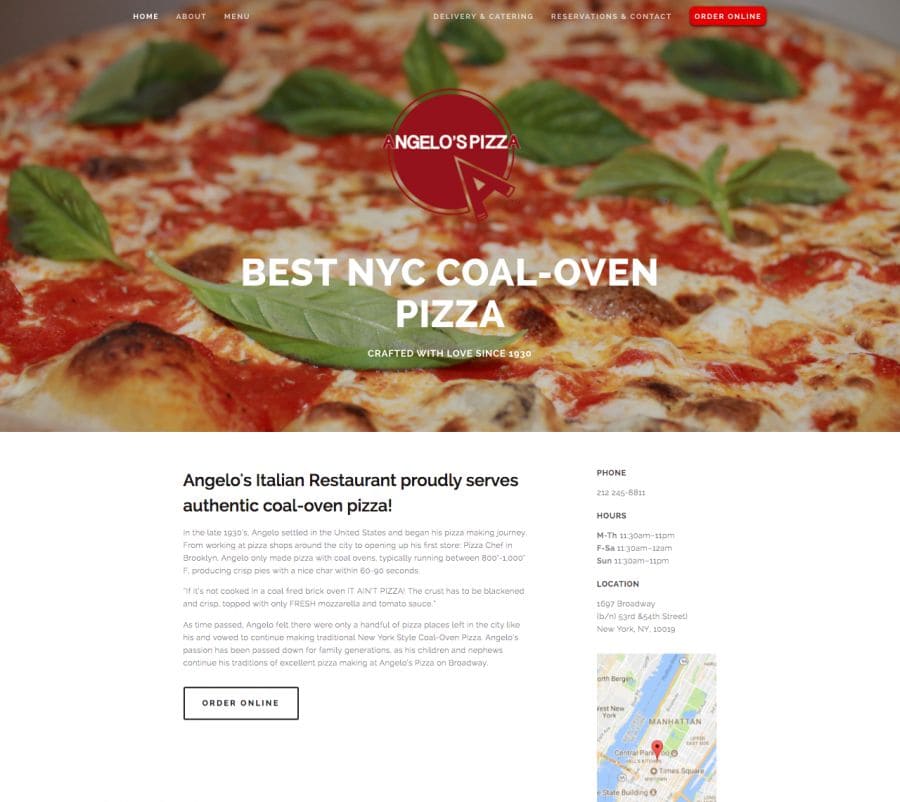
“Order Online” button, phone, opening hours and location information at hand.
Don’t make users navigate through your website just to find it. It might create a negative experience or even make them leave your website before they find it.
If you’re not sure what kind of information you should offer right away, maybe looking at other websites from your same industry could help. Conventions are a good starting point.
10.
Use images to convey a message, set a mood or create empathy –but don’t overuse them
Images are a really important part of the web nowadays. Big image backgrounds, hero images, illustrations, galleries, and whatnot.
Using images on your website can be very favorable when used wisely:
- They can tell a complex idea in a simple way
- They create empathy and identification
- They tell a story
- They support an idea
- They evoke emotions
- They draw attention
- They create a specific atmosphere
- They generate impact
- They influence a user’s first impression
As good as images are, when used all over the place –just because it’s “cool”–, they might stop benefiting your design and make it harder to consume.
If you decide to use images, here are some tips to keep in mind:
✓ Consider whether if the image will be used as the main content or as a more decorative or supportive companion of another element (like a background for a big title).
✓ Use real photos, no cheesy stock photos.
✓ Choose images that match your brand’s visual identity and target audience.
✓ Use high-quality images, but also adapt their size and weight to the web.
✓ Try to keep similar criteria within all your images. Like: Will they have humans? Will they have a similar atmosphere? Will they follow a color palette? Will they be energetic/calm/happy/dramatic?
11.
Be consistent
Your website is a huge part of your brand and a great supporter of your visual identity.
You want your users to recognize your brand through all your visual expressions. And also make sure all your graphic materials help to convey the same idea by being coherent with each other.
That’s when consistency comes to help. By making consistent use of certain elements (like typography, colors, proportions, etc.) you’ll enhance your message and establish familiarity with your visual identity.
How does that come into play when it comes to creating your website? Here’re some ideas:
- Decide which font you’ll use for headings and which one for the body (and maybe a third one for little details) and keep it that way through all your website copy. That includes deciding to use the headings font in all caps and bold, for example.
- Decide which color of your color palette will be used for buttons and calls to action.
- Decide if there are certain elements that will always use the same color or size.
- Think if all pages should start with a similar heading or not.
- Keep a consistent proportion within titles, subtitles and body.
- Make sure all the images you use have a similar atmosphere.
Fortunately, if you’re using one of our themes, you’ll be covered with most of these tips. But as our themes are also very flexible, there’s part of this work that will rely on your decisions.
(And, by the way, if you’re not a designer but can’t wait to become one, Mai Knoblovits has a fantastic mini-course called Zero to Designer to learn graphic design online.)
Be sure you follow these tips to make a solid website that will help you achieve your goals!