Sure. You’re about to start designing a new website, or creating a new photo gallery, or even publishing a new post on your blog, and you’d love to use super cool images.
And here’s when the big challenge arrives. You decided to use photos, and you know why and for what purpose but… which pictures to use? Where to get them? And, mostly: how to make them look good? Let’s face it, we usually don’t get from our clients the best looking photos nor we can always pay for a professional photographer to take them. Or maybe we have pretty cool photos but when inserting them inside our design or content, they don’t look as we expect them to.
In all of these cases we can take advantage of a few tools that will make our images much nicer and useful for our design. I like to call these: tips to make your photos work for you.
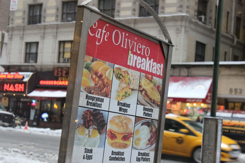
Along these tips we’ll work with Photoshop and we’ll use this image as a starter:
Images are very important when building a professional website. But that’s not all. Download the 7 Ways Guide to Make Your Website Look Professional, and make sure your website makes your business look good.
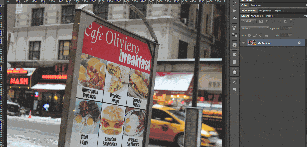
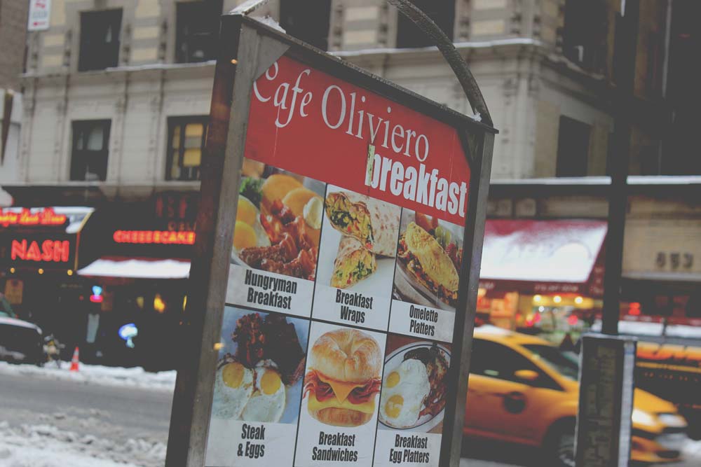
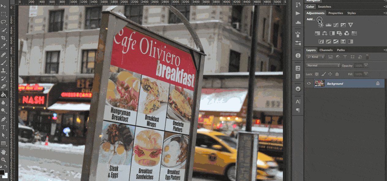
1. Film Look / Crushed Black
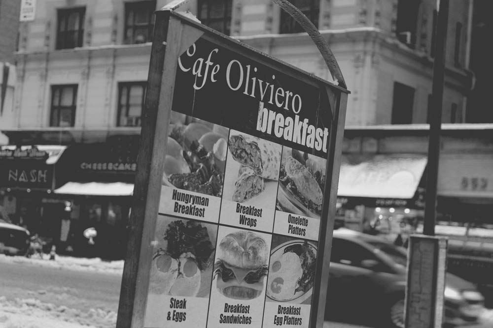
The “Film look” is a very trendy effect right now, I’m sure you’re seeing it everywhere. Actually, it’s achieved by turning down the dynamic range of the photo, so it looks like older pictures. We’ll adjust the Curves to get that look. Here’s how:
Now our photo looks like this:
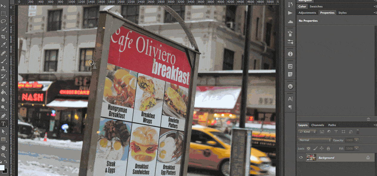
2. When using text on top of an image
Also very common these days is the use of text, a big and shiny white text, on top of an image background or a slider. But the problem many of you face is that the text becomes not legible at all. Don’t worry; is really easy to solve it. We just need to make our picture darker. For that we’ll create a new layer with a black background and place it on top of the image. Then we’ll reduce its opacity to something like 50%, maybe less, depending on your specific photo. Here’s how it’s done:
Now we get a nice picture that doesn’t compete at all with our text.

Another tip: you can make this trick with any other color you want and get something really cool.
3. Black & White
An older but still solid tip is to turn your pictures to gray scale. It’ll make a bad photo look much better. Just remember for what use do you need that picture, because using a black and white image may not be appropriate for every purpose. Follow these steps:
Now our picture looks like this:
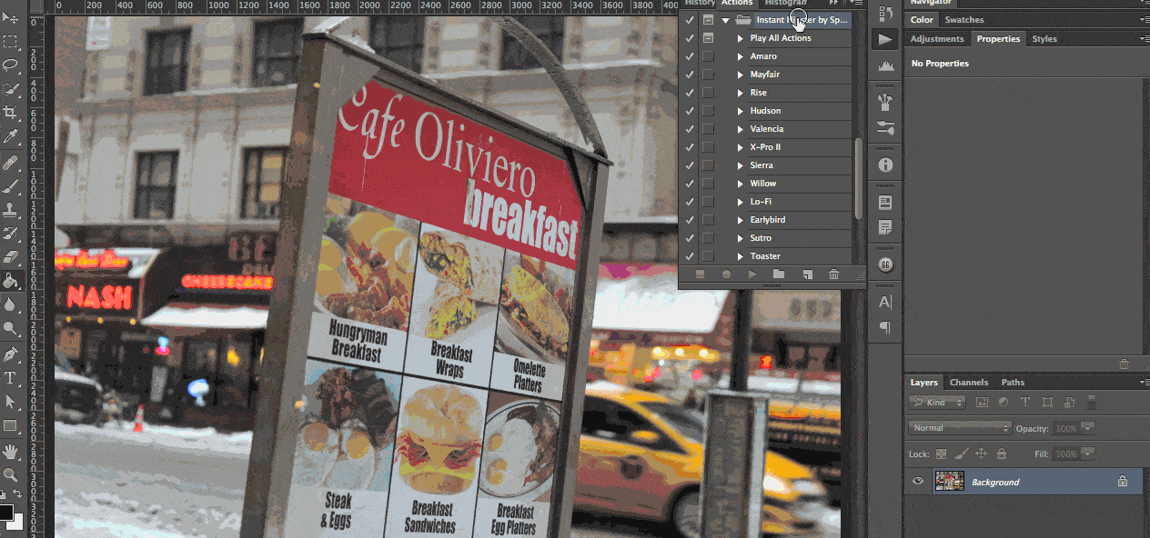
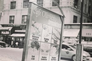
4. PSD Actions
Finally, remember (or discover, if you’re not familiar with) there are many cool PSD actions made by great designers and photographers that can level up our photos in just seconds. I really love this set of actions called “Instant Hipster”, that comes with 19 retro effects. Try them out:


Hello, just wanted to say thank you for that curve adjustment pro-tip. I have been trying to put my finger on that technique for ever since I noticed hubspot was using it and I have failed to figure it out, spending far longer than I am willing to admit in writing. 🙂 Let’s just say that I super appreciate it!
Hi Steve,
Haha, it’s ok, we’ve all been there. I’m happy you know how to get that look now 🙂
Use tips. Thanks for sharing.