Colors and Fonts… What a challenge!
If you’re building your own website and you’re not an experienced designer, you’ve probably already noticed that fonts and colors are a huge deal.
Like…
- There are thousands of possibilities to choose from
- Fonts and colors are accountable for your website’s (and therefore your brand’s) personality
So…
You might be wondering:
How do I choose the perfect font combination and the right color palette for it?
How do I put colors together?
Is that font a good, solid typeface?
Will these fonts and colors really represent my brand?
I get your feeling. It’s confusing and overwhelming.
So what do you do?
Fortunately, there’s no need to reinvent the wheel. If you won’t be coding your site from scratch, then why would you design your brand from scratch?
If you want to make sure your design will work, the smartest thing you can do is look for inspiration and rely on already created font combinations and color palettes.
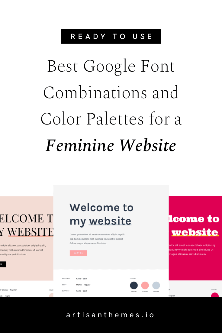
In this post you’ll find 18 font and color blends for feminine websites you can trust
Each one is like a toolkit, with style guides you can use to actually build your brand.
Look for the one that you feel better represents you and just grab the fonts and colors it uses. Apply them to your website. And go make yourself a cup of tea, you deserve it. ☕️
There is more than one way to have a “feminine” styled website
Feminine can mean delicate, elegant, romantic, but also vibrant, strong and powerful.
I put together a highly versatile collection of font and color combinations that can serve any kind of feminine modern websites.
If it’s for your personal brand, your blog, your business, an organization or an online magazine, you’ll find in these ideas the perfect match for your project.
How to use Google Fonts and the color palette on your website
→ If you’re using one of our WordPress themes, then all you need to do is go to Theme Options » Typography in your dashboard.
You’ll find a dropdown menu for the Headings and another one for the Body font. That menu offers you all available fonts from Google, so just choose the one you need and click Save.
After that, go to the Design tab in Theme Options and copy-paste the color codes you liked into the Color Palette option. Now these colors will be available for you to use every time you see a color picker in your Artisan theme.
→ If you’re not using one of our themes, here’s what to do to use the fonts you’ve chosen:
Step 1: Embed the fonts into your website by adding the embed code as the first element in the < head > of your HTML document.
Step 2: Declare the fonts that will be used for body and headings in your styles.css file.
You’ll find both the embed code and the CSS code below each combination, so you can copy-paste them to your files.
18 ready-to-use Google Fonts combinations and color palettes for a feminine styled website
Here they are:
1. Karla + Martel
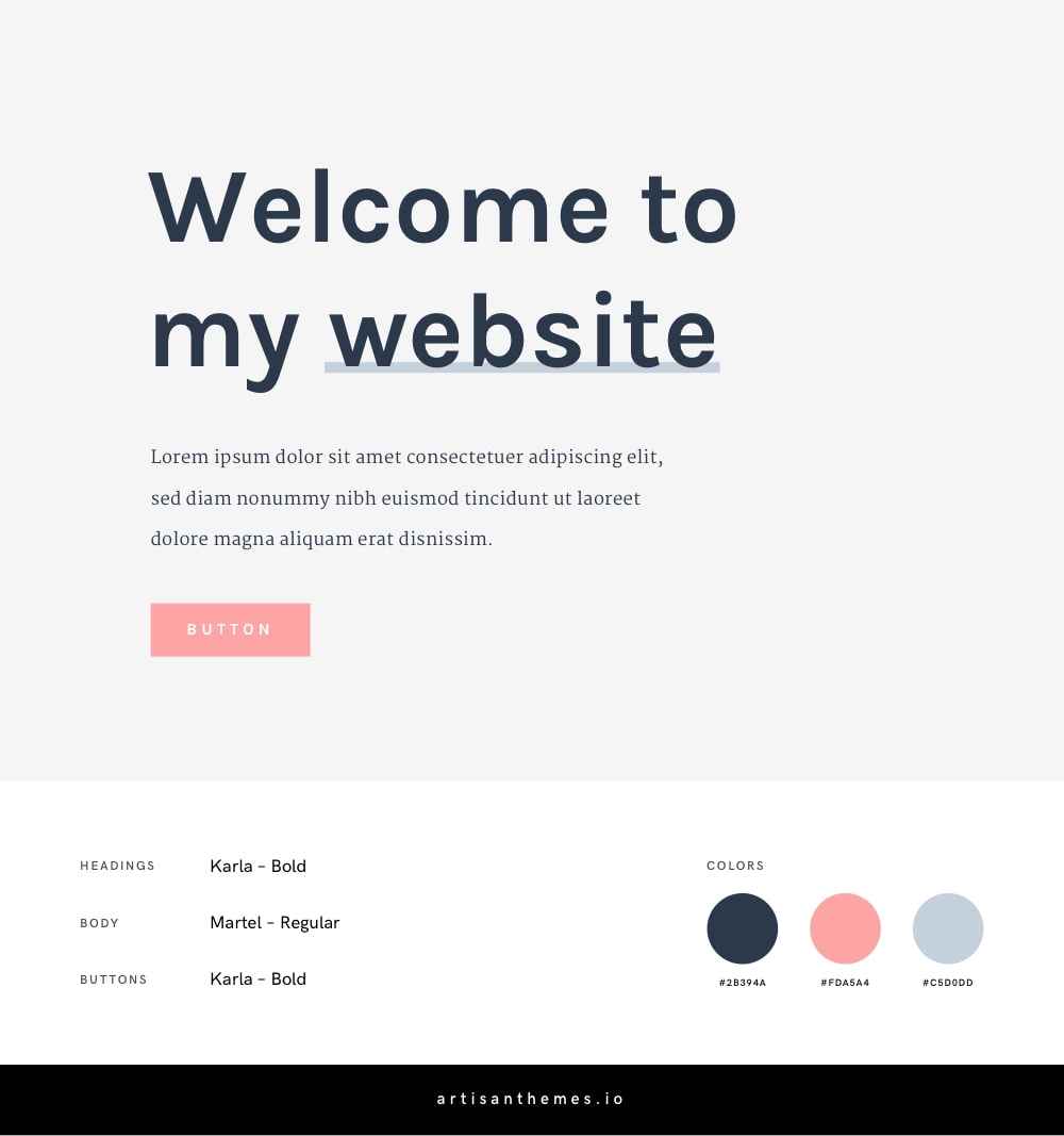
Our first combo is a pretty delicate yet cheerful one. With a grotesque sans serif typeface for the headings, a refined serif body font, and pastel shades in the palette.
This is the combination you want if you’re looking for a clean, light and friendly style.
Fonts
Embed code:
<link href="https://fonts.googleapis.com/css?family=Karla:400,700|Martel:400,700" rel="stylesheet">
CSS code:
body {
    font-family: 'Martel', serif;
    font-weight: 400;
}

h1, h2, h3, h4, h5, h6 {
    font-family: 'Karla', sans-serif;
    font-weight: 700;
}

.button {
    font-family: 'Karla', sans-serif;
    font-weight: 700;
    font-size: 13px;
    text-transform: uppercase;
    letter-spacing: 3px;
}
Color Codes
#2B394A#FDA5A4#C5D0DD
2. Barlow + Rasa
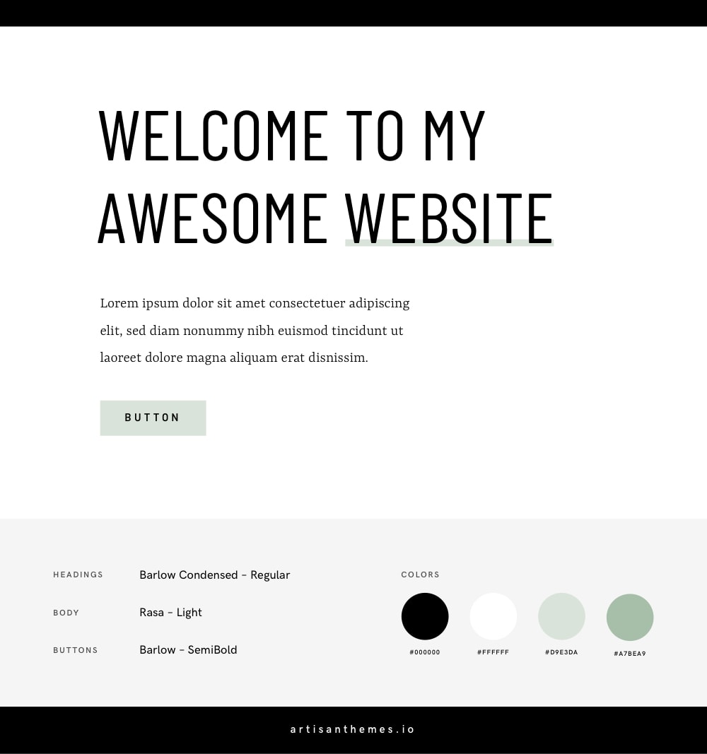
This one is chic and vivid. With a monochromatic color palette and a modern & traditional contrasting font blend.
It gives a sense of a smart and authoritative brand, with refined touches and strong choices.
If you’ll go with this one, try using mostly black and white and then introducing the green shades only where necessary in very small quantities. This will help to maintain the authority concept.
Fonts
Embed code:
<link href="https://fonts.googleapis.com/css?family=Barlow+Condensed|Barlow:600|Rasa:300,500" rel="stylesheet">
CSS code:
body {
    font-family: 'Rasa', serif;
    font-weight: 300;
}

h1, h2, h3, h4, h5, h6 {
    font-family: 'Barlow Condensed', sans-serif;
    font-weight: 400;
    text-transform: uppercase;
}

.button {
    font-family: 'Barlow', sans-serif;
    font-weight: 600;
    font-size: 13px;
    text-transform: uppercase;
    letter-spacing: 3px;
}
Color Codes
#000000#ffffff#D9E3DA#A7BEA9
3. Raleway
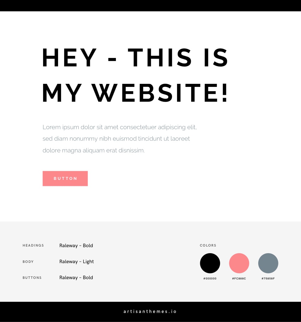
The chic feminine combination by excellence. Black, white and a rich pink. With the geometric and cool Raleway used for both the headings and the body text.
* See this combination in action on this Artisan Site for a female entrepreneur by Artisan Themes: Coach.
Fonts
Embed code:
<link href="https://fonts.googleapis.com/css?family=Raleway:300,700" rel="stylesheet">
CSS code:
body {
    font-family: 'Raleway', sans-serif;
    font-weight: 300;
}

h1, h2, h3, h4, h5, h6 {
    font-family: 'Raleway', sans-serif;
    font-weight: 700;
    text-transform: uppercase;
    letter-spacing: 2px;
}

.button {
    font-family: 'Raleway', sans-serif;
    font-weight: 700;
    font-size: 12px;
    text-transform: uppercase;
    letter-spacing: 3px;
}
Color Codes
#000000#FC888C#75858F
4. Playfair Display + Gothic A1
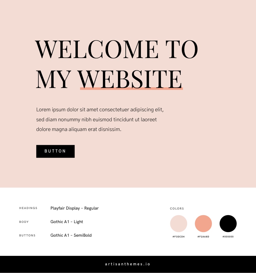
Looking for the classic feminine-fashion-chic kind of style? Then this is the one you should choose.
The beautiful Playfair Display font in all caps together with the black and pink shades, make all the magic.
Use it for a lifestyle magazine website or a trendy modern business. Your audience will love it.
Fonts
Embed code:
<link href="https://fonts.googleapis.com/css?family=Gothic+A1:300,600|Playfair+Display" rel="stylesheet">
CSS code:
body {
    font-family: 'Gothic A1', sans-serif;
    font-weight: 300;
}

h1, h2, h3, h4, h5, h6 {
    font-family: 'Playfair Display', serif;
    font-weight: 400;
    text-transform: uppercase;
}

.button {
    font-family: 'Gothic A1', sans-serif;
    font-weight: 600;
    font-size: 13px;
    text-transform: uppercase;
    letter-spacing: 3px;
}
Color Codes
#F3DCD4#F2A68D#000000
5. Work Sans + Merriweather
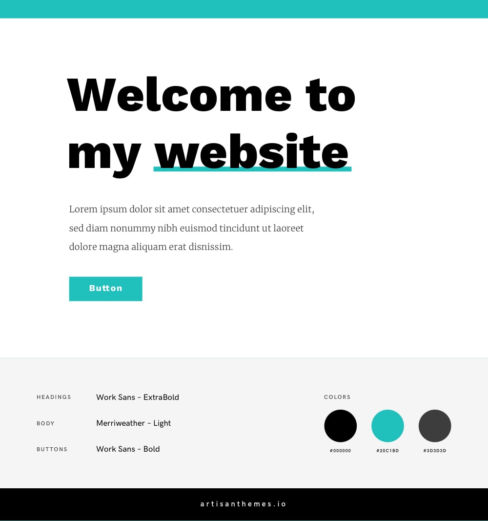
Bright and sharp. Simple but powerful. A combination with a lot of white space, solid typefaces and a vivid eye-catching accent color.
This one is suitable for a solid, assertive and confident business or blog.
Fonts
Embed code:
<link href="https://fonts.googleapis.com/css?family=Merriweather:300|Work+Sans:700,800" rel="stylesheet">
CSS code:
body {
    font-family: 'Merriweather', serif;
    font-weight: 300;
}

h1, h2, h3, h4, h5, h6 {
    font-family: 'Work Sans', sans-serif;
    font-weight: 800;
}

.button {
    font-family: 'Work Sans', sans-serif;
    font-weight: 700;
    font-size: 15px;
    letter-spacing: 1px;
}
Color Codes
#000000#20C1BD#3D3D3D
6. Ultra + Work Sans
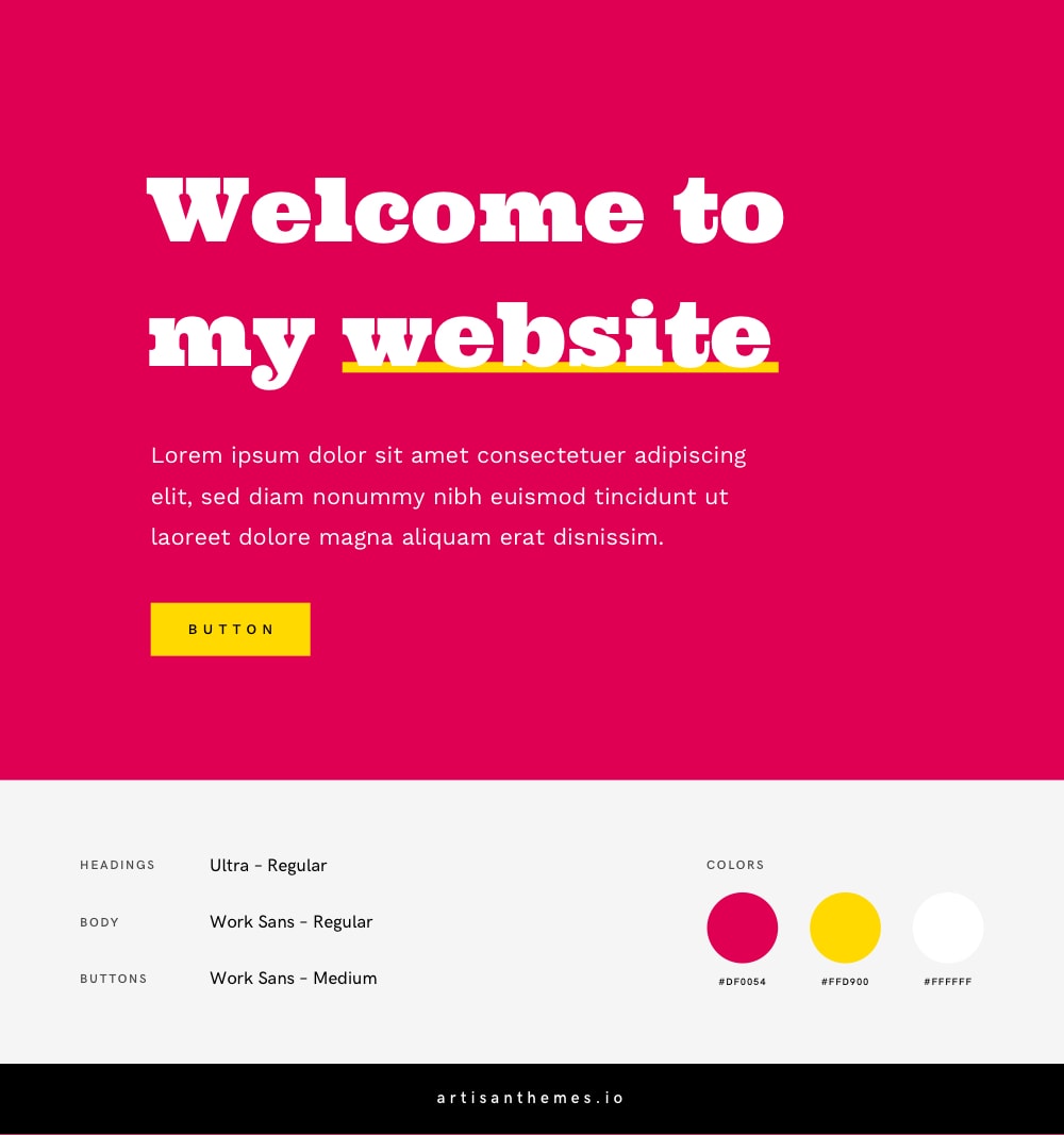
If high-contrast, eye-catching and vibrant design if what you’re after, this combination will do it.
The Ultra font and these bright colors will make your website wild and bold, while Work Sans will do the job of balancing the whole thing and keep your website clear and aesthetic.
Fonts
Embed code:
<link href="https://fonts.googleapis.com/css?family=Ultra|Work+Sans:400,500" rel="stylesheet">
CSS code:
body {
    font-family: 'Work Sans', sans-serif;
    font-weight: 400;
}

h1, h2, h3, h4, h5, h6 {
    font-family: 'Ultra', serif;
    font-weight: 400;
}

.button {
    font-family: 'Work Sans', sans-serif;
    font-weight: 500;
    font-size: 13px;
    text-transform: uppercase;
    letter-spacing: 3px;
}
Color Codes
#DF0054#FFD900#ffffff
7. Cormorant Garamond + Khula
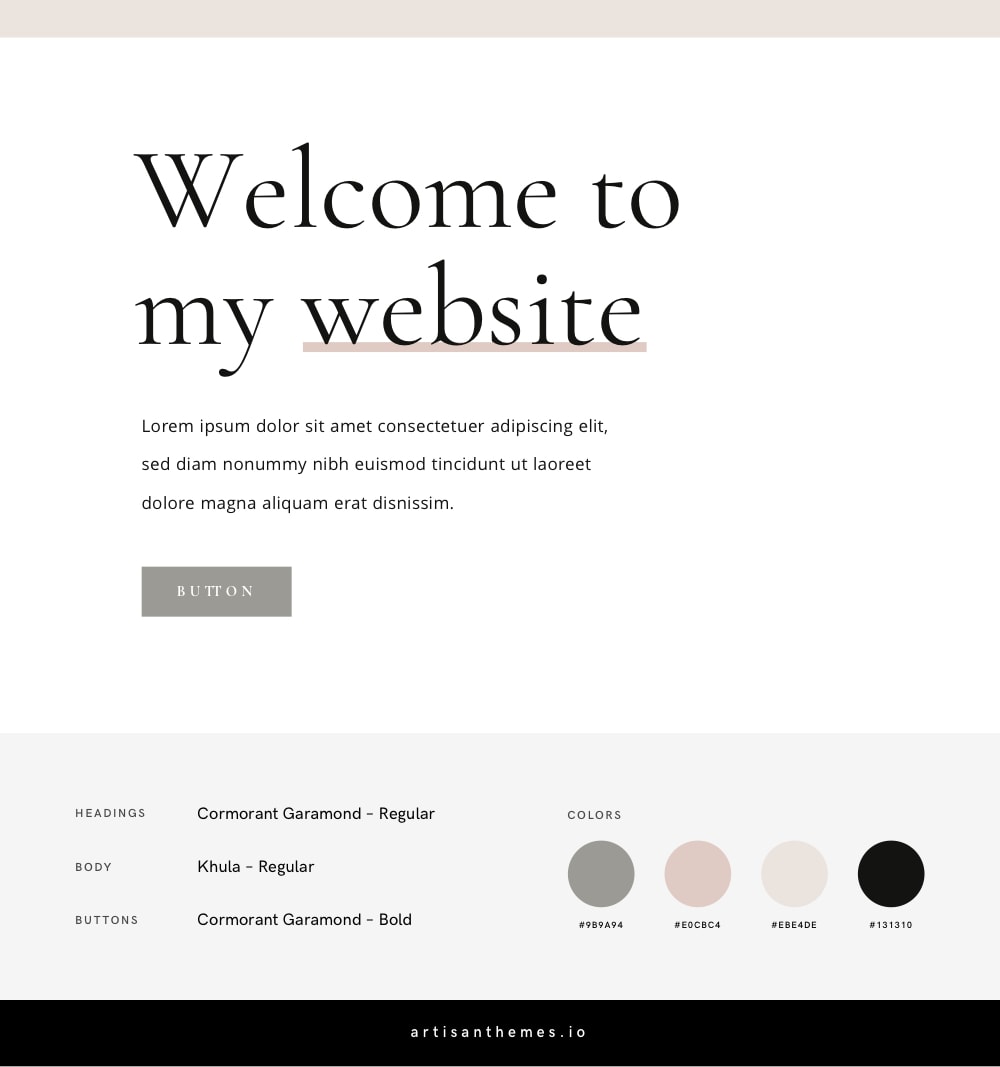
Enter the more traditional and calm combination. A beautiful serif font for the headings, combined with a subtle and warm color palette.
It will make your website look refined and elegant.
Fonts
Embed code:
<link href="https://fonts.googleapis.com/css?family=Cormorant+Garamond:400,700|Khula" rel="stylesheet">
CSS code:
body {
    font-family: 'Khula', sans-serif;
    font-weight: 400;
}

h1, h2, h3, h4, h5, h6 {
    font-family: 'Cormorant Garamond', serif;
    font-weight: 400;
}

.button {
    font-family: 'Cormorant Garamond', serif;
    font-weight: 700;
    font-size: 13px;
    text-transform: uppercase;
    letter-spacing: 3px;
}
Color Codes
#9B9A94#E0CBC4#EBE4DE#131310
8. Playfair Display + Montserrat
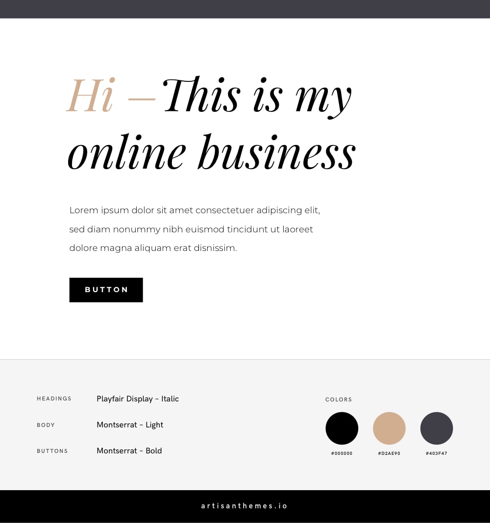
Two of my favorite Google Fonts together, what a pleasure!
Use them with this color palette and your site will look luxurious, trendy and exclusive.
Fonts
Embed code:
<link href="https://fonts.googleapis.com/css?family=Montserrat:300,700|Playfair+Display:400i" rel="stylesheet">
CSS code:
body {
    font-family: 'Montserrat', sans-serif;
    font-weight: 300;
}

h1, h2, h3, h4, h5, h6 {
    font-family: 'Playfair Display', serif;
    font-weight: 400;
    font-style: italic;
}

.button {
    font-family: 'Montserrat', sans-serif;
    font-weight: 700;
    font-size: 13px;
    text-transform: uppercase;
    letter-spacing: 3px;
}
Color Codes
#000000#d2ae90#403F47
9. Satisfy + Halant + Montserrat
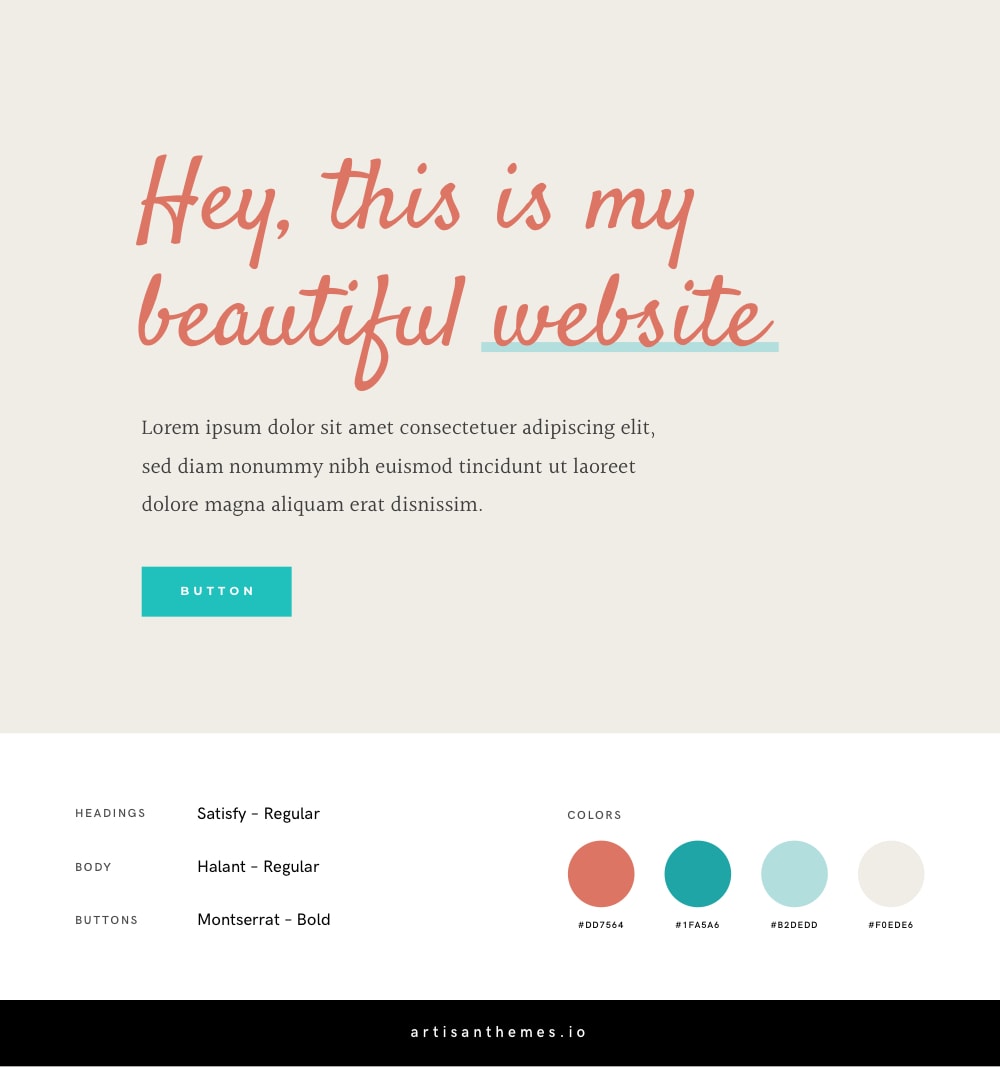
Now, to a friendly-er combination.
I must confess, I’m not a fan of the script fonts available in Google Fonts. And I also don’t think a script font is suitable for all the headings on a website. Why? Because its strong personality makes it less legible and also because it might fatigue your readers.
But I thought I can make some of them work. And this is the case for Satisfy, a script font with a friendly personality.
This combination is joyful and sweet. And it uses Halant for the body and Montserrat for the buttons, to equilibrate Satisfy’s unique presence.
Fonts
Embed code:
<link href="https://fonts.googleapis.com/css?family=Halant|Montserrat:700|Satisfy" rel="stylesheet">
CSS code:
body {
    font-family: 'Halant', serif;
    font-weight: 400;
}

h1, h2, h3, h4, h5, h6 {
    font-family: 'Satisfy', cursive;
    font-weight: 400;
}

.button {
    font-family: 'Montserrat', sans-serif;
    font-weight: 700;
    font-size: 13px;
    text-transform: uppercase;
    letter-spacing: 3px;
}
Color Codes
#DD7564#1FA5A6#B2DEDD#F0EDE6
10. Montserrat + Josefin Sans
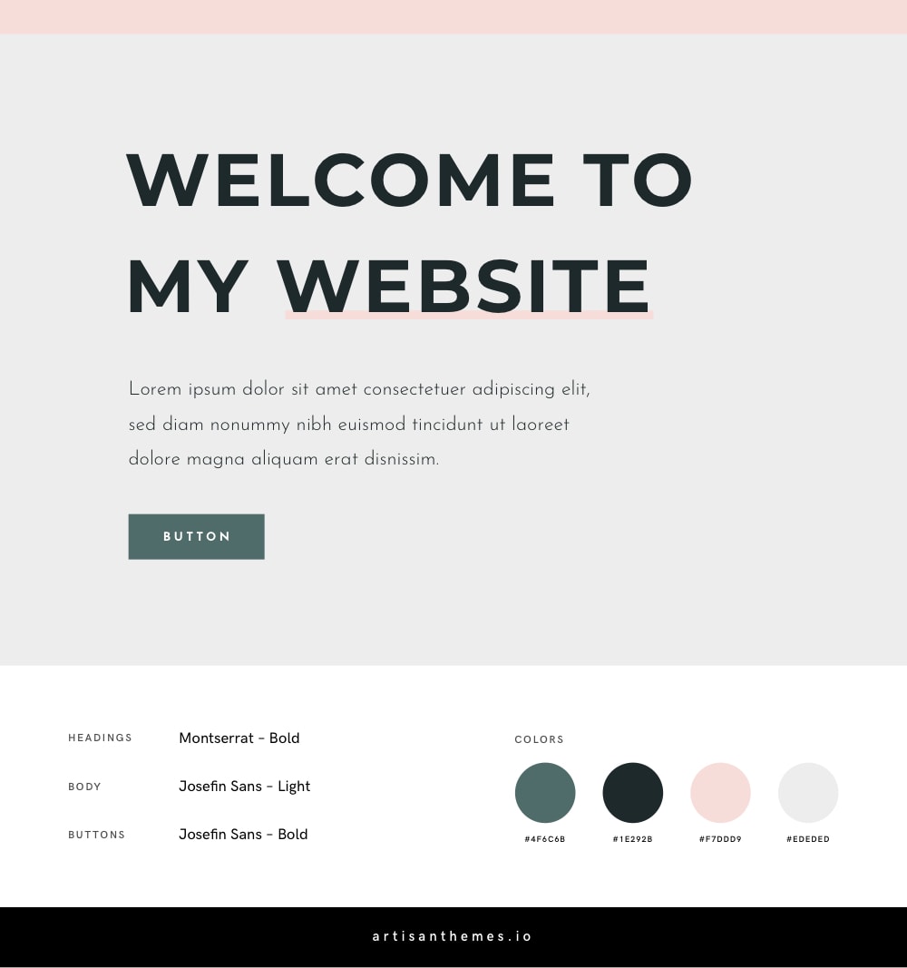
Montserrat may be one of the most gorgeous and versatile typefaces in the Google Fonts collection. According to which weight you use, or if in all caps or lowercase, you’ll get totally different results.
Together with the refined Josefin Sans and a very trendy color palette, you get a this combination to use if you want to achieve a contemporary and cool feminine website.
Fonts
Embed code:
<link href="https://fonts.googleapis.com/css?family=Josefin+Sans:300,700|Montserrat:700" rel="stylesheet">
CSS code:
body {
    font-family: 'Josefin Sans', sans-serif;
    font-weight: 300;
}

h1, h2, h3, h4, h5, h6 {
    font-family: 'Montserrat', sans-serif;
    font-weight: 700;
    text-transform: uppercase;
}

.button {
    font-family: 'Josefin Sans', sans-serif;
    font-weight: 700;
    font-size: 13px;
    text-transform: uppercase;
    letter-spacing: 3px;
}
Color Codes
#4F6C6B#1E292B#F7DDD9#EDEDED
11. Libre Baskerville + Work Sans
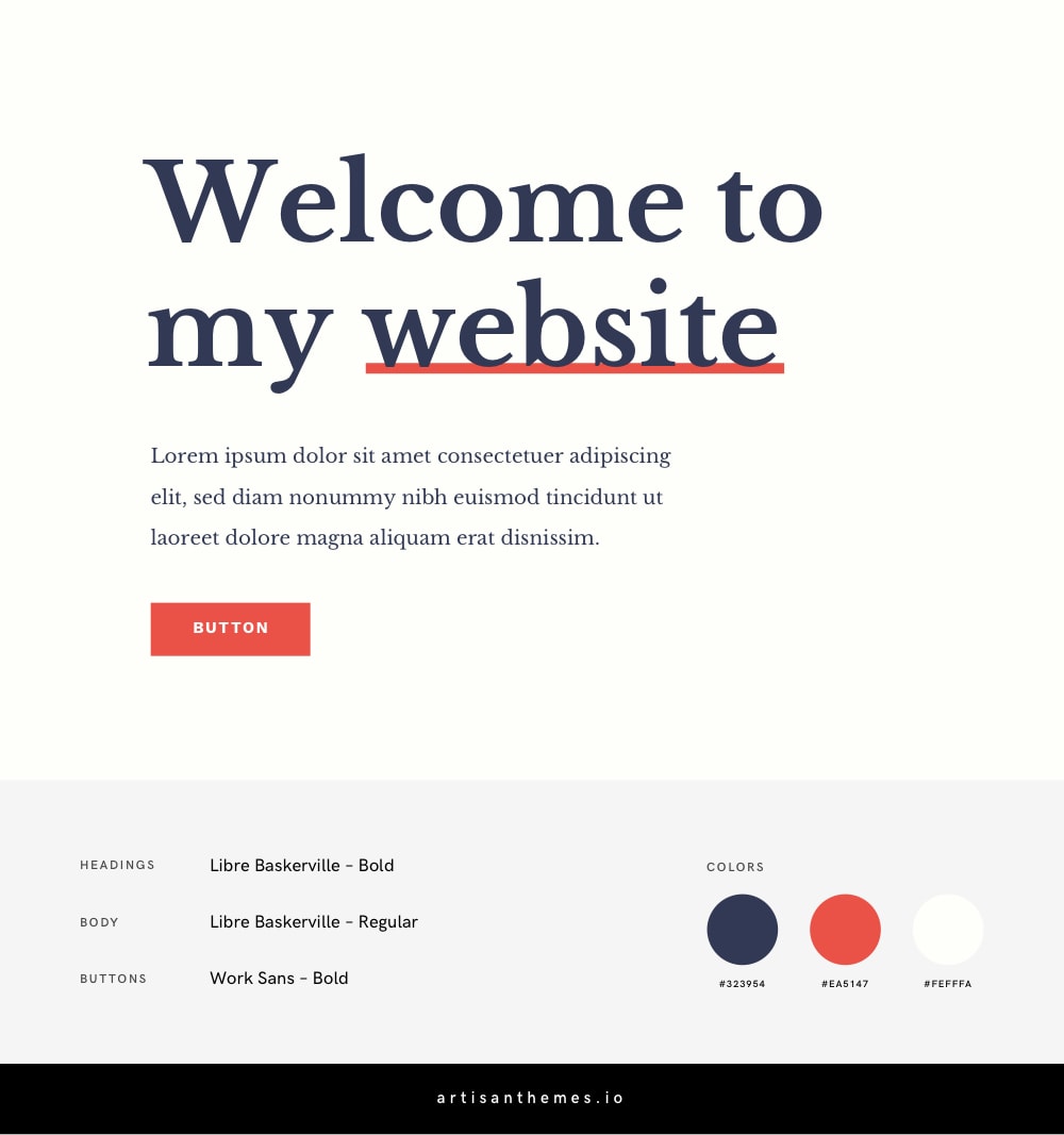
Libre Baskerville is a beautiful serif typeface that can serve both headings and body text. In this case, by using the bold weight for the headings and the regular one for the body, we get a harmonious and solid combination.
Then Work Sans comes in handy for the buttons. And the color palette gives the final touch for a classic, confident look and feel.
Fonts
Embed code:
<link href="https://fonts.googleapis.com/css?family=Libre+Baskerville:400,700|Work+Sans:700" rel="stylesheet">
CSS code:
body {
    font-family: 'Libre Baskerville', serif;
    font-weight: 400;
}

h1, h2, h3, h4, h5, h6 {
    font-family: 'Libre Baskerville', serif;
    font-weight: 700;
}

.button {
    font-family: 'Work Sans', sans-serif;
    font-weight: 700;
    font-size: 13px;
    text-transform: uppercase;
    letter-spacing: 3px;
}
Color Codes
#323954#EA5147#FEFFFA
12. Dancing Script + Open Sans
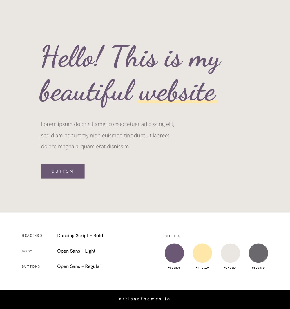
Here’s another combination using a script font. In this case: Dancing Script, a casual font with delicate curves. Open Sans complements it perfectly.
If you prefer a more naive and pretty style or maybe a “spiritual” appearance, then grab this palette with these fonts and you’re done.
It will perfectly fit a website for a spa, a beauty salon, a flower shop or anything in that tone.
Fonts
Embed code:
<link href="https://fonts.googleapis.com/css?family=Dancing+Script:700|Open+Sans:300,400" rel="stylesheet">
CSS code:
body {
    font-family: 'Open Sans', sans-serif;
    font-weight: 300;
}

h1, h2, h3, h4, h5, h6 {
    font-family: 'Dancing Script', cursive;
    font-weight: 700;
}

.button {
    font-family: 'Open Sans', sans-serif;
    font-weight: 400;
    font-size: 13px;
    text-transform: uppercase;
    letter-spacing: 3px;
}
Color Codes
#6B5875#FFE6A9#EAE6E1#6B686D
13. Karla + Zilla Slab
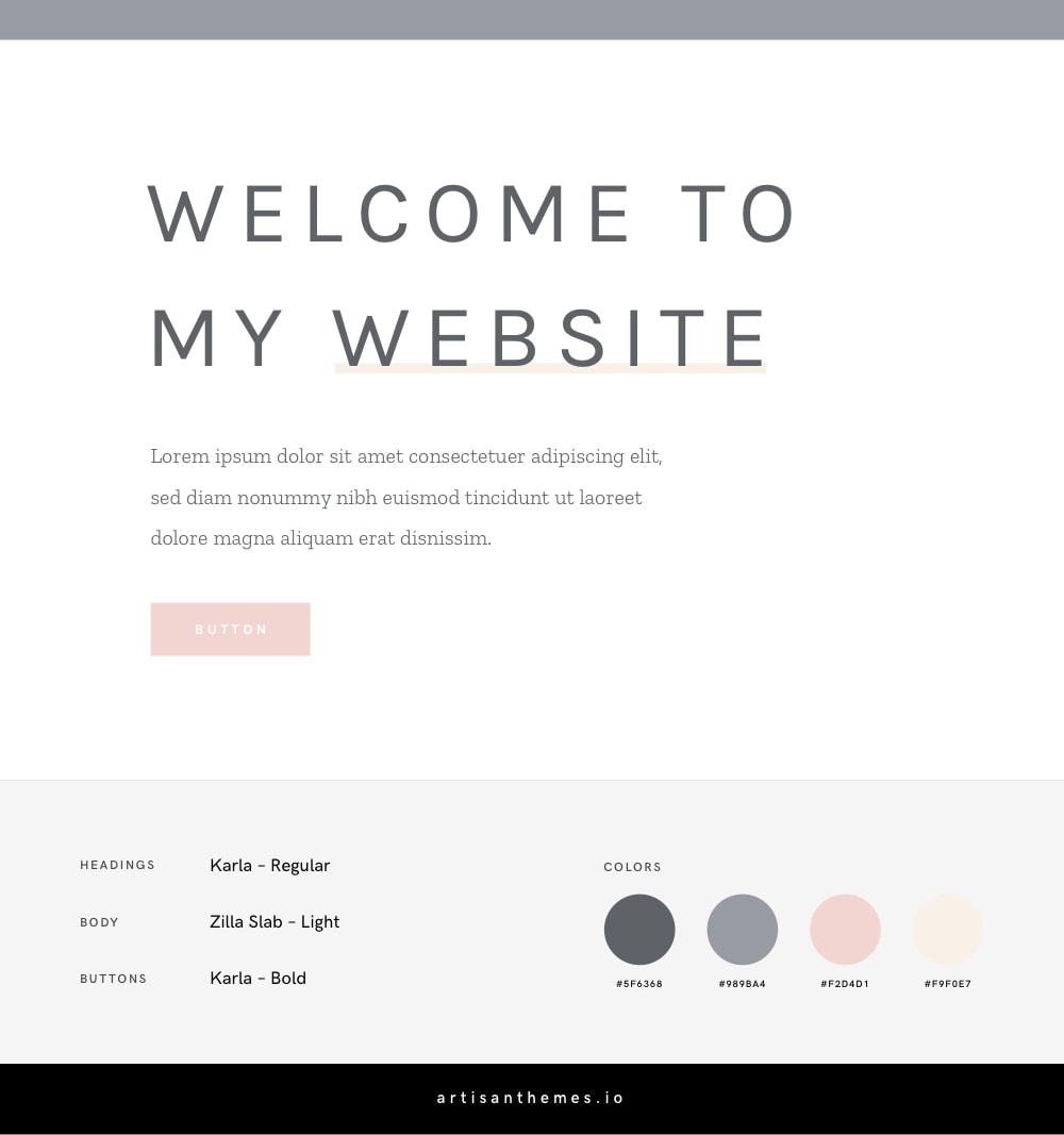
Karla is something special. One of the most beautiful and cool sans serif typefaces you’ll find in Google Fonts. This time used in all caps and with a slight letter spacing.
Put it together with Zilla Slab’s smooth curves, a soft color palette, and you’ll get this sophisticated style you’re looking for.
Fonts
Embed code:
<link href="https://fonts.googleapis.com/css?family=Karla:400,700|Zilla+Slab:300" rel="stylesheet">
CSS code:
body {
    font-family: 'Zilla Slab', serif;
    font-weight: 300;
}

h1, h2, h3, h4, h5, h6 {
    font-family: 'Karla', sans-serif;
    font-weight: 400;
    text-transform: uppercase;
    letter-spacing: 2px;
}

.button {
    font-family: 'Karla', sans-serif;
    font-weight: 700;
    font-size: 13px;
    text-transform: uppercase;
    letter-spacing: 3px;
}
Color Codes
#5F6368#989BA4#F2D4D1#F9F0E7
* See this font combination in action in this ready-to-use feminine website for a solopreneur.
14. Taviraj + Lato
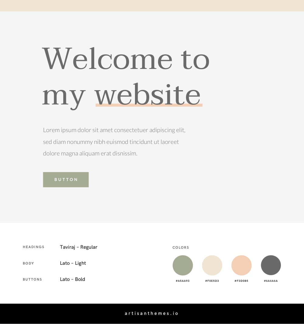
Earth colors and a rounded wide serif font? Be prepared for a warm harmonious website.
Suitable for a brand that cares for wellness, or nature. Or for body-care related businesses.
Fonts
Embed code:
<link href="https://fonts.googleapis.com/css?family=Lato:300,700|Taviraj" rel="stylesheet">
CSS code:
body {
    font-family: 'Lato', sans-serif;
    font-weight: 300;
}

h1, h2, h3, h4, h5, h6 {
    font-family: 'Taviraj', serif;
    font-weight: 400;
}

.button {
    font-family: 'Lato', sans-serif;
    font-weight: 700;
    font-size: 13px;
    text-transform: uppercase;
    letter-spacing: 3px;
}
Color Codes
#A5AA93#F0E5D3#F3D0B5#6A6A6A
15. Cormorant SC + Cormorant Garamond
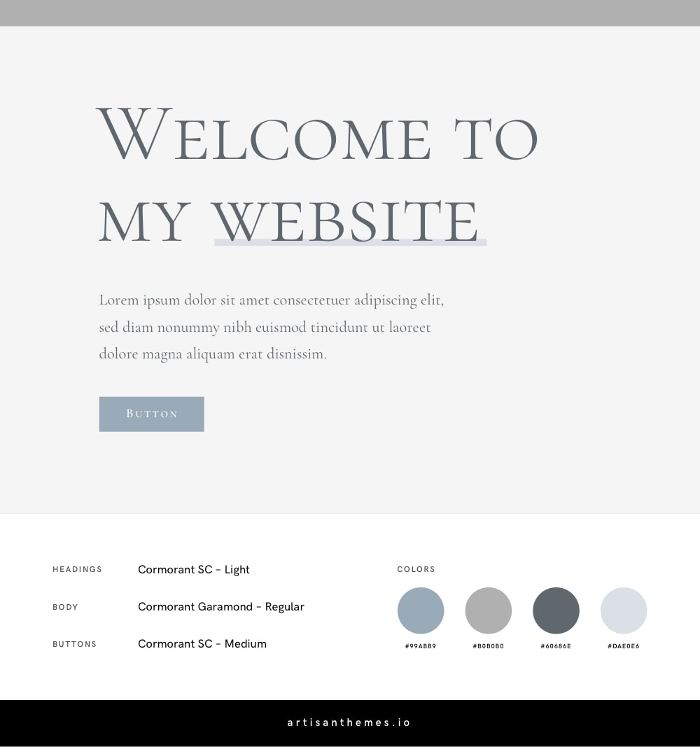
This combination is modest, elegant and classy. Suitable for an institution, a traditional wedding website or an NGO.
It uses the Cormorant family in its different variants and a clean and muted color palette.
* Check this font combo in action on this Artisan Site for a Wedding website.
Fonts
Embed code:
<link href="https://fonts.googleapis.com/css?family=Cormorant+Garamond|Cormorant+SC:300,500" rel="stylesheet">
CSS code:
body {
    font-family: 'Cormorant Garamond', serif;
    font-weight: 400;
}

h1, h2, h3, h4, h5, h6 {
    font-family: 'Cormorant SC', serif;
    font-weight: 300;
}

.button {
    font-family: 'Cormorant SC', serif;
    font-weight: 500;
    font-size: 13px;
    text-transform: uppercase;
    letter-spacing: 1px;
}
Color Codes
#99ABB9#B0B0B0#60686E#DAE0E6
16. Josefin Sans + Montserrat
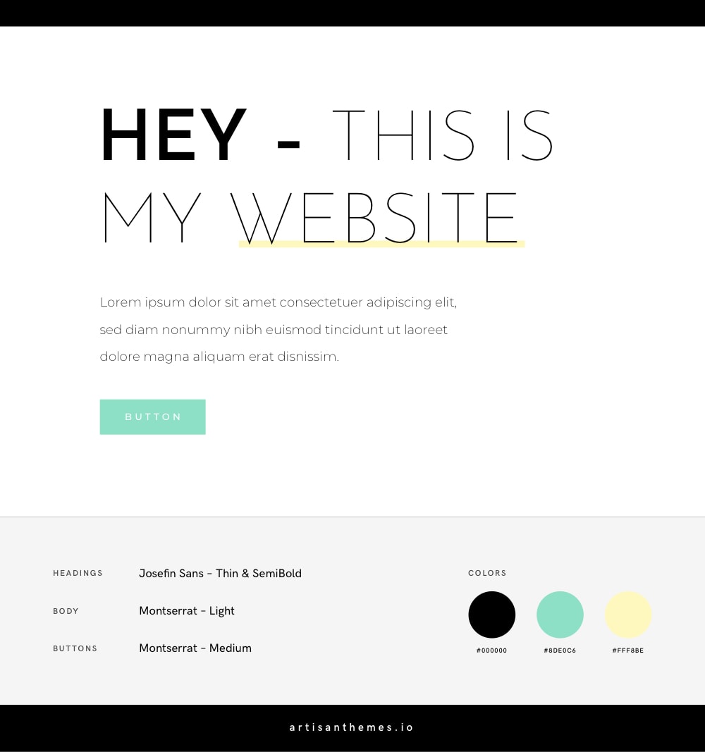
I like the vibes from this combination. It’s fresh, youthful and bright.
We already combined Josefin Sans and Montserrat, remember? But this time, by alternating their roles, using different weights and adding different colors, we get a totally different look.
* You can see this font combination in action on this Artisan Site by Artisan Themes: Lifestyle.
Fonts
Embed code:
<link href="https://fonts.googleapis.com/css?family=Josefin+Sans:100,600|Montserrat:300,500" rel="stylesheet">
CSS code:
body {
    font-family: 'Montserrat', sans-serif;
    font-weight: 300;
}

h1, h2, h3, h4, h5, h6 {
    font-family: 'Josefin Sans', sans-serif;
    font-weight: 100;
}

.button {
    font-family: 'Montserrat', sans-serif;
    font-weight: 500;
    font-size: 13px;
    text-transform: uppercase;
    letter-spacing: 3px;
}
Color Codes
#000000#8DE0C6#FFF8BE
17. Poppins + Work Sans
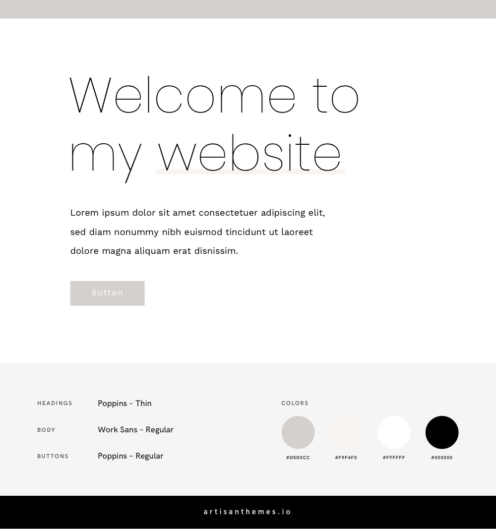
Neutral colors with clean, geometric and refined typefaces. They make an elegant, neat and exquisite combination for a high-end business.
* See this combination in action on this Artisan Site by Artisan Themes: Deco.
Fonts
Embed code:
<link href="https://fonts.googleapis.com/css?family=Karla:Poppins:100,400|Work+Sans" rel="stylesheet">
CSS code:
body {
    font-family: 'Work Sans', sans-serif;
    font-weight: 400;
}

h1, h2, h3, h4, h5, h6 {
    font-family: 'Poppins', sans-serif;
    font-weight: 100;
}

.button {
    font-family: 'Poppins', sans-serif;
    font-weight: 400;
    font-size: 15px;
    letter-spacing: 1px;
}
Color Codes
#D5D0CC#F9F4F0#FFFFFF#000000
18. Archivo + PT Serif
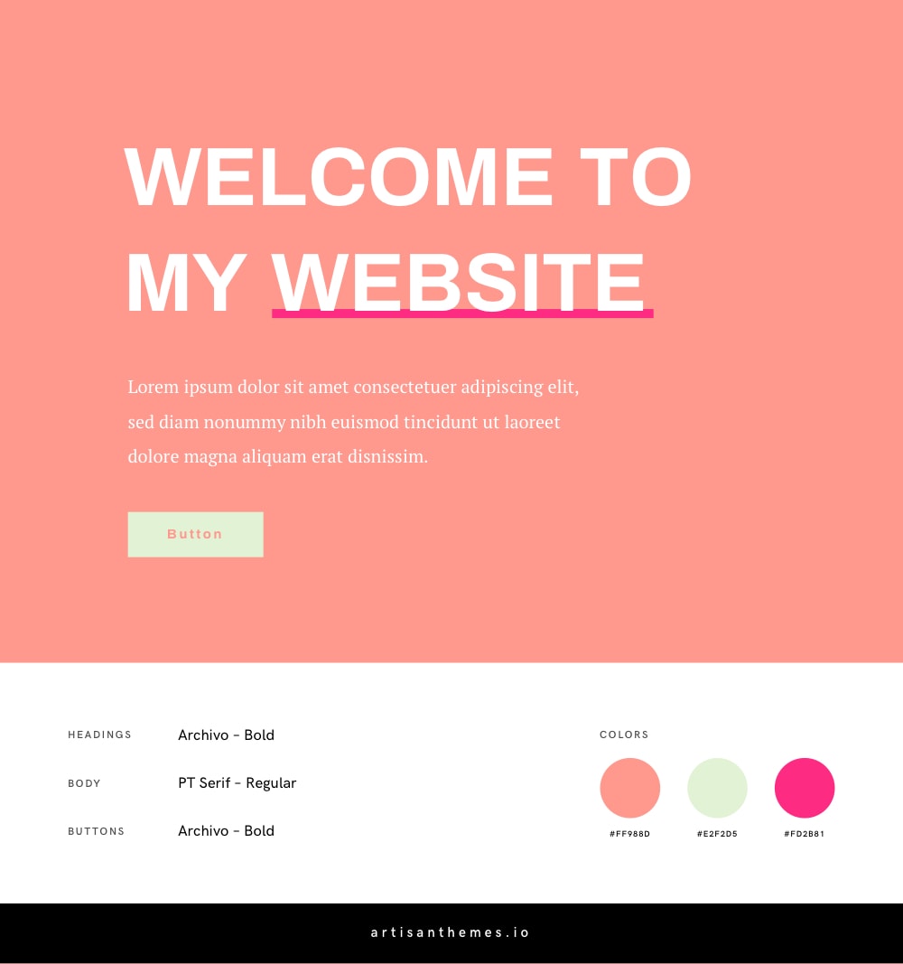
This final combination is like candy: attractive, joyful, positive, energetic.
The boldness of Archivo with the classical PT Serif will make your website look creative and vivid. Use it for your blog or personal site and you’ll make your visitors smile.
* Take a look at the color palette in action on this Artisan Site by Artisan Themes: Foodie.
Fonts
Embed code:
<link href="https://fonts.googleapis.com/css?family=Archivo:700|PT+Serif" rel="stylesheet">
CSS code:
body {
    font-family: 'PT Serif', serif;
    font-weight: 400;
}

h1, h2, h3, h4, h5, h6 {
    font-family: 'Archivo', sans-serif;
    font-weight: 700;
}

.button {
    font-family: 'Archivo', sans-serif;
    font-weight: 700;
    font-size: 15px;
    letter-spacing: 1px;
}
Color Codes
#FF988D#E2F2D5#FD2B81
Found one you like?
I hope so! And I’d love to see how you applied it on your website.
Share your link in the comments or tell me if you struggle with putting these fonts and colors in use and I’ll try to help :slightly_smiling_face:
If you want to see even more combinations, take a look at this post. You’ll find there 10 ready to use Google Fonts combinations for modern websites.
A very good list. Thank you for your work. Just made some quick choices because of this page.
Thank you, SO very much for your hard work!!
This is massively helpful! Thank you so much! When you start looking into Google fonts as a non-designer, it’s horrendously hard to figure out what looks good – this article with the examples is brilliant.
Love the combinations! Seeing them with the colors was also very helpful 🙂
Amazing stuff with the combinations. Continue the good work!
Exeletentes convinaciones, muchas gracias
Allow me to be the first guy to thank you. I’m making a website for my girlfriend’s business and I was just so lost when she told me that the fonts should be more feminine.
This article is of ridiculous quality, super thank you for your hard work on it.
R
I’m with you Rafal, I was designing my wife’s website just now and thought, being a designer of many years, let me check what can fit specific for a female. Both fonts and colors. Spot on! Well done Mai!
Thank you, Dayo 🙂
Another guy here adding his kudos to Mai’s exceptional font pairings and color palettes. I have a lot of female clients whose audiences are women, and I’ve enjoyed choosing colors and fonts for their branding. This is even more inspiration, and very classy at that.
Thanks Chaz 🙂 Glad you find this useful!
Thank you for this article, it is very helpful and very well put together. A great read and a massive help, thank you!
this is something I struggle with daily. your site helped me find my makeup artist client’s new typography set in a matter of minutes. thank you!
This is truly a gem. Thanks so much for all of your hard work.
Very helpful blog especially for newbies like me. Thank you so much for these.
Thank you so much! Very interesting association of colors and fonts!
Very nice and inspiring even I don’t use Google fonts anymore. 🙂
Beautiful and super helpful. Thank you so very much
Thank you so much, very good set of typefaces. Do you have for 2025? updated version?