The thing with choosing fonts…
If you’re building a website and you’re not precisely a designer, you’ll find yourself facing a big challenge when it comes to choosing the right fonts for it.
It’s definitely not an easy task. Not even for those who work in design.
There’s so many to choose from. Where to start? How can you be sure you’re choosing the right one? How to combine two fonts?
Well, those are questions that you’ll be able to answer with time, gaining experience and learning about typography, if you’d like.
But there’s a shortcut. You can also rely on inspiring yourself by other designers’ combinations.
I prepared for you 10 fail-proof combinations that work.
Reliable combinations
These are thought for websites with a modern approach, or that are looking to go through a brand renewal.
All the combinations use Google fonts. And they showcase one typeface for the headings (marked as H) and another one for the body (marked as B).
There’re no weird or too-fanny fonts in here, which can quickly make your design look unprofessional.
All of them are solid and trustable typefaces with proper legibility. And the combinations are meant to create balance so your website looks modern and polished.
Exclusive Bonus: Download the 7 Ways Guide to Make Your Website Look Professional. And improve your site’s credibility!
How to use these combinations
→ If you’re using one of our WordPress themes, then all you need to do is go to Theme Options » Typography in your WordPress Dashboard.
You’ll find a dropdown menu for the Headings and another one for the Body font. That menu offers you all available fonts from Google, so just choose the one you need and click Save.
→ If you’re not using one of our themes or if you’re coding yourself a website, there’re two steps you need to follow:
Step 1: Embed the fonts into your website by adding the embed code as the first element in the < head > of your HTML document.
Step 2: Declare the fonts that will be used for body and headings in your styles.css file.
You’ll find both the embed code and the CSS code below each combination, so you can copy-paste them to your files.
Just one more thing before we begin
I created 10 font combinations that are suitable for any kind of modern website. I tried to cover several styles so you find the one that matches your brand.
But then I thought, why don’t I offer you one more piece of inspiration together with the font combination?
So I added a color palette to each one of them, for you to not only grab the fonts you should use but also the colors that go nicely with them.
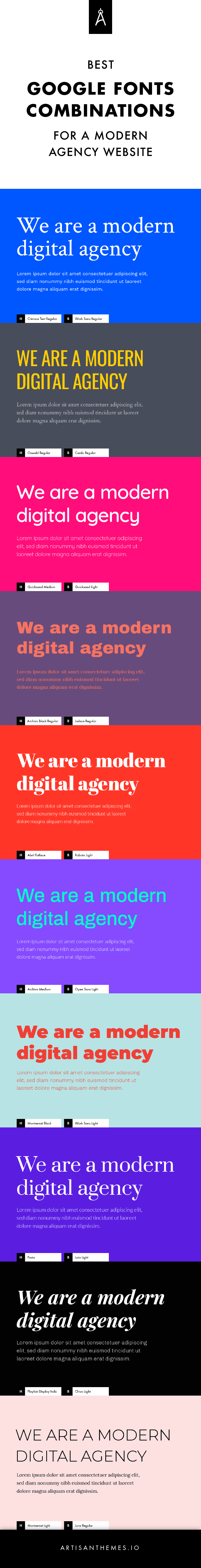
10 ready to use Google Fonts combinations for modern websites
1. Crimson Text + Work Sans
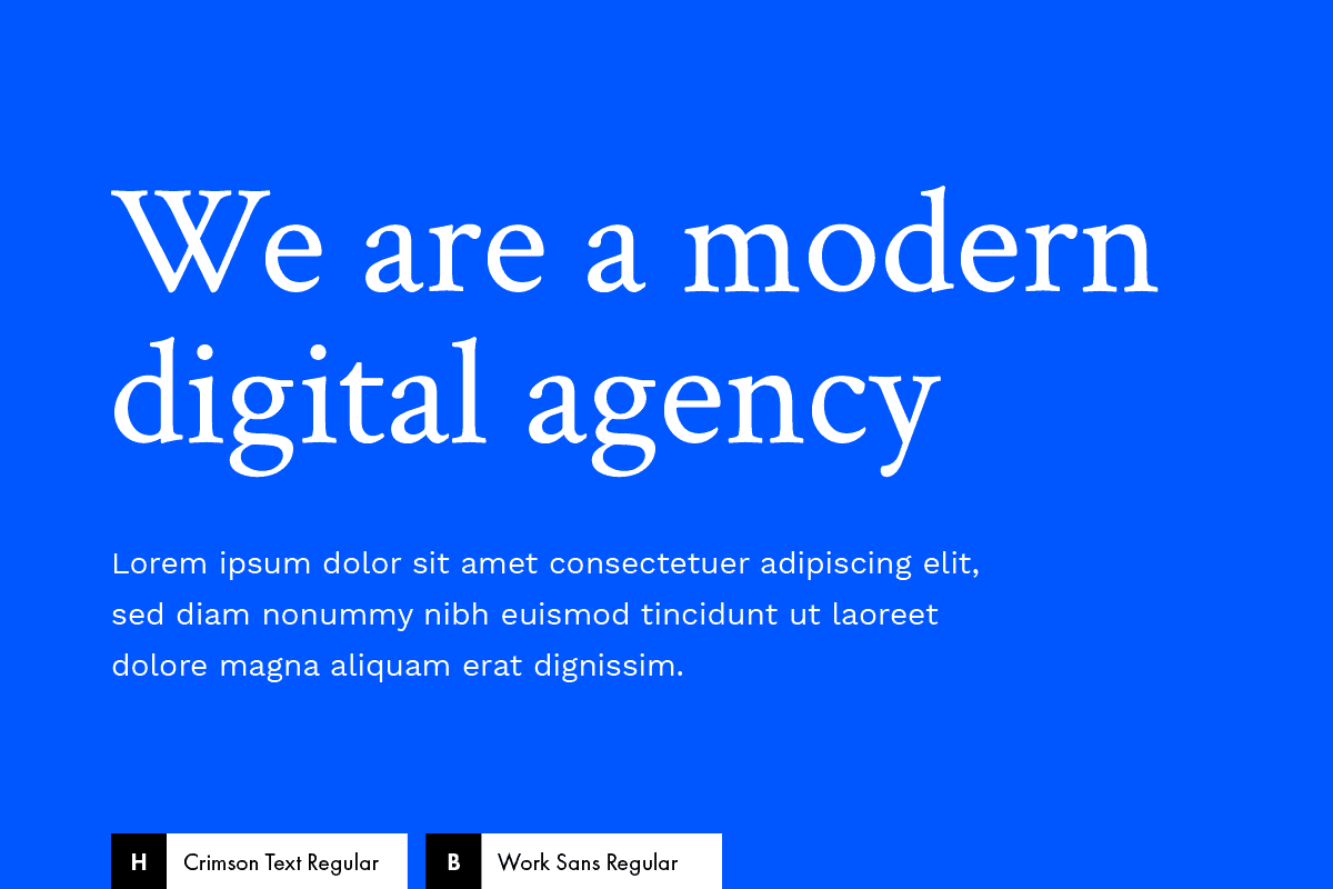
If you’re looking for a high-end kind of style, a look that will make your website appear both prestigious and contemporary, this is the combo for you.
Crimson Text –a serif font inspired by old-style typefaces– for the headings, combined with Work Sans –a modern, kind of grotesque sans-serif– for the body, make a solid combination of tradition + modernity.
* See this combination of fonts and colors in action on this Ready Made Site by Artisan Themes: Blue Agency.
Fonts
Embed code:
<link href="https://fonts.googleapis.com/css?family=Crimson+Text|Work+Sans:400,700" rel="stylesheet">
CSS code:
body {
 font-family: 'Work Sans', sans-serif;
}

h1, h2, h3, h4, h5, h6 {
 font-family: 'Crimson Text', serif;
}
Colors
Background color: #0057ff
Text color: #ffffff
2. Oswald + Cardo
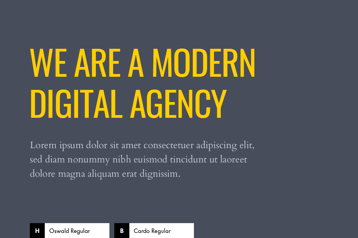
A high contrast combination that will impact your site’s visitors for sure.
That’s Oswald + Cardo. A condensed sans-serif in all caps for the headings and a classically styled serif for the body.
Fonts
Embed code:
<link href="https://fonts.googleapis.com/css?family=Cardo:400,700|Oswald" rel="stylesheet">
CSS code:
body {
 font-family: 'Cardo', serif;
}

h1, h2, h3, h4, h5, h6 {
 font-family: 'Oswald', sans-serif;
 text-transform: uppercase;
}
Colors
Background color: #484d5c
Headline color: #ffce00
Body color: #c0ccd4
3. Quicksand (Medium + Light)
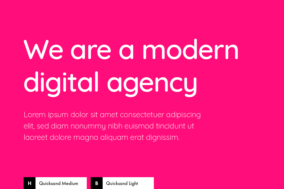
Sometimes one font is enough to make your design stand. This is one of those times.
Grab Quicksand in two different weights, Medium for the headings and Light for the body, and your website’s typography is done.
Quicksand is a geometric display sans-serif with rounded terminals, which makes it a friendly and pleasant type.
Use it with bright colors and you’ll get this modern sharp look.
Fonts
Embed code:
<link href="https://fonts.googleapis.com/css?family=Quicksand:300,500" rel="stylesheet">
CSS code:
body {
 font-family: 'Quicksand', sans-serif;
 font-weight: 300;
}

h1, h2, h3, h4, h5, h6 {
 font-weight: 500;
}
Colors
Background color: #ff0d7b
Text color: #ffffff
4. Archivo Black + Judson
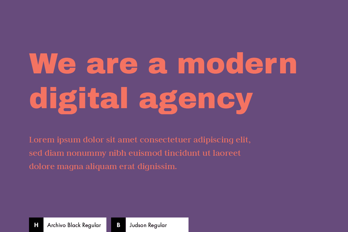
Robust, bold with a touch of elegance. Meet: Archivo Black + Judson.
A heavy sans-serif for headlines, with a more delicate serif font for the body.
Fonts
Embed code:
<link href="https://fonts.googleapis.com/css?family=Archivo+Black|Judson:400,700" rel="stylesheet">
CSS code:
body {
 font-family: 'Judson', serif;
}

h1, h2, h3, h4, h5, h6 {
 font-family: 'Archivo Black', sans-serif;
}
Colors
Background color: #674b7c
Text color: #f47362
5. Abril Fatface + Roboto
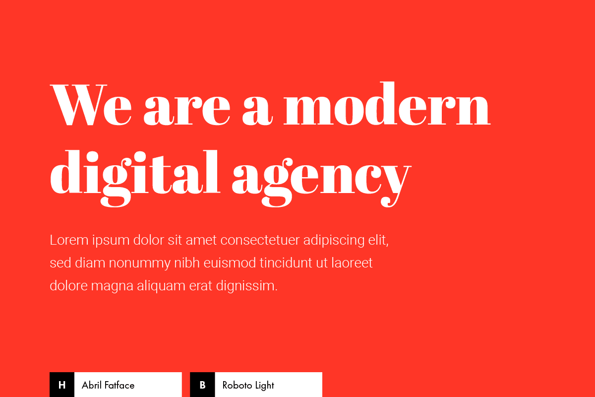
Abril Fatface and Roboto make a fashionable and chic combination.
As said by Abril Fatface’s authors: “The thin serifs and clean curves lend the typeface a refined touch that give any headline an elegant appearance”.
Roboto enters in order to equilibrate Abril’s personality. Achieving a stylish and modern balance.
Fonts
Embed code:
<link href="https://fonts.googleapis.com/css?family=Abril+Fatface|Roboto:300,700" rel="stylesheet">
CSS code:
body {
 font-family: 'Roboto', sans-serif;
 font-weight: 300;
}

h1, h2, h3, h4, h5, h6 {
 font-family: 'Abril Fatface', serif;
}
Colors
Background color: #ff3627
Text color: #ffffff
6. Archivo + Open Sans
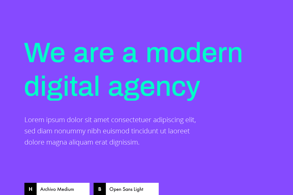
Vivid, bright, shiny. A font combination for youthful and cheerful brands.
Use Archivo (weight 500) for the headings, Open Sans (weight 300) for the body, and ta-da…! You’re ready to go.
Fonts
Embed code:
<link href="https://fonts.googleapis.com/css?family=Archivo:500|Open+Sans:300,700" rel="stylesheet">
CSS code:
body {
 font-family: 'Open Sans', sans-serif;
 font-weight: 300;
}

h1, h2, h3, h4, h5, h6 {
 font-family: 'Archivo', sans-serif;
 font-weight: 500;
}
Colors
Background color: #864aff
Headline color: #00fdcb
Body color: #ffffff
7. Montserrat + Work Sans
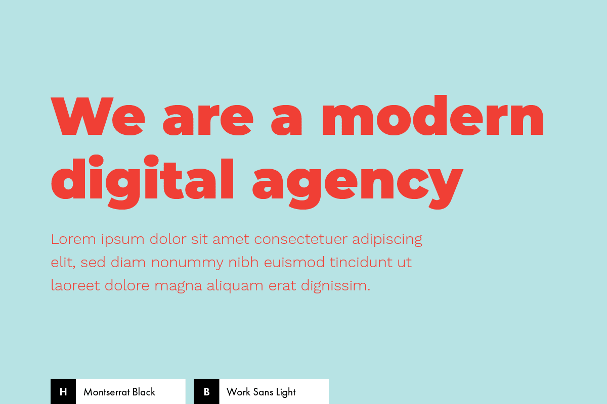
Bold, bold, bold, geometric, bold… and friendly. If that’s what you’re after, then try this combination.
I don’t have to say much about Montserrat, one of the most beautiful and solid typefaces in the Google Fonts collection.
It’s perfect for modern websites, and you’ll see it adapts itself to many different personalities.
Here we have it on its strongest and thicker side, but it can also serve chic and more delicate styles as well (spoiler alert: combination number 9).
Combine it with Work Sans (light version), a font that I’ve been personally falling in love with for the last months, and you’ll have nothing to worry about. Like, in life. That powerful they are.
Fonts
Embed code:
<link href="https://fonts.googleapis.com/css?family=Montserrat:900|Work+Sans:300" rel="stylesheet">
CSS code:
body {
 font-family: 'Work Sans', sans-serif;
 font-weight: 300;
}

h1, h2, h3, h4, h5, h6 {
 font-family: 'Montserrat', sans-serif;
 font-weight: 900;
}
Colors
Background color: #b7e3e4
Text color: #f03f35
8. Prata + Lato
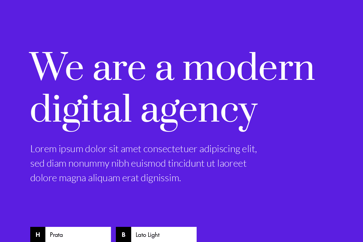
I can’t hide my love for Prata. It’s an elegant serif typeface with refined curves and strong serifs, which make headlines neat and attractive.
Together with Lato as body font, this blend delivers an audacious but also elegant and minimal style for any website.
* See this combination in action on this free WordPress theme called Pepper.
Fonts
Embed code:
<link href="https://fonts.googleapis.com/css?family=Lato:300,700|Prata" rel="stylesheet">
CSS code:
body {
 font-family: 'Lato', sans-serif;
 font-weight: 300;
}

h1, h2, h3, h4, h5, h6 {
 font-family: 'Prata', serif;
}
Colors
Background color: #5b1ee1
Text color: #ffffff
9. Montserrat + Lora
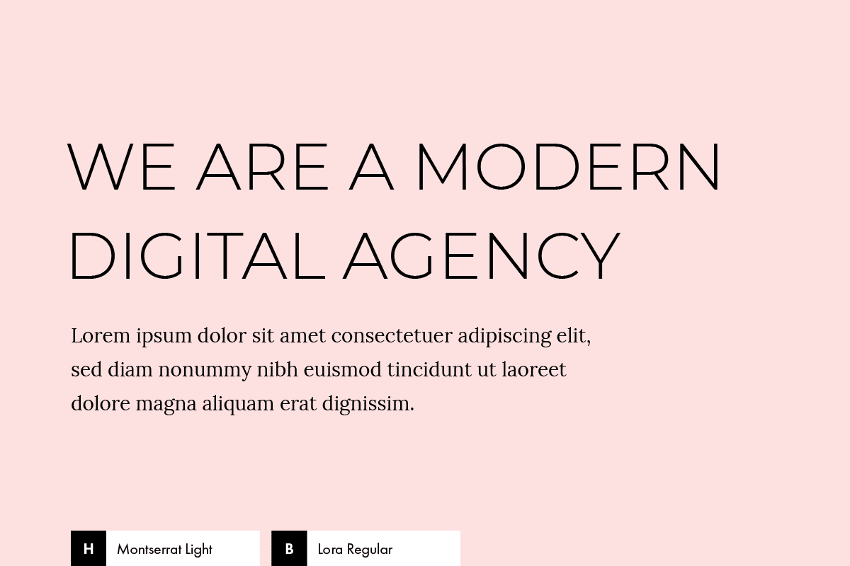
Remember I said Montserrat could serve many different styles and purposes? Here’s the proof.
This combination uses it in all caps and with a light weight, turning your headlines into both delicate and trendy.
Combine it with a clean serif like Lora and a pink or a rose gold palette, and bum, you have a feminine styled website for a solopreneur or a modern brand run by a woman.
Fonts
Embed code:
<link href="https://fonts.googleapis.com/css?family=Lora:400,700|Montserrat:300" rel="stylesheet">
CSS code:
body {
 font-family: 'Lora', serif;
}

h1, h2, h3, h4, h5, h6 {
 font-family: 'Montserrat', sans-serif;
 font-weight: 300;
 text-transform: uppercase;
}
Colors
Background color: #fce1e0
Text color: #000000
10. Playfair Display + Chivo
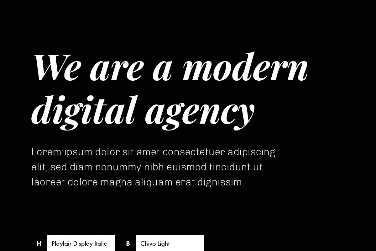
Luxurious and trendy. That’s the status you can achieve with this combination.
The headings are dressed with Playfair Display, one of the most beautiful serifs from Google Fonts. Use it in italics and your website will look premium and exclusive.
Chivo’s elegance and fine strokes, used in Light, makes it ideal for combining with the strong features of Playfair Display.
What are you waiting to try it out?
Fonts
Embed code:
<link href="https://fonts.googleapis.com/css?family=Chivo:300,700|Playfair+Display:700i" rel="stylesheet">
CSS code:
body {
 font-family: 'Chivo', sans-serif;
 font-weight: 300;
}

h1, h2, h3, h4, h5, h6 {
 font-family: 'Playfair Display', serif;
 font-weight: 700;
 font-style: italic;
}
Colors
Background color: #000000
Text color: #ffffff
Hope you find these combinations useful! I’m sure you’ll keep a couple of faves from here at hand.
Looking for more design advice on building your own website? Keep reading here: 11 Essential Tips for Non-Designers Building a Website
Beautifully written, you guys!
Great selection of fonts. I choose Chivo for my next project.
I found this error in your write-up: These are thought for agencies “o” businesses with a modern approach, or that are looking to go through a brand renewal.
——
Take a look at the “O”.
Cheers.
Hi! Glad you found it useful.
And thanks for the heads up, we’ve fixed it 🙂
The Playfair Display + Chivo nailed it! Beautiful. And the color palettes are just wonderful.
I was already considering PD but wasn’t sure about using it for content.
Thank you so much for this article, beautiful.
Glad you found your combination 🙂 I’d love to see what you’re creating with it.
Thanks for commenting, Manuel!
I will be honored if you do give it a look!
http://manuela.sgedu.site/ivana/
It is a fashion blog for a friend of mine with awesome style. However, it has been a slow process, we are not in a hurry, and since i’m just getting used to WordPress and Divi, it has served me as a learning experience.
Also, i’m pretty much getting a bit of here and there from different fashion blogs that i find that matches the aesthetic we are aiming to achieve.
I apologize if you see something weird with the site, right now i’m working on the navigation menu for mobile screen sizes! Actually, i made simply copy and create a new provisional homepage 🙂
Thank you and appreciate any feedback!
Hey Manuel,
I think the font combination looks awesome on your site 🙂 Good choice!
You’re on the right path, looking for inspiration and seeing how others do what you’re trying to do, is the best way to go when you’re starting.
Thanks for sharing it with me!
P.S. Just a quick thought: I noticed that when you navigate to a post, there’s no way to keep browsing the site (the header nav disappears, there’s no “related posts” or anything like that). I assume that’s because you’re still working on it, but I thought it was worth mentioning it.
Thanks! This helped me with an upcoming project!
So great to read that, Anna! You’re welcome. And share your project when it’s done 🙂
Wow! I love quicksand combo! Thank you, it really helped me!
So happy to read that, Lilly 🙂 You’re welcome!
Thanks so much for taking the time to put this together. I’ve referenced this article so many times when creating font combos.
Please send me a link to any others you do!
Love your work, you are a very talented designer, especially the archive and open sans light combination. The fonts and the tones are sublime!
Hey, I loved this. Please add more, I’m eagerly waiting for more according to the most popular design trends in 2020.
Very helpful article, thank you.
Great ideas to put together here and even as I type this comment I just love the font it is in. Clean and nice. I was thankful for this site as I struggled to find the right complementary pair of fonts for headlines and content. Thank you
Great Pairings! May I know the font you use for this website? 🙂
thanks for great posy I like those combinations if fonts
Montserrat + Lora will be ideal for my personal website, many thanks
Thank you! Grateful.
This is so helpful! Thanks 🙂
Thank you so much!
Great selection of fonts. For our website, I am thinking about Roboto for both heading and body, but I was wondering what font I use for our social media images. So far, I like ubuntu and open sans while testing out Roboto and pt sans. Any suggestions?
This is one of the best selections I have found on the internet. Thank you!
Thank you, Ali!
Very helpful article, thank you. Playfair Display + Chivo will be ideal for my personal website, many thanks!
As I eventually used your amazing suggestions I just wanted to say thank you .. The idea to use Playfair Display italic is awesome .. never considered italic for my headings. But it looks really good and so I also went for Chivo as it just fits 🙂