We believe our themes are so easy to use that you can build lots of different sites even barely having any web design experience. Pepper, our free and newest theme, is no exception to that. In this posts series I’ll take you to the backstage of building Pepper’s demo pages so you can get the most out of your new theme.
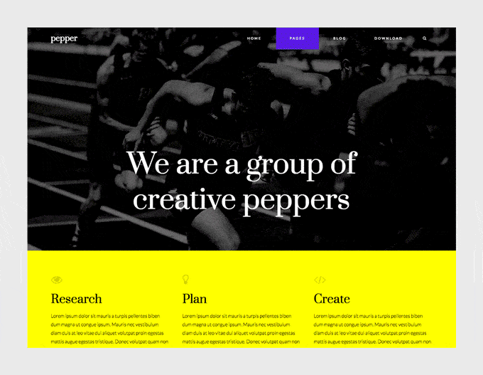
Remember the previous about page we built? Well, here’s another example for a cool about page. This time, one with a lot of character and high contrast that can serve any kind of business or organization.
This is the page we’re going to build today.
So how we built it?
The first thing you’ll need to do is to create a new modular page. The page where we’ll be adding our modules. For that:
1. Go to Pages » Add New, and insert a page title.
2. Select “Modular Page” as the Template.
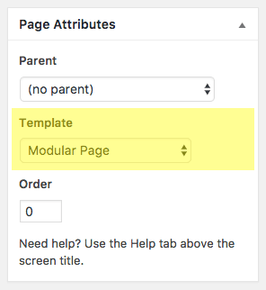
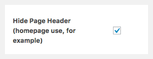
3. Check “Hide Page Header” option (we don’t want to show the title of this page).
4. Click Publish.
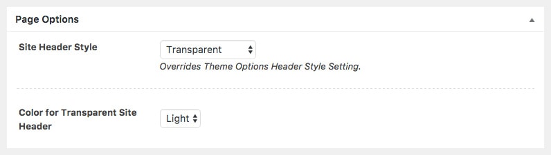
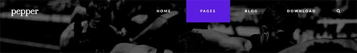
Transparent Header
We want this particular page to have a transparent header. This means that the site’s header will no longer have a background color, and the first module will place itself behind it. So that the header elements (logo and navigation) lay above the background of the first module on the page.
To do that, scroll to the Page Options section in that page and choose Transparent as the Site Header Style, and Light for the Color setting.
Update this page.
The result will look like this:
Tip: use Light when the header will lay on top of a dark background, and Dark when the first module will have a dark background.
Now it’s time to add some modules to this page.
How to create a new module?
To create a new module simply go to Modules » Add New on the left menu of your WordPress dashboard. Once the new module is created, insert a title and select the type of module you’re going to use (Blog, Canvas, Gallery, Slogan, Modules Columns or Modules Wrapper).
Let’s go over each module for this page now.
1st module: Slogan
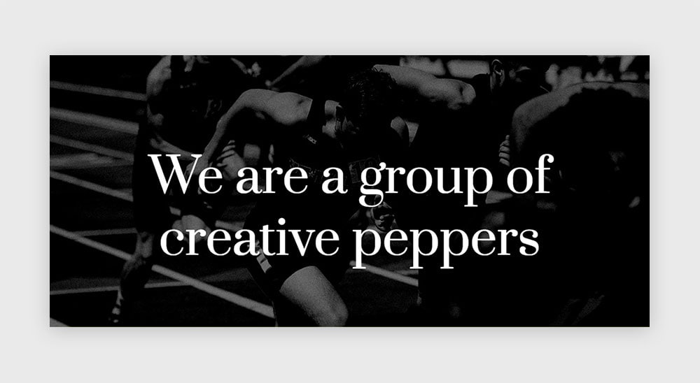
This is an about page, so let’s start with a module that will help you introduce yourself as quickly and clear as possible. A Slogan module comes handy for that. Create a new one and insert your introduction text in the text editor.
In this case we’re using a Heading 1, so we get a nice and bold headline, and coloring the whole text with white.
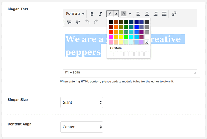
The chosen options for this module are:
– Slogan Size: Giant (means it’ll fill the entire height of the screen -with a minimum and a maximum height-)
– Content Align: Center
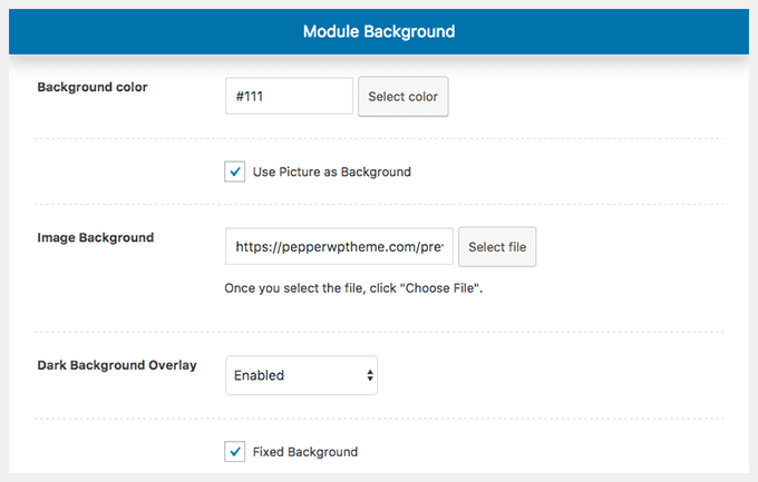
Now, let’s talk about the background. We downloaded a really nice picture from Unsplash by Braden Collum, made some tweaks to it and used it as the background for this first module and the last one on this page. The picture will help us give a strong impression and achieving a high contrast within this section and the next to follow which uses a bright yellow.
Once you have your winning picture, go to the Background section in the Module Style tab and set your background with the following settings:
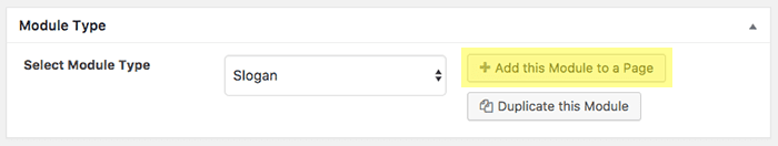
First module finished. Let’s publish it, and add it your modular page.
2nd module: 3 Canvas modules inside a Columns module
The Columns module is a super useful module that will let you group other created modules and arrange them according to different layouts. And by doing that it’ll provide you with an incredible power to do almost everything while playing with the grid of your site like a boss.
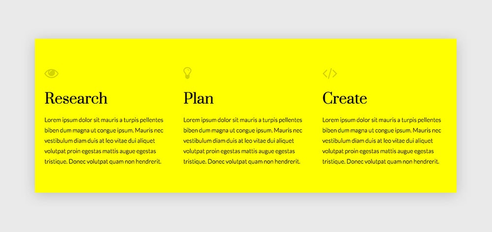
So let’s first create the modules that will go inside the Columns. In this case the three inner modules are simply Canvas modules.
The Canvas modules:
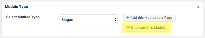
We’ll use these 3 modules to present different services. In this case, they’ll all look the same. So once you create one, you’ll be able to quickly duplicate it by clicking on “Duplicate this module” as many times as you need and just change the copy in the new ones.
Use the Canvas editor on Text mode instead of Visual so you can add a little bit of HTML for the icon above the service title. This is the code we’re using in the first one:
<h1><span style="color: #d4d400"><i class="fa fa-eye"></i></span></h1>
<h1><span style="color: #000000">Research</span></h1>
<span style="color: #000000">Lorem ipsum dolor sit mauris a turpis pellentes biben dum magna ut congue ipsum. Mauris nec vestibulum diam duis at leo vitae dui aliquet volutpat proin egestas mattis augue egestas tristique. Donec volutpat quam non hendrerit.</span>
If you pay attention to that bit of HTML code, the < i > element with the “fa” class on it is what calls for the icon element. You can choose a different icon one for each service if you’d like.
The icon font integrated in Pepper is the great Font Awesome, so you can check their icons out and choose some from the list.
Once you’ve created and published the 3 Canvas modules, we can move on to arrange them inside one wrapping module.
The Columns module:
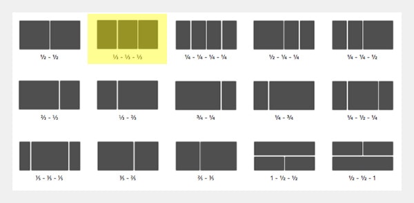
Create a new Columns module and select the second layout with 3 even parts. Insert each previously created Canvas module inside each column.
Let’s now choose a bright yellow background for this section by navigating to the Module Style tab. We’re using #ffff00 in this case.
Publish it. Add it to your modular page.
3rd module: Slogan
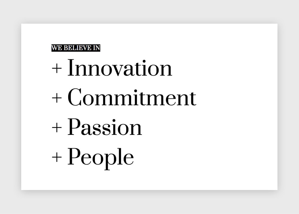
A second Slogan module this evening (don’t worry, we have three more to go). Now to present the brand’s values.
The Slogan Size in this case will be Regular, because we want the module to have an “auto” height. That means it won’t fit the height of the screen (as the Giant size does), but grow together with its inner content. Since we’ll have in this module such a large content with big words, it might be confusing because at the end it could be even taller than the Giant mode. But what it actually means is that it’ll just take the vertical space it needs (can be a small space or a huge space, that’ll depend on the content).
Set the Content Align to Left. And write your text inside the editor.
For the big words we’ll use a Heading 1, and for the smaller title at the beginning a Heading 6. Now, the big words will use a black color, while the Heading 6 will take a white color over a black background. You’ll find the background color tool right next to the color tool in the editor.
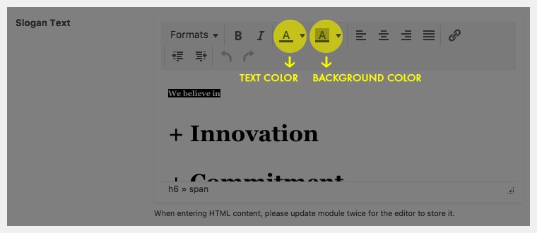
That’s all. Select a white background for the whole module (Module Style tab » Background section) and publish this cute module. Add it to your page.
4th module: Gallery
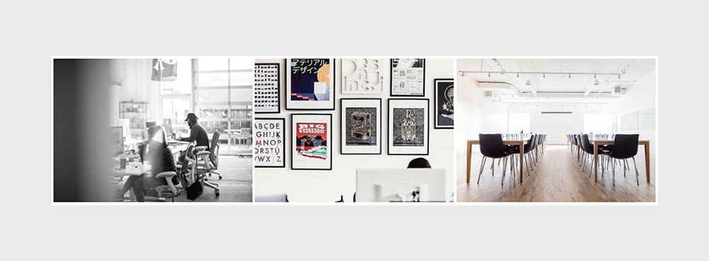
Create a new Gallery module and upload your pictures by clicking on the “Select Gallery” button next to the “Create Gallery” field. Once the Media Library popup is open, click on “Create Gallery” on the left menu. Upload and/or select the images that you’ll include in this gallery, then click on “Create a new gallery”. Review your images (you can add captions to each image), and click on “Insert Gallery“.
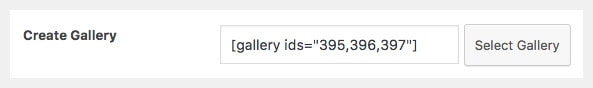
Your gallery shortcode should now be visible inside the “Create Gallery” field.
Choose Perfect Grid as the Gallery Style and select the Layout 3.
If you want to, you can choose the images to open in a lightbox. Remember you need to install the Responsive Lightbox plugin which is integrated with our themes if you’d like that functionality in your galleries.
Choose a white background for the module by navigating to the Module Style tab.
Publish it. Add it to the page.
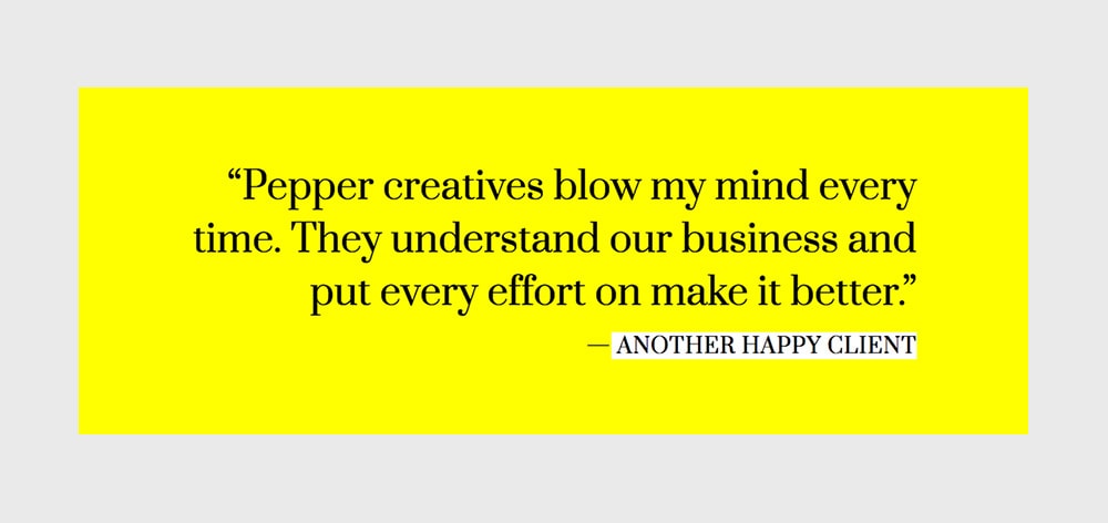
5th module: Slogan (testimonial style!)
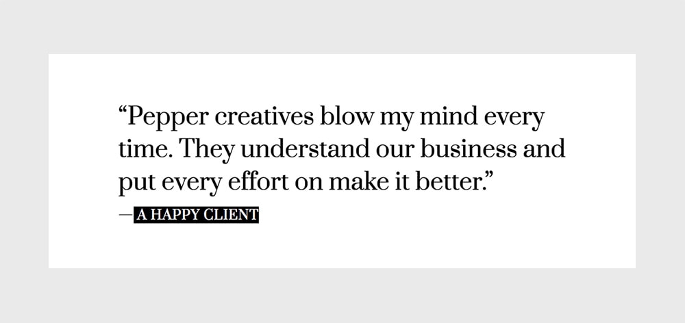
Another Slogan, this time to feature a client testimonial.
Insert the text in the Slogan editor. We’ll use a Heading 4 for the quote and a Heading 6 for the author. The Heading 4 will be colored with black, and the Header 6 with white as the text color and black as the background color. Just like we did with the Heading 6 on the Slogan module before.
Choose Regular as the Slogan Size, and Left for the Content Align option.
Set a white background for the module and you’re ready to go. Publish, add it.
6th module: Slogan (for another testimonial)
This module and the previous one are pretty much the same. So instead of starting from scratch let’s begin by duplicating the previous module.
You can do that right from the list of modules by placing your mouse over the previous module and clicking on “Duplicate”. Or you can click on “Duplicate this module” in that module’s edit page.
Besides the copy changes you’ll make for this new testimonial, these are the style and layout changes we’re going to apply:
– Content Align: Right
– Module Background Color: #ffff00
– Colors for the testimonial’s author: white as background and black as text color.
That’s it. Publish this new module too and place it below the other in your modular page.
7th module: Slogan
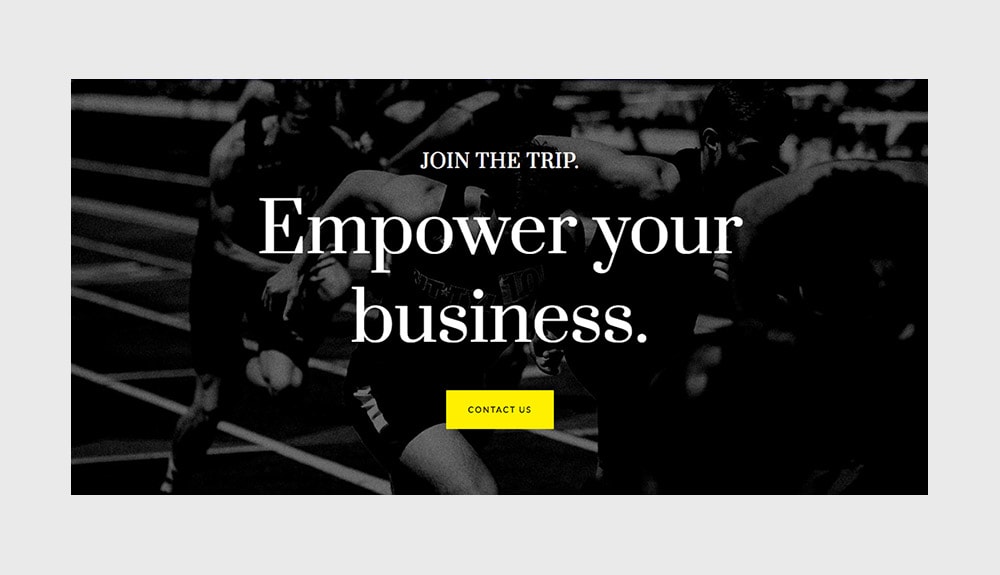
The last Slogan module. And very similar to the first module on this page. We’ll use almost the same settings:
– Slogan Size: Regular
– Content Align: Center
– The same picture as background
– Heading 1 for the big text and Heading 6 for the small title, both white
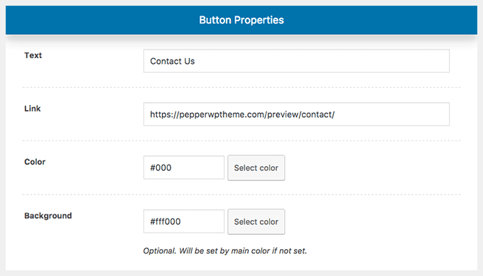
The biggest difference here is that we’ll add a call to action button on this last module. Your visitors just learned about your brand, they read through all this information. Now you want them to do something so they stay with you and you can keep offering value. You can offer them to contact you, or visit your portfolio. You name it. But it should be something there that tells them what to do next.
The Slogan module allows us to add a button after the content. In this case we’ll use it with the following settings:
That’s it. Publish this last module, add it to your modular page and enjoy a cool and creative about page.
So there you go! If you followed every step on this post you should have an amazing about page on your site. And you can play with the colors and the styling too to match your overall design.
Any questions? Let me know in the comments below.
Haven’t you download Pepper theme yet? Please, oh please, download it here and share the word.
Hey I’m so confused. I can’t find SLOGAN as a module option. Just purchased Pepper theme on 2/11/23.
???
Thanks,
Alix
Hi Alix!
The module is called Headline now, it works the same, just a different name. We’ll update it here as well. Thanks!