We believe our themes are so easy to use that you can build lots of different sites even barely having any web design experience. Pepper, our free and newest theme, is no exception to that. In this posts series I’ll take you to the backstage of building Pepper’s demo pages so you can get the most out of your new theme.
Pepper can really be anything. Today, we’re going corporate style. So, if you happen to have a corporate site to build or if you just want to practice your Pepper’s skills and discover how to get the maximum out of it, follow this post.
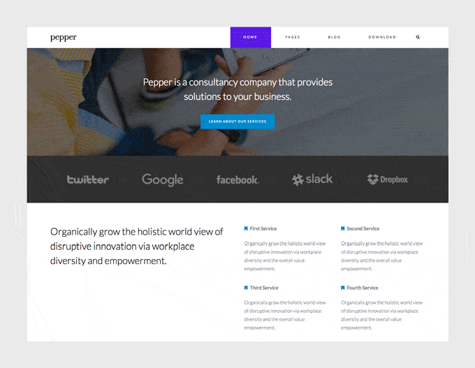
This is the page we’re going to build today.
So how we built it?
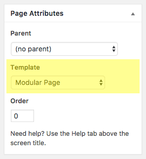
The first thing you’ll need to do is create a new modular page. The page where we’ll be adding our modules. For that:
1. Go to Pages » Add New, and insert a page title.
2. Select “Modular Page” as the Template.
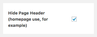
3. Check “Hide Page Header” option (we don’t want to show the title for this page).
4. Click Publish.
Now it’s time to add some modules to this page.
How to create a new module?
To create a new module simply go to Modules » Add New on the left menu of your WordPress dashboard. Once the new module is created, insert a title and select the type of module you’re going to use (Blog, Canvas, Gallery, Slogan, Modules Columns or Modules Wrapper).
Let’s go module by module for this page.
1st module: Slogan
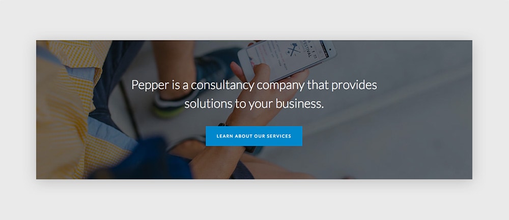
The simple module that turns any plain page into an awesome and impressive one: the Slogan.
Here we’ll use it in the most simple way. Fill in your copy inside the Slogan Text editor as a regular paragraph, without any format but a white color.
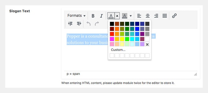
The options used here are:
– Slogan Size: Regular
– Content Align: Left
Scroll down to the Button Properties section if you’d like to use a button and complete the details. The colors we’re using in this case are #08c for the background of the button and #fff as the color.
Now, let’s go to the Module Style tab. Scroll to the Module Background section and upload the image you’d like to use as the background of the module. Remember to check the option “Use Picture as Background”.
That’s is. Let’s Publish this module. And then “Add This Module to a Page“.
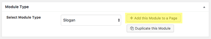
Once you click on that button, a popup window will open with the modular pages you’ve created on your site. Select the one you created before and save it.
2nd module: Gallery (for clients logos)
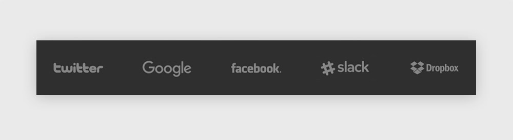
The Gallery module isn’t just for photographs or illustrations. We can think of it as a module than allows us to arrange any kind of images in many different layouts.
One great idea is to use it as a clients logos showcase.
To do that, upload the logos you’re gonna use and insert them as a gallery in your module.
In Gallery Style choose Masonry. We use that style so the images don’t get cropped (in Perfect Grid or Mosaic they will). I recommend prepping images of the same size so the final grid looks good. In this case I uploaded images that are 500×300 (with a nice blank space around the logo, it shouldn’t touch the borders of the image).
Finally, select the Layout 5 which will make a five columns layout.
There you go. Hit Publish and add the module to the proper page.
3rd module: Different modules inside a Columns module
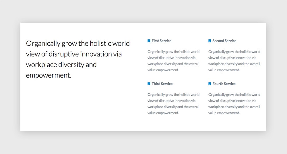
The Columns module is a useful module that lets you group other modules and arrange them according to different layouts. By doing that it’ll provide you with an immense power to do almost everything and play with the grid of your site like a boss.
Let’s first create the modules that will go inside the Columns. In this case we’ll have:
- One Slogan module (placed on the first column)
- Four Canvas modules (placed on the second and third columns)
The Slogan module:
The easiest one. Create a new Slogan module and add your text inside the editor. A regular paragraph without formatting will do. Choose Regular as the Slogan Size, and Left for the Content Align option. Publish it.
The Canvas modules:
We’ll use these 4 modules to present different company services. In this case, they’ll look the same. So once you create one, you’ll be able to quickly duplicate it by clicking on “Duplicate this module” as many times as you need and just change the copy in the new ones.
Use the Canvas editor on Text mode instead of Visual so you can add a little bit of HTML for the icon next to the service title. This is the code we’re using:
<p style="text-align: left;"><span style="color: #08c; margin-right: 5px;"><i class="fa fa-bookmark" aria-hidden="true"></i></span> <strong>First Service</strong></p>
<p style="text-align: left;">Organically grow the holistic world view of disruptive innovation via workplace diversity and the overall value empowerment.</p>
As you can see it’s very simple. There’s one paragraph containing the icon and the service title, and a second one for the service content.
The < i > element calls for the icon, where its class defines which icon is to be called.
We decided to use the same icon for all the services, but you can choose to use a different one for each one if you’d like. The icon font integrated in Pepper is the great Font Awesome, so you can check their icons out and choose one from the list.
Once you’ve created and published the Slogan module and the four Canvas modules, we can move on into arranging them inside a Columns module.
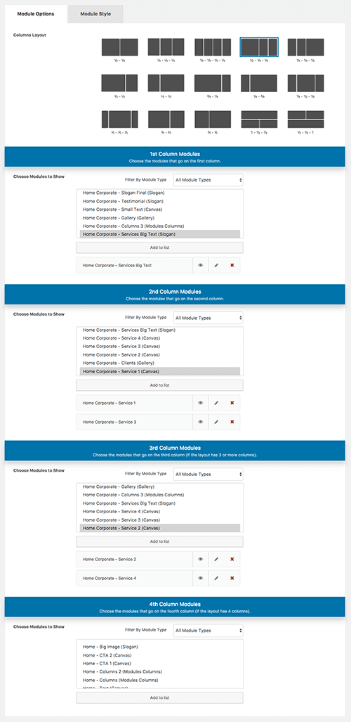
The Columns module:
Create a new Columns module. Select the fourth layout and insert the Slogan module in the first column; the first and third Canvas modules inside the second column; and the second and fourth Canvas modules inside the third column.
Does it sound like a mess? Here’s a screenshot of how it should look:
What are you waiting for? Publish this module and add it to your page. 🙂
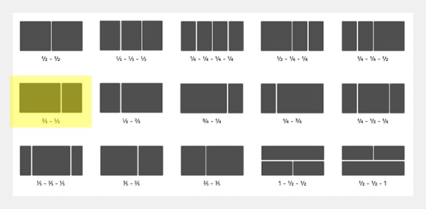
4th module: Slogan inside a Columns module
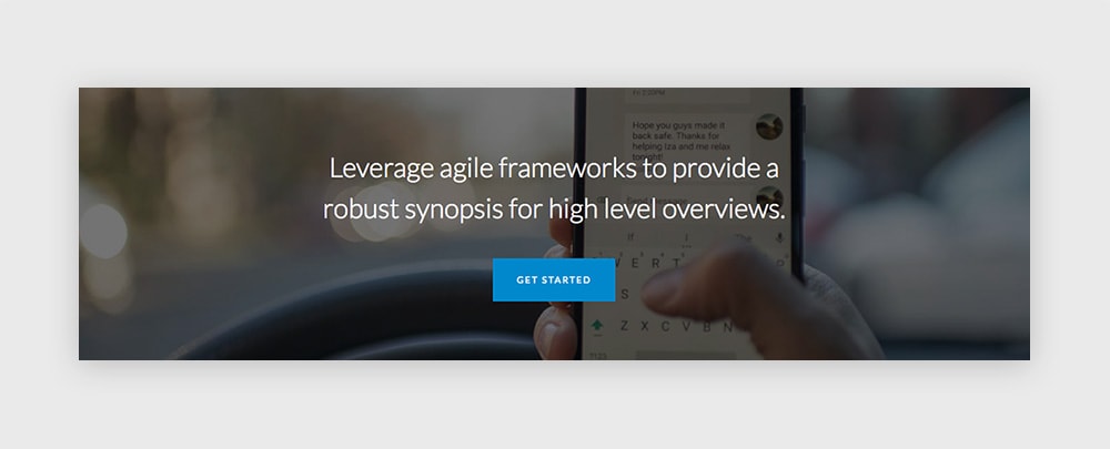
Here’s a nice hack for when you just need a simple slogan but you’d like to limit the width of the text. We created a Slogan module with the copy and the button we wanted, and then we inserted it inside a new Columns module.
So…
First – Create a new Slogan module. Fill in the text and button fields. Publish this module.
Then – Create a new Columns module.
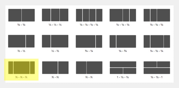
In this case we’ll use a 3 columns layout where the middle column is wider than the first and the third one. And in that middle column we’ll insert the Slogan module we’ve created before.
This layout should work just as expected:
Now, the background image should be added to the Columns module (not to the Slogan). But do remember to set the color of the text and button in the Slogan module.
Publish this Columns module and add it to your modular page.
5th module: Gallery and Canvas inside a Columns module
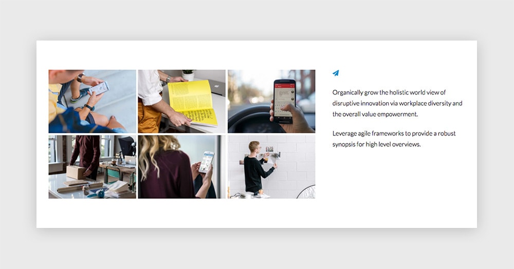
Once again, we have a Columns module used to display two different modules together as one.
The first module, which will go inside the first column, is a Gallery module. And the second one is a simple Canvas module.
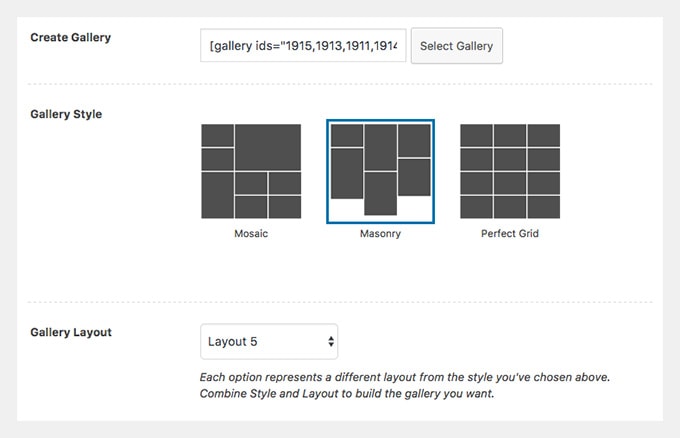
The Gallery module:
Create a new Gallery module and upload your pictures. Choose Perfect Grid as the Gallery Style and select Layout 3.
If you prefer it, you can choose the images to open in a lightbox. Remember you’ll need to install the Responsive Lightbox plugin which is integrated with our themes if you’d like that functionality in your galleries.
Publish it.
The Canvas module:
Create a new Canvas module. As we did before, we’re going to work with the Text mode of the editor here because we want to add an HTML icon. This is the content we’re using here:
<span style="color: #08c;"><i class="fa fa-paper-plane" aria-hidden="true"></i></span>

<span style="color: #000000;">Organically grow the holistic world view of disruptive innovation via workplace diversity and the overall value empowerment.</span>

<span style="color: #000000;">Leverage agile frameworks to provide a robust synopsis for high level overviews.</span>
Publish this module.
The Columns module:
Let’s wrap the Canvas and the Gallery together in one nice section. Create a new Columns module for that and select this layout:
Insert the Gallery you’ve created in the first column and the Canvas module inside the second column.
Choose a white color background for this module by going to the Module Style tab.
All left to do is Publish and add this module to a page.
6th module: Slogan (for a testimonial)
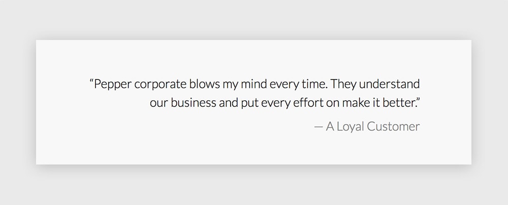
Here’s an interesting use case of the Slogan module. Let’s say you have a compelling testimonial you want to feature on your site. The Slogan editor comes handy for that.
We’ll use only regular paragraphs here, not headings. But we’ll choose different colors for the quote and the author of the quote. A black for the first one and a lighter grey for the second.
The options used here are:
– Slogan Size: Regular
– Content Align: Right
Finally, select a light grey (#f8f8f8 will do the job) as the module’s background. Publish and add it to your page.
7th module: Slogan
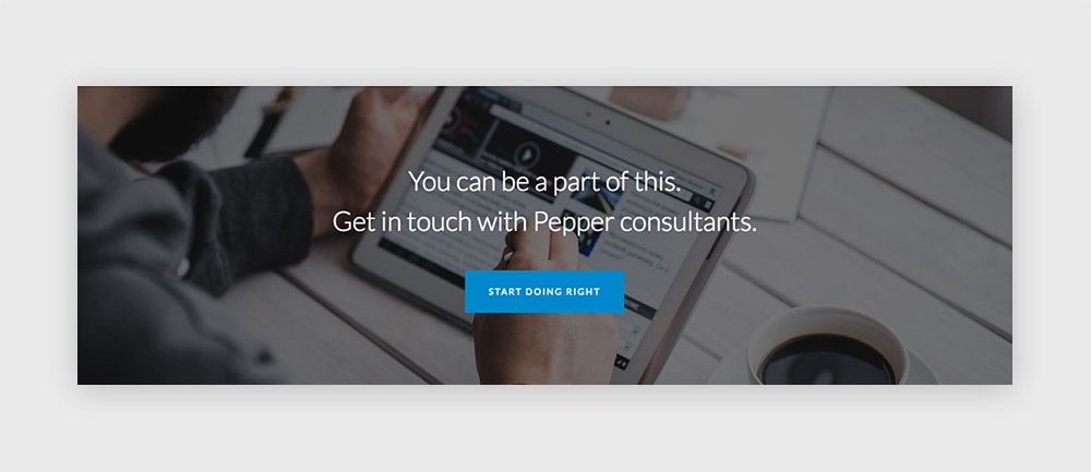
The final opportunity to close the deal. A neat phrase with a clear call to action button. And again, a Slogan module.
We’re using here the same settings as in the first module on this page.
So there you have it. A corporate style homepage that looks polished and solid.
Any questions? Let me know in the comments below.
Haven’t you download Pepper theme yet? Please, oh please, do it here and share the word.