You probably already know we aim to make WordPress themes that let you build sites easily but with beautiful and fully functional results.
Our internal motto has been for a while now Keep it useful.
And that’s the logic behind our themes: to make a product that will serve website builders as a solid and intuitive tool to build their own space on the web. Offering the right set of options and tools that will give you a great site with no extra difficult configurations.
By stacking modules one on top of the other we aim at giving designers and non-designers as one the chance to have a fully customizable website. One that also looks amazing, always.
Along with this, and because we know how important is your website in terms of branding, we also care about creating a product that allows you to really adjust the appearance of your site so that it matches your brand and visual identity.
That’s when we figured there’s something else we can add to our themes so you can dig into more custom design and style options for each section of your site.
So, for those who’d love to have more control over the little details: meet Artisan Advanced Styles.
How it works
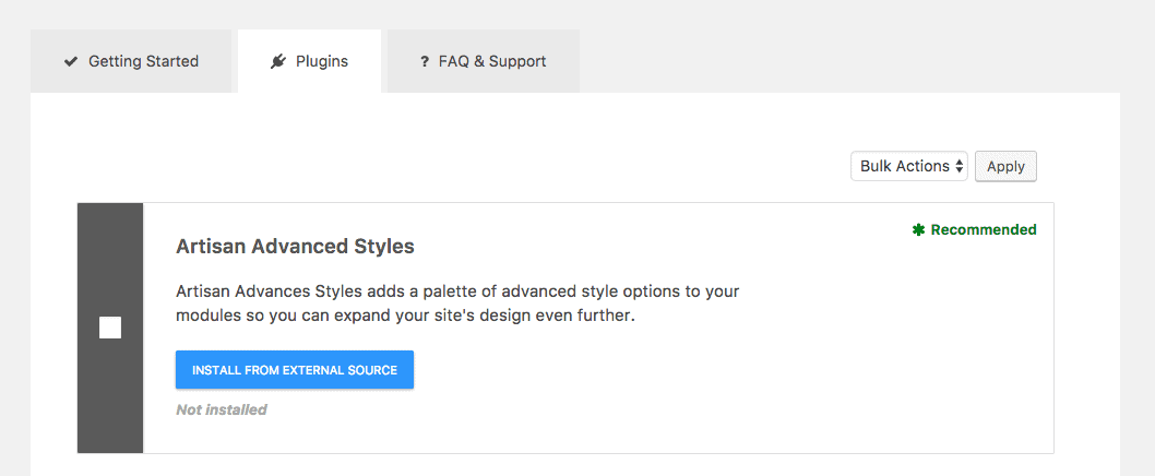
The Artisan Advanced Styles comes shipped with your theme as a plugin you can activate as you’d do with any other regular plugin.
And you’ll find it available in the Appearance » Getting Started page, on the Plugins tab.
Once you activate it, it’ll automatically add a third tab to all your site’s modules called “Advanced Styles”. Under this tab you’ll find several options that extend the module’s appearance in many cool and also (*turns to serious look mode*) useful ways.
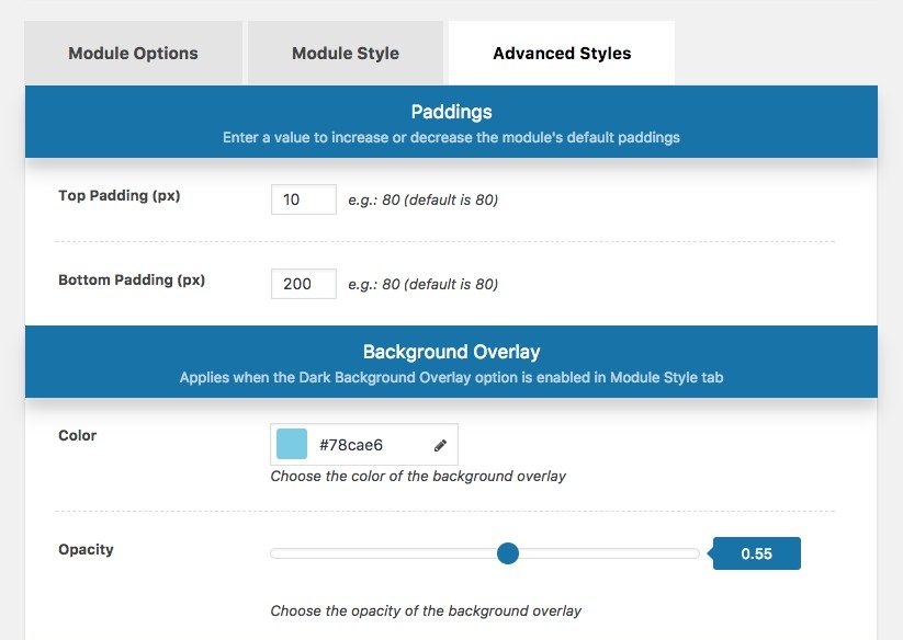
Advanced Styles tab
Remember you can edit the modules, including the Advanced Styles settings, both from the WordPress backend and on the new Artisan Themes Front-End Editor.
Let’s get into your new set of tools.
Options Included
1. Custom Paddings
Each of our themes structures every module differently, and that includes the blank space around the module.
The top and bottom paddings are in charge of separating a module from the next and previous ones on a page, and make each section a whole (with its own background and inner content).
But what if you want to decrease the paddings to make a module look closer to the next one? Or the opposite, if you want to increase the paddings to isolate it even more and give more room to the module’s background?
Now you can do it without having to touch a line of code.

Advanced Styles – Custom Paddings
You can adjust the top and bottom paddings separately and completely change the way the spacing works for each module in a page.
There’s actually no limit to what you can put there as long as it is a positive number (and no decimals, please). You’ll find the default value of your theme’s modules paddings next to the blank field. According to that, enter a smaller or a bigger number.
Play with the paddings to bring modules closer or to isolate them by creating more negative space around the content of the module.
Don’t miss out!
The Ultimate WordPress Website checklist including everything you need to make sure your site is ready and optimized for your visitors. Get it here!
2. Custom Background Overlay
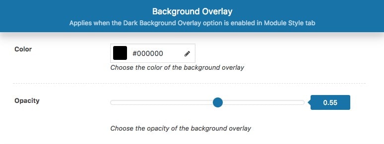
Advanced Styles – Custom Dark Overlay
Inside the regular Module Style tab you’ve always had an option to enable a Dark Background Overlay. It’s a very useful option when you’re using an image as the module’s background.
This option adds an overlay layer with the purpose of readability: making the background image darker and your module’s content more visible and legible.
The overlay layer has always been black (with a transparency, of course).
From now on you can choose your own color for the overlay, and also a different opacity value.
Let’s say you added an image background and enabled the Dark Overlay on the Module Style tab. This is how the module will look:

Default Dark Overlay (Color: #000000 – Opacity: 0.55)
You’ll see a darker image background using the default values: #000000 as the color, and 0.55 for the opacity.
With Artisan Advanced Styles you can set a different color and a different opacity to get other cool effects:

Custom Dark Overlay (Color: #1c58a6 – Opacity: 0.75)
This vibrant example uses a blue color and an increased opacity of 0.75, like this:
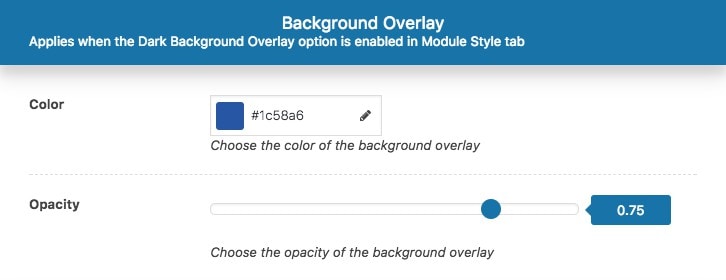
Custom Dark Overlay Settings (Color: #1c58a6 – Opacity: 0.75)
In this other example we wanted to get a much warmer effect, so we used #8a867c as the color and reduced the opacity to 0.35.
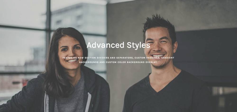
Custom Dark Overlay (Color: #8a867c – Opacity: 0.35)
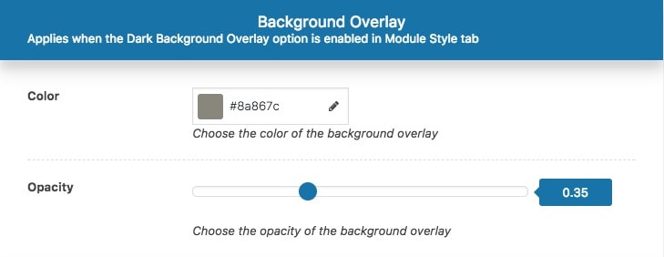
Custom Dark Overlay Settings (Color: #8a867c – Opacity: 0.35)
Pretty cool and simple, right?
3. Gradient Background
Until now you were able to set a Background Color or an Image Background for each module. And those were good options.
With the Artisan Advanced Styles plugin, you’ll have a full new background option: Gradients.
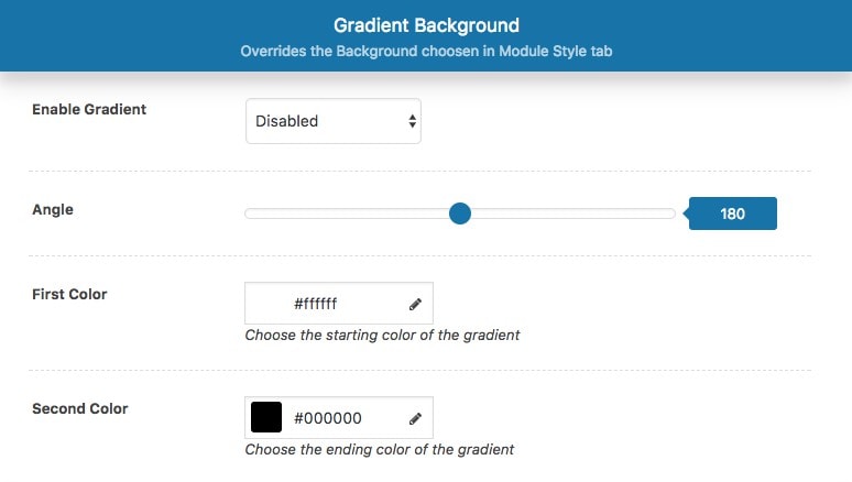
Advanced Styles – Gradient Background
The Gradient Background comes with 3 options to play with:
– The angle:
From 0° to 360°, you can choose the direction of the linear gradient. Would you rather have it be horizontal, vertical, diagonal or anything in between? You can decide it by choosing an angle value.
– The first color:
Set the starting color of your gradient.
– The second color:
Set the ending color of your gradient
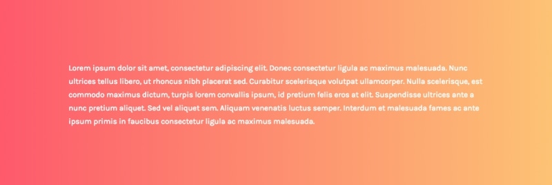
Want to try a cool first gradient? Enable the Gradient background and try these values:
Angle → 90
First color → #ff5f6d
Second color → #ffc371
Your module will now look like this:
Here’s another example with a Pricing Tables module in Pepper+ WordPress theme.
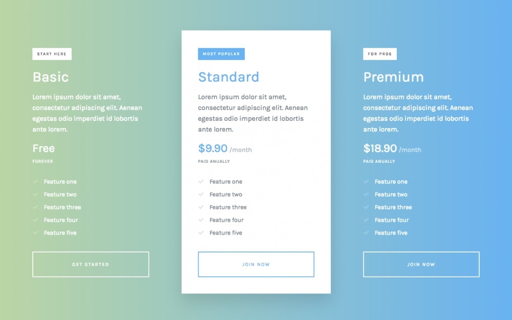
From #bcd4a3 to #64b3f4. Angle: 90º.
Hot Hint: You can pick a lot of cool gradient ideas on this site.
4. 35+ Top & Bottom Dividers
You know you can build your WordPress pages by stacking modules one above the other. Till now each module started and finished right at the edge of its surrounding modules.
What if you could have the possibility to separate each module from the other by adding an extra awesome divider?
From different kinds of borders and fancy separators to complex shape dividers, you can now separate each module from the next one by adding a top or a bottom divider.
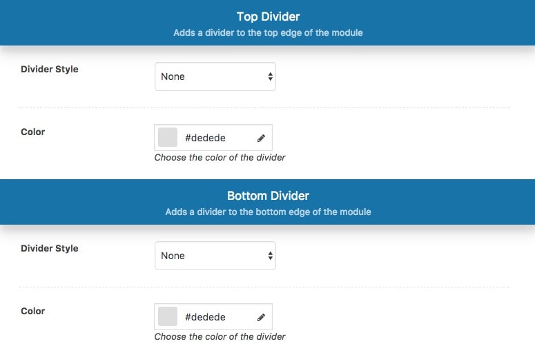
Advanced Styles – Top and Bottom Dividers
How does it work?
On each module’s Advanced Styles tab you can decide to add a top and/or a bottom divider.
Dividers are placed inside the module. The top one at the top edge of the module and the bottom divider at the bottom edge.
And you can also choose a custom color for each divider, top and bottom.
* Important tip:
Think of the top divider as how you’d like the module that is above it to be finished. And the bottom divider, as how you’d like the next module to begin.
The 3 kinds of dividers
You’ll find more than 35 dividers to choose from and they’re divided into 3 categories:
Borders
Those are the simpler dividers. You’ll find solid, dotted, dashed and double borders with varied thicknesses.
Shapes
Oh, my, these are fun. The shape dividers are a really neat way to separate – and connect – modules.
You’ll find shapes such as Curve, Waves, Triangle, Clouds, Arrow, Tilt, Zigzag, Stamp and many more.
Now listen, we all love fun, but sometimes life needs to be taken seriously too. Ok, not life but our design decisions👮🏼♀️ (cue the Style Police). Shape dividers give your site a strong personality. You need to use them carefully, so your site doesn’t end up being too overloaded.
With shapes, the Color option is crucial. Remember I said you should think the bottom divider as the beginning of the next module? Well, to give the impression that a module merges with the next one, you should select for the divider the same color that the next module uses as the background.
The same goes for the top module, just choose the color that the module above is using for the background.
If it sounds confusing, in a minute I’ll show you some examples. And once you start working with dividers you’ll see how easy it is.
Separators
Separators are minimal dividers that don’t occupy the whole width of the module. They are little ornaments that you can use to elegantly separate a module from the next or previous one.
Let me show you some examples
These are just a few examples of some of the dividers available.
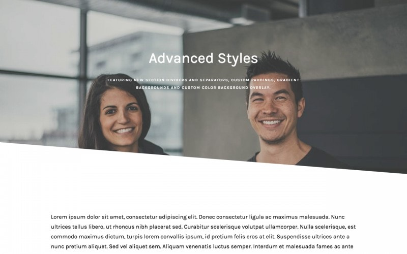
Tilt Divider
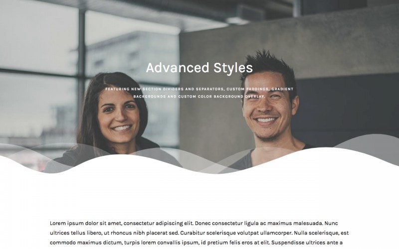
Waves Divider
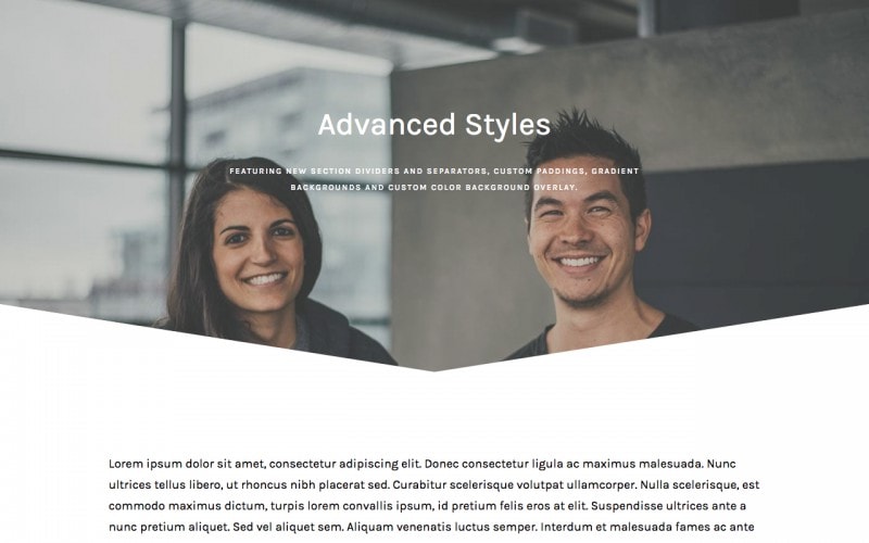
Inverted Triangle Divider
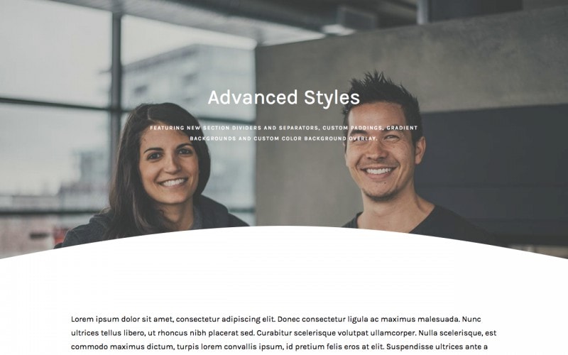
Curve Divider
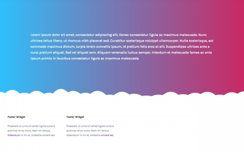
Clouds Divider
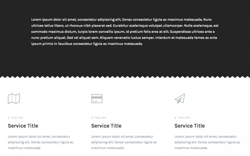
Zigzag Divider
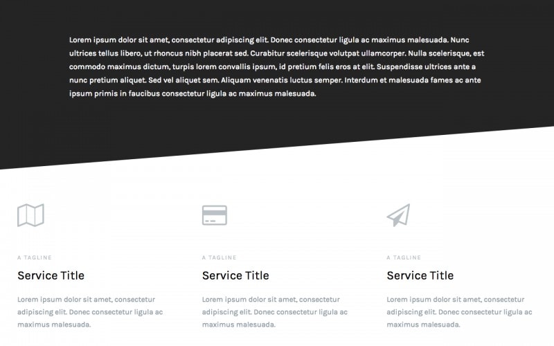
Tilt Divider
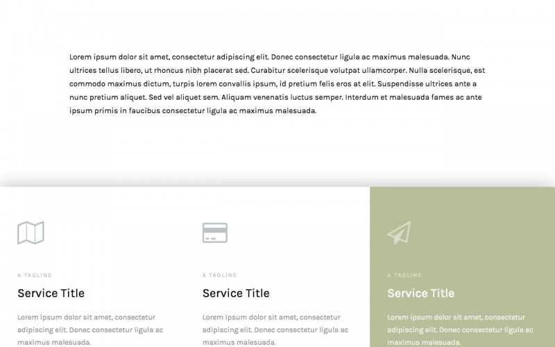
Shadow Separator
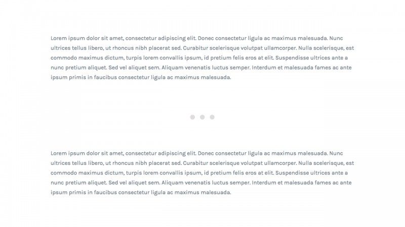
Big Dots Separator
Diamonds Separator
Fancy Separator
Fancy Separator
Dashed Border
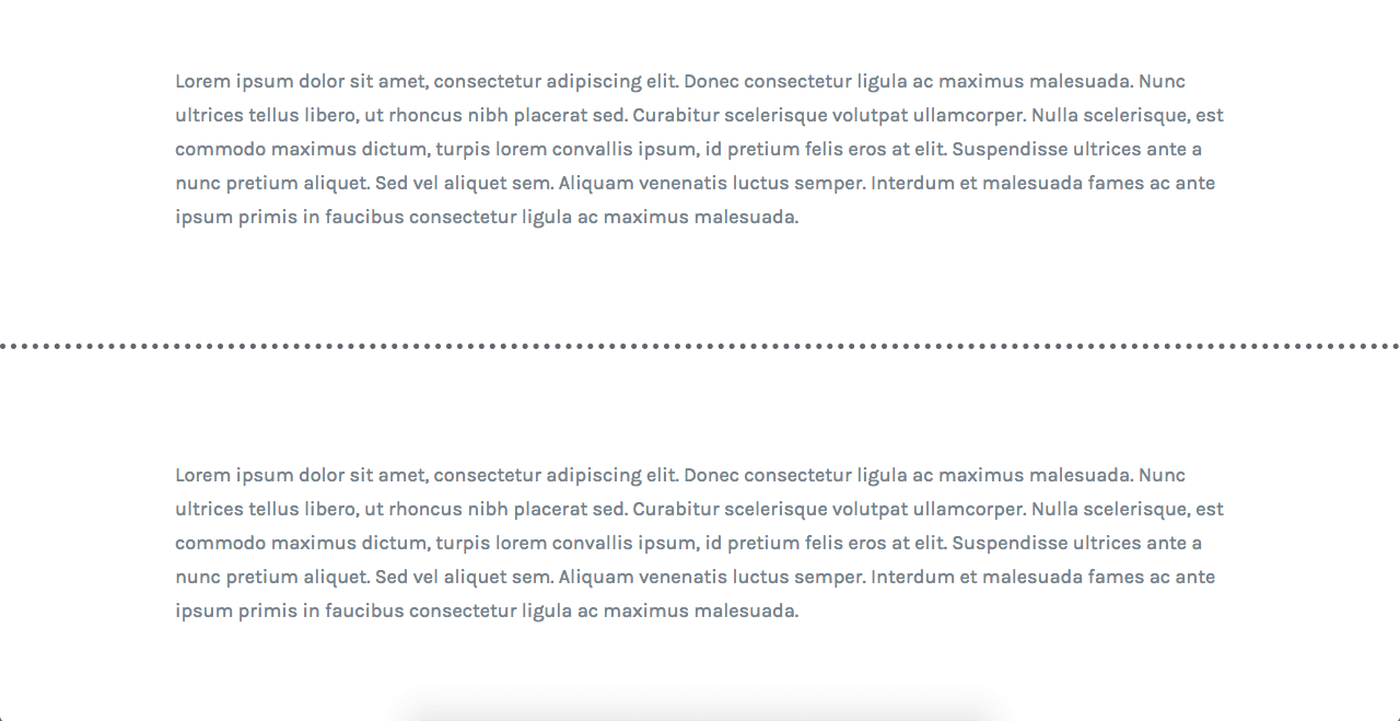
Dotted Thick Border
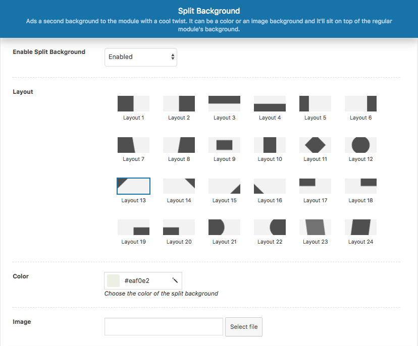
5. Split Background
Here’s another big addition that can really change the way your modules look.
The Split Background adds an extra layer to your module that works as a second background.
I’ve already mentioned you’ve been always able to set a regular color or image background in the Module Style tab. And that you can now even select a Gradient background instead.
But this is something else: the split background won’t replace your regular background but will add a second area with a specific shape that will coexist with the regular background.
One above the other. Giving the effect that one cuts the other in different ways (according to the layout you choose).
There are 20+ layouts to choose from. And you can decide if this new area will have a color or an image as the background.
If it’s a color, just keep in mind it should be a different color from the regular background. If not, you won’t notice it.
Here are some examples so you get an idea of what you can do with the Split Background:
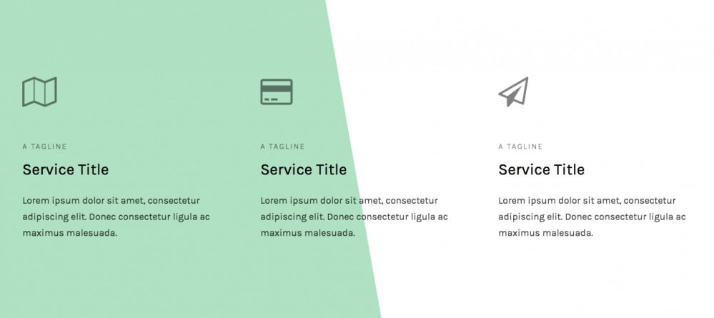
Services module with Split Background (color), Layout 7 – Pepper+ Theme
In the above simple example we’ve set white as the regular background of the module, and a light green for the split background, using Layout 7.
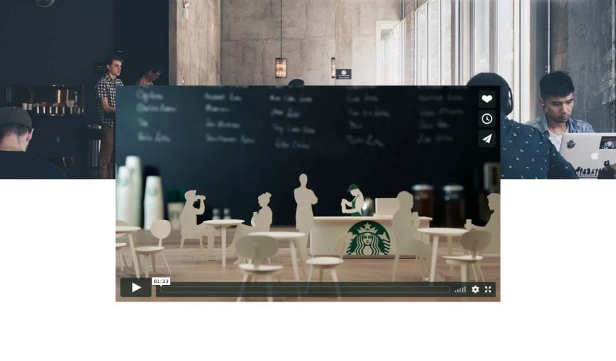
Video & Embeds module with Split Background (image), Layout 3 – Pepper+ Theme
Here we used the Layout 2 on a Video module, this time with an image background.
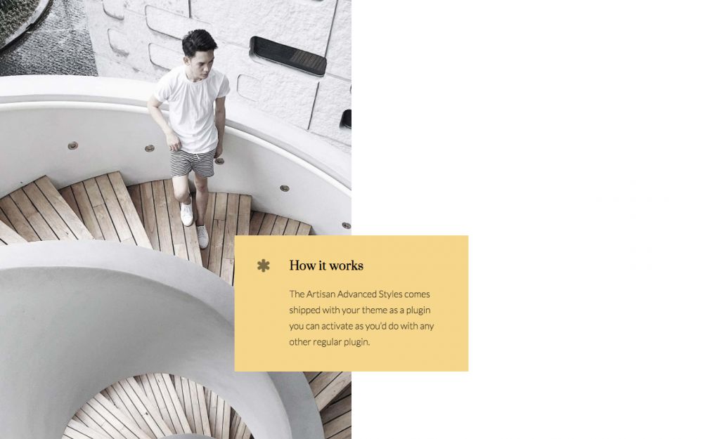
Services module with Split Background (image), Layout 1 – Pepper+ Theme
This is an example of the Services module and a split background that occupies half of the module.
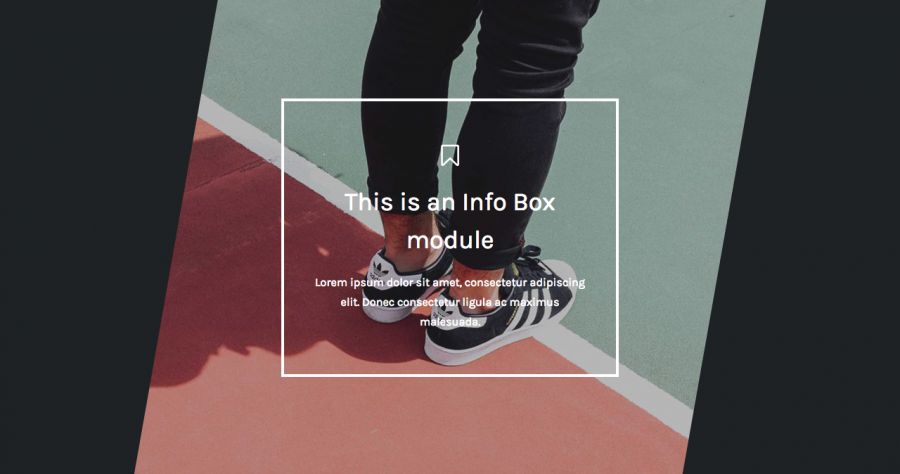
Info Box module with Split Background (image), Layout 24 – Pepper+ Theme
In this case, we’ve set a black background for the whole module and an image background for the Split, using Layout 24.
The next one looks similar, but it’s actually the opposite. We’re using an image background for the whole module and a color white Split Background. In this case, Layout 23 is being used.
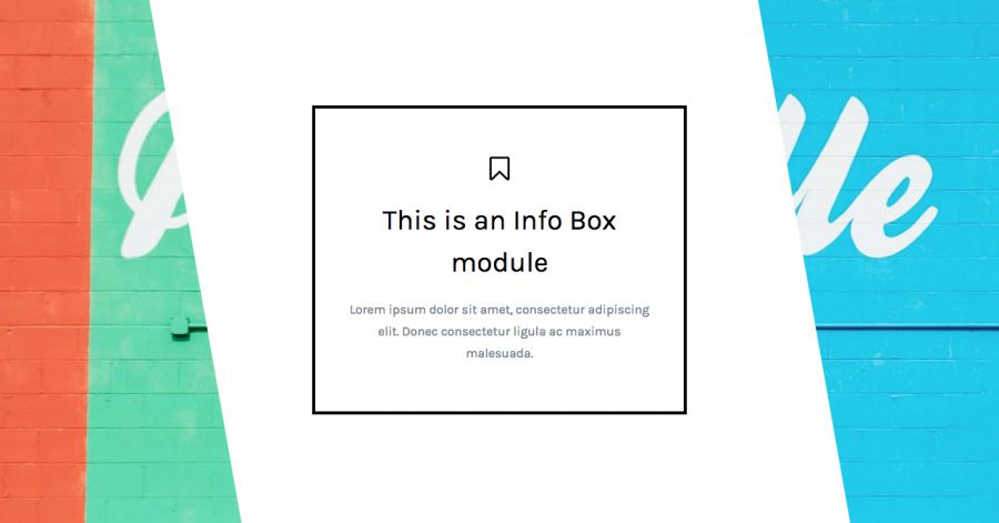
Info Box module with Split Background (color), Layout 23 – Pepper+ Theme
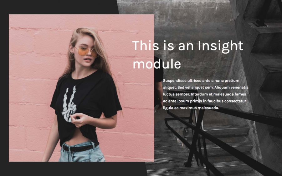
Insights module with Split Background (color), Layout 7 – Pepper+ Theme
This time we’re using a regular image background and a color Split Background, with Layout 7 chosen.
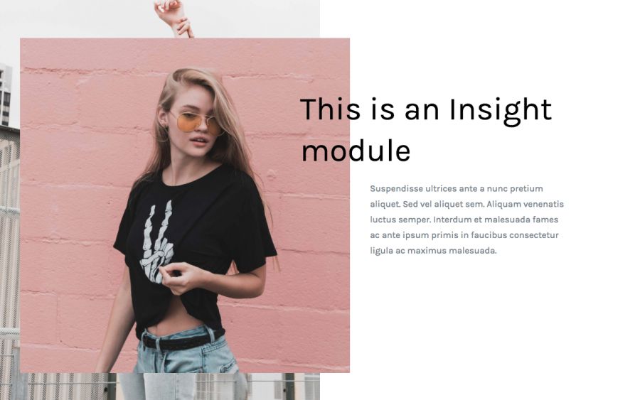
Insights module with Split Background (color), Layout 1 – Pepper+ Theme
This final example uses Layout 1, white as the whole module’s background and an image Split Background.
There are infinite possibilities to what you can do with the Split Background. Just start playing with it and let your imagination fly 😊.
6. Responsive Visibility
Let’s say you designed a module and it looks awesome on desktop screens, but you’d like to make it look different on smaller devices. Maybe removing the big image and make the copy stand out more.
A great solution would be to have 2 modules added on that page, and set the first one to be visible only on desktops and the other one to be visible only on tablets and mobile devices.
Or maybe you’d like to have a specific section that only shows up to users who visit your site from phones. In this case, you’d need only one module, and you’d also need to only make it visible for mobile devices.
You can do all that now with the Responsive Visibility option. Just select Show/Hide for each device type and you’re ready to go.
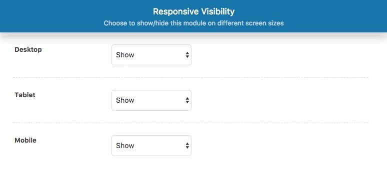
Advanced Styles – Responsive Visibility
We’d really love to hear what you think about this new addition to our themes. Do you find it useful? Is there something else you’d like to see there?
Let us know in the comments!
Featured image credit: Gratisography
