So many hats
Taking perfect lightened, balanced, framed and beautiful pictures is great. But unfortunately, being an outstanding photographer is not enough when you run a photography business.
Even less when you realize how competitive the photography market is. I mean, how many people offer photography services in your own city? I bet a lot.
Running a photography business means wearing multiple hats, besides the photographer one. It means taking care of your finances, your customer relationships, your branding, your social media, your marketing strategy.
And all of these may be even as crucial to your business success as the photos you take.
Let’s talk specifically about your marketing strategy.
If you’ve been in the business for a while, you probably already know marketing should be a key component of your day to day activities.
And if you’re just starting, the sooner you begin getting into a marketer’s mind, the better.
You must have a professional website
An essential part of your marketing strategy is your website. It’s one of the most important pieces that you’ll use to connect with potential clients.
Your website is the most effective gear to help positioning your brand and selling your services.
It’s a place where design and content work together to tell your compelling story to your visitors: who you are, what you do, how you work, how good your work is, how much you care about your clients.
How you use design and content to tell that story will affect the way people engage with it and how likely they are to hire you. It’ll affect how much you charge for your services. It’ll affect what kind of clients you book. It’ll affect your business’ success.
Minimal and modern style – Make your work stand out
One useful thing that you can take from looking at other photographers’ websites is how the design style of their sites is related to how they position their brand (and prices!).
Those doing a smart branding job won’t have a poorly designed website for a prestigious expensive business.
If you noticed, most websites of distinguished photographers usually have a minimal design that makes their work stand out. They tend to use neat and clean typefaces, neutral colors and a lot of white space. These design characteristics grant their brands a higher status.
So this is definitely something you could try if you’re going for a modern style branded website.
If you want to bring some friendliness to your site so that it says “I’m a prestigious photographer but also friendly and approachable”, you can still use a minimal design style but introduce some warm and light colors. Or maybe use a script font for your logo and small details of your website.
Ready-made photography websites for WordPress
Enough preamble already. Let’s now put the web designer hat on and start talking about how to build that website in WordPress.
* (If you arrived to this post you were probably already sure about WordPress, but if not, here’s a post you should read that will convince you + explain how to start a website with WordPress).
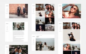
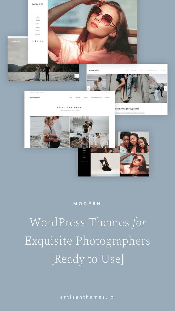
Here’s a list of 6 Ready Made Sites for photographers.
Ready Made Sites are sites based on our themes that you can install with one click from your WordPress dashboard. Then you simply replace the content with yours and customize every aspect you’d like about it, like colors, layout, typography, etc.
So, it’s as simple as this:
Like one of this sites? Purchase the theme it’s based on and install the site you liked.
All of these sites feature different styles and layouts, so you can pick the one that suits your business the most.
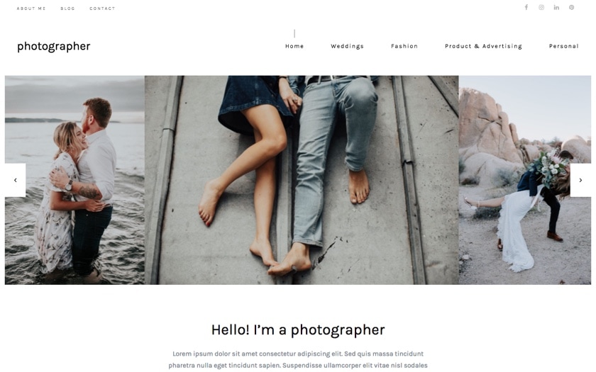
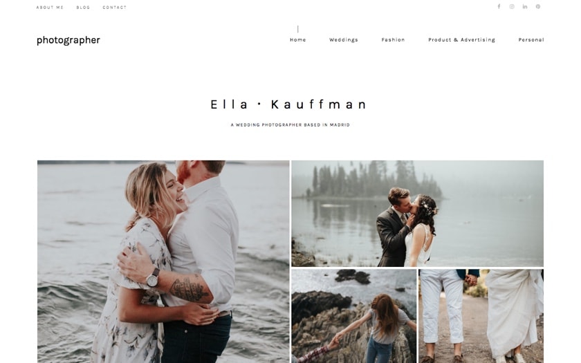
Photographer V1
Photographer is our most recent Ready Made Site (at least when writing this, who knows when you’ll be reading me?).
It’s based on Pepper+ theme, which features unconventional grids, big typography, and an overall chic style.
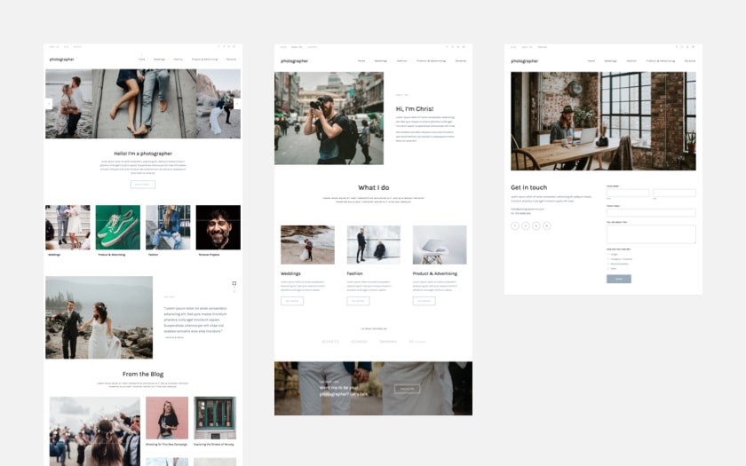
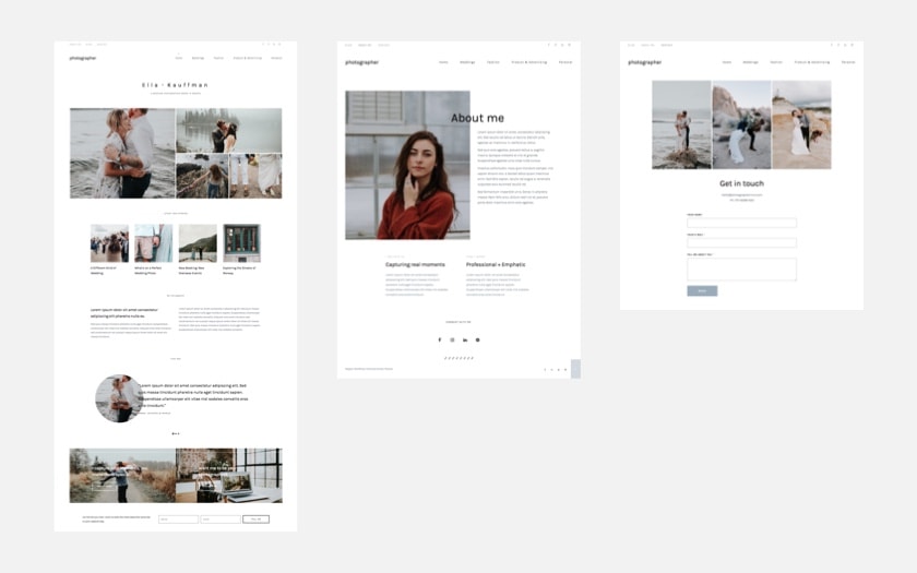
Photographer was specifically built for a photography business website. And it’s actually 3 sites in 1. It has 3 different homepages, 3 about pages and 3 contact pages with layouts and style variations.
When you install it you’ll get all the 3 versions, then you can choose which pages suit your style the most.
This is version 1. It has a carousel slider on the homepage, links to your work, testimonials, latest blog posts and impressive calls to action. Plus a straightforward about page and a contact page with a form, social links and contact details.
See a full live preview here.
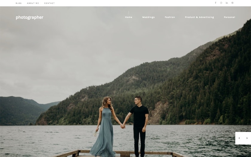
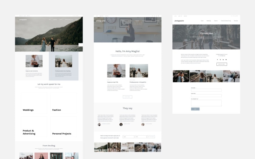
Photographer V2
The second version of this site is perfect for impressing your visitors with big stunning photos.
It has a modern and clean style, that is yet warm and friendly. Includes testimonials, latest posts, portfolio covers, and super elegant about and contact pages.
See it live here.
Photographer V3
The 3rd version of Photographer is the most minimal and delicate one. The white space, together with the texts and the photos on it make the magic happen.
The about page and the contact page match that concept too.
It’s a go-to design for an elegant and sophisticated creative.
These pages include a testimonials section, posts, calls to action, galleries, social icons and more.
See the live preview here.
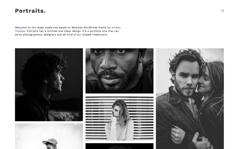
Portraits
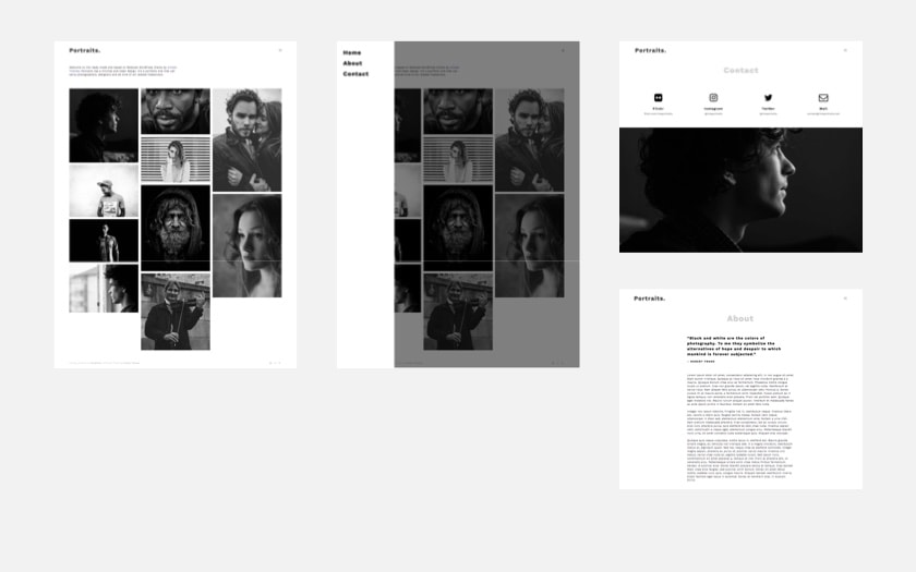
Portraits goes straight to the point. It’s a portfolio website with a clean layout and with only the minimum stuff necessary on it.
It’s suitable both for your own portfolio website as well as for a specific photography project you may have.
Like, let’s say you traveled through Latin America to photograph people in these countries and you want to create a website only to showcase this project called peoplefromlatam.com. Portraits is a great option for that.
It’s based on Modules theme, so you once you get Modules you can install this site with one click from your WordPress dashboard.
See the full demo of Portraits here.
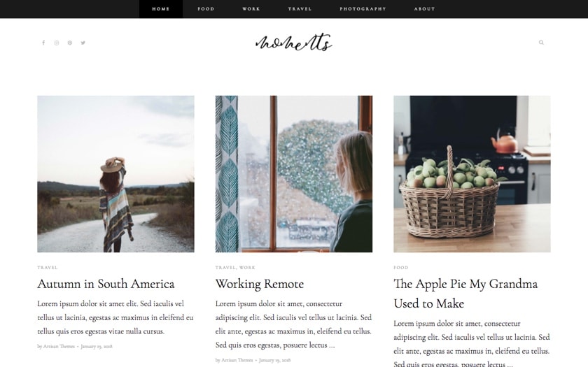
Moments
If you’re not looking for a businessy looking website but rather a simpler place where you can share your photography work, then all you probably need is a stylish, tasteful blog.
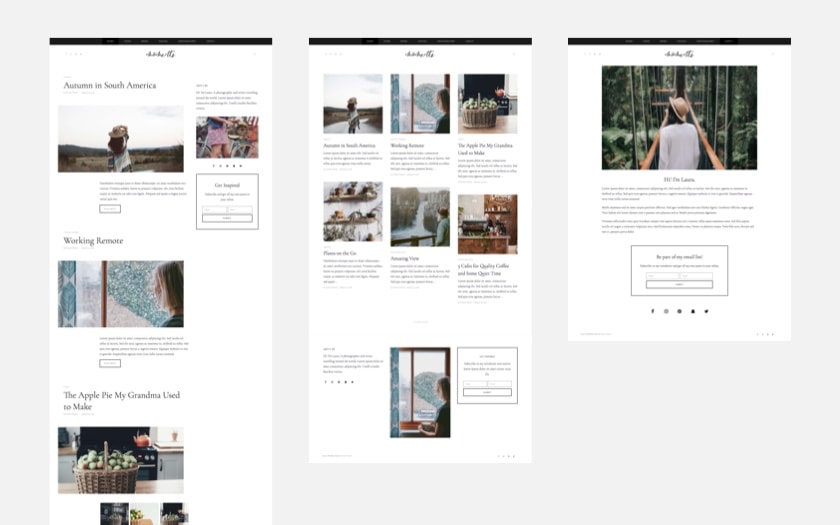
Moments is perfect for that. A minimal and chic website that will make your photos look gorgeous.
It’s based on Pepper+ WordPress Theme, so you’ll get all Pepper+ functionalities when installing this site.
Moments includes 2 different homepages for you to choose, a refined about page and category pages.
And it has a lead capture box that you can connect with Mailchimp, ConvertKit or Drip to start growing your email list.
Just replace the content with yours and you’re ready to go out to the world.
See Moments here.
Photography – Dark / Light
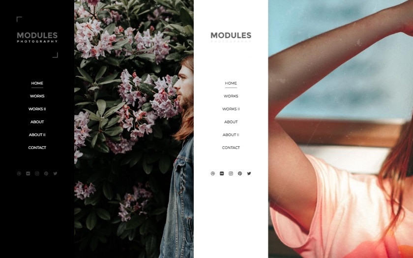
Photography is a wide full-screen photography website that comes in two versions: dark and light. With a side header, 2 already laid out portfolio pages, about pages and a contact page.
If you’re after a design with less written words and mostly full of images this site will do the job.
It’s based on our Modules WordPress theme and it’s ready to install with one click from your WordPress dashboard.
See the light version here and dark version here.
Excited to start uploading your work into one of these ready-made sites?
I can relate to that feeling.
You upload your work, fill up your services, set up the contact form, write a little bit about yourself… and bum, you start getting inquiries and booking events on your calendar 🙂
So grab the one you like and start building your professional photography website in minutes.
And then put back the photographer hat with a smile on your face… your clients will be so pleased.
