It’s been a while since responsive web design is among us. Today’s technological evolution gives people the possibility to access online contents from several devices. And that requires from us, web developers and designers, the flexibility to make our products optimized for phones, tablets, desktops, televisions, and users’ needs when they surf the web from those different devices.
A few weeks ago I stumbled upon this site by Joe Harrison: “Responsive logos”. And I thought “that’s really cool”.
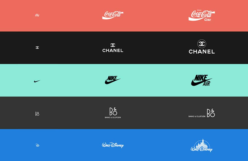
It made me think why don’t we consider responsive in a broader vision. If the idea behind responsive is that people need different levels of simplicity/complexity when they’re on different devices, and our content and design should follow those needs… Why don’t we translate the idea of responsiveness to all kind of areas?
Based on this site’s experiment we’ll guide you in this post on how you can implement a responsive logo on your site.
Let’s say you’ll use 3 versions of your logo. Here’s an example of how you can make your logo responsive. Your actual responsive logo, of course, will be up to your brand and what you consider is important to show on each level:
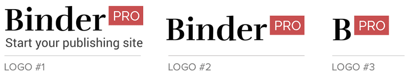
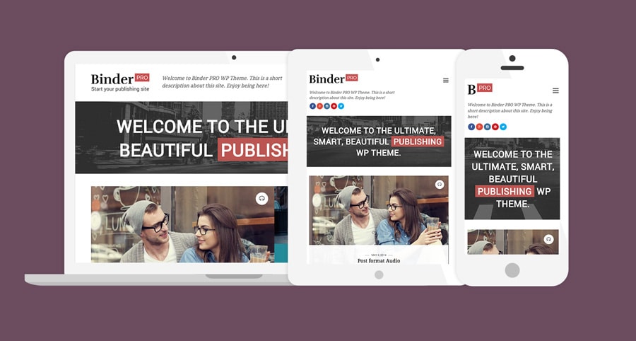
Binder PRO’s responsive logo example:
Logo #1: Full version – Contains the full logotype + the brand’s slogan.
Logo #2: Middle version – Just the logotype.
Logo #3: Simpler version – A reduced version of the logotype.
You can also decide to rearrange the elements of your logotype for different devices instead of showing/hiding them.
First, we’re going to show how to achieve that using two of our WordPress themes: Nayma and Binder PRO. And then, a quick example of this same technique applied to any plain HTML site.
Guide for Our WordPress Themes
Step 1: Main logo
Upload the main logo (Logo #1) in Theme Options >> General tab.
Step 2: Other versions
Upload the other logo versions to your site through the Media manager or via FTP. Grab the URL of each logo and keep it on a side note. We’ll use them on the next steps.
For example:
Logo #2: http://yoursite.com/wp-content/uploads/logo2.png
Logo #3: http://yoursite.com/wp-content/uploads/logo3.png
Step 3: About custom CSS
We’ll customize the theme through CSS so it can handle the different versions of your logo.
By the way, you have two different ways to apply custom CSS in our themes:
The first one is by pasting the CSS rules inside the Custom CSS box in Theme Options >> Design tab.
The second option is using a style.css file in a child theme.
Both ways are completely safe. You can keep updating the themes and those changes will stay there.
Step 4: The media queries
The media queries we’re going to use in this case are:
@media only screen and (max-width: 959px)
@media only screen and (max-width: 519px)
If you decide to have one more version between the second and the third one, you can also use this media query:
@media only screen and (max-width: 759px)
Step 5: The CSS code
Now we are ready to go and write our custom CSS code.
First we are going to hide the original logo on screens that are smaller than 960px. Then we’ll place the Logo #2 as a background of the site title link and set the proportions of that specific logo version.
Lastly, we’ll replace just the background image (with Logo #3) and adjust the logo proportions for screens smaller than 520px.
This is how the CSS code will look (it applies to Nayma and Binder PRO WordPress themes):
@media only screen and (max-width: 959px) {
   .site-title img {
      display: none;
   }
   .site-title a {
      display: inline-block;
      background: url("https://yoursite.com/wp-content/uploads/logo2.png") no-repeat center center;
      background-size: contain;
      width: 220px;
      height: 40px;
   }
}

@media only screen and (max-width: 519px) {
   .site-title a {
      background-image: url("https://yoursite.com/wp-content/uploads/logo3.png");
      width: 100px;
      height: 44px;
   }
}
Copy the code and change:
– The URL of your images (for Logo #2 and Logo #3)
– The proportions for each image (for Logo #2 and Logo #3). Important: we recommend using a logo that is maximum 60px height, no more than that, so the layout doesn’t break down.
Plain HTML Example
If you’re running without any of our themes, this is an example of how the header’s markup should look:
Site Title
And for the CSS:
.site-title a {
	display: inline-block;
	background: url("https://yoursite.com/images/logo1.png") no-repeat center center;
	background-size: contain;
	width: 187px;
	height: 60px;
	text-indent: -9999px;
}

@media only screen and (max-width: 959px) {
   .site-title a {
      background-image: url("https://yoursite.com/images/logo2.png");
      width: 220px;
      height: 40px;
   }
}

@media only screen and (max-width: 519px) {
   .site-title a {
      background-image: url("https://yoursite.com/images/logo3.png");
      width: 100px;
      height: 44px;
   }
}
Remember to replace the URL of each logo image and adjust the proportions for each one.
That’s it. We have now a responsive logo in our website.
Have any question? Write it on the comments!
Don’t forget to share with us how your site looks with the responsive logo.
Have new ideas on how to make different versions of the same logo? Bring them on!
The challenge is also how to design the Responsive Logos. That means that you must have several logos that must be “one” for the read impression of your public target.