I was recently designing the new site for our company. Since we decided to change our name to Artisan Themes, a name that definitely reflects us and our work better, we have faced the challenge of making all the visual elements that come along our brand and products to reflect the same personality that you can meet when you talk with us over the forums, when you email us or when you reach us at our Slack community.
We’ve iterated over a couple of versions and soon the final result will be launched on production, right here.
Despite the fact that I designed the brand identity myself and I knew in deep what we’re trying to tell, I found myself stuck more than once. I sat in front of my design and felt like I was lost and clueless about where to go or how to continue. I couldn’t event tell if what I had done so far was good or not.
I guess it happens to designers that work mostly alone and sit for hours and hours on a design. In some point you feel like you can’t even tell the difference between wrong and right. You’re stuck.
And you know you’re stuck. But that doesn’t help, because you feel like you need to keep trying, and that leads you to even more confusion. Maybe you settle on a design that feels more or less right because you eventually need to settle on something, but it doesn’t really make you happy.
How does it feel to be stuck?
For me feeling stuck in this process was sitting in front of the design and having thoughts such us:
“It doesn’t look clean enough”
“It doesn’t reflect the brand”
“It doesn’t look modern enough”
“How do I make this right?”
“Which color should I use here?”
“Which font from our brand system goes there?”
“Which size should this be?”
“Mmmh… Why doesn’t it look good? What is it?”
“I hate it” 🙂

Ok, Ok, let’s all calm down.
So first, don’t be afraid to be stuck. Stuck can be good. It might be the opportunity to improve, to look after better solutions.
But what to do when you’re in that situation?
Here are some tips that had helped me in this process of designing our new website. I’ve tried them all, and I’m thankful I’ve tried those because they helped me get better results.
1. Go back to simple
Black and white. One font. Just text.
When your design looks like a mess it’s time to go back to simple. Get rid of colors, get rid of graphics at this moment. It’s you and the content, black text over a white background. Work with that. Start from there.
Try to make it look good without adding anything else, just the minimum elements needed. Play with sizes, with white space, with different layout possibilities, columns, relationships and proportions. Care for your typography, the font size, the line height, the letter spacing, the capitalization.
Once you’re done, ask yourself these questions:
– Does it need anything else?
– Will some other element help me tell what I’m trying to tell?
– Will some other element help me better convey the brand personality?
If the answer to one of these is yes, then add whatever you need. But don’t go crazy now, remember you’ve already had a mess before. Try adding one color, try adding images, try adding graphics. But just one thing at a time while asking yourself the same questions every time you’ve done adding something.
2. See how others do that
Stuck on a section of your site that you don’t really understand how to design?
Good news! I’m sure many existing sites have that same kind of section.
Browse your favourite sites. Check how they present their homepage, their testimonials, their products, their blog, their pricing tables. Taking a look at big brands like Apple, Dropbox, Evernote, Samsung or Starbucks may help. But there’re also smaller businesses that really know how to do it too, and sometimes they can provide even better examples.
Here’s a great tool. A whole group of sites dedicated to pages showcase, curated by @tchret:
Checkout Pages: pages.xyz/type/checkout
Pricing Pages: pages.xyz/type/pricing
Product Pages: pages.xyz/type/product
Store Pages: pages.xyz/type/store
Warning:
The fact that you’re looking at others’ designs doesn’t mean you need to copy those. Your brand is your brand, your story is your story, and the designs you build should work with that and for that. But it helps looking at how others have managed to solve the same problems you need to solve. Rely on habits, especially when you’re lost.
3. Look for pictures inspiration
Not just web design inspiration, but any visual manifestation can inspire you. Enter Google Images, look for words that relate to the world of what you’re designing.
For example, when we started designing our brand we knew it’d have to be related to these concepts: artisan, handmade, industrial, urban, modern, fashion, tools. Each one of these words opened a whole visual universe. We collected the images that felt related to our brand and they’re always there when we need to come back to the brand core visual idea.
You can use Flickr or Pinterest too but it has to be a place where you’ll be able to find all kind of different stuff.
4. Ask for someone else’s opinion
And try what he/she says, even if you don’t like it.
Listening to what others have to say about your design can be harsh. It can easily feel like criticism. Criticism make us start defending ourselves as if someone was attacking us. And it really shouldn’t.
Listening to others’ opinions can help you enormously. Even if you think that what they say sounds silly or totally wrong, their words can actually light ideas in your brain.
If you don’t have someone to ask there’s always the online community. There’re many Facebook groups for designers where you can share your designs and ask for feedback. If you’re an Artisan Themes customer there’s also our Slack team to join.
Whoever you found and whatever their design skills are, another person’s vision can add a great amount of value to the process. That’s for sure.
5. Take a shower, shower helps thinking
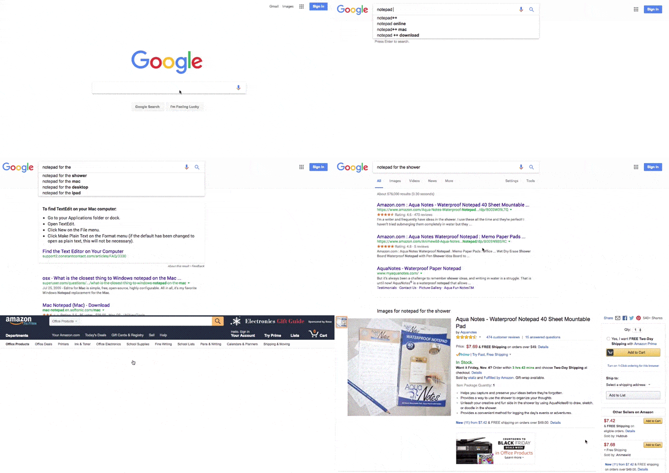
I cannot tell you how many times I wish I had a notepad inside the shower… wait a minute, maybe there’s such a thing.
Found it. Now, what I was saying?
Oh, yeah. Apparently there’s something to do with the steam or the water falling over your head. Or maybe with the fact that creativity thrives when you relax and stop trying so hard. Whatever the reason behind, I can swore some of my best ideas came out of the blue while I was in the shower.
So go now and take a shower. If you haven’t took a shower yet today, it’s also a great opportunity to make your roommate / co-workers / next door neighbors like you more.
And if you did already took a shower today, make it a quick one.
6. Write a post about being stuck 🙂
Let your frustration and experiences be the others’ findings. You’re not alone in the world, you’re not the only designer, and chances are there are others going through the same stuff. Share your thoughts so we can all learn from them.
You’ll also be rewarded by the amazing effect that writing has on our brain. When you write, you put things in order. And things in order let you think clearer, let you identify where the poop is so you can find a better solution.
7. Go to sleep, leave it for tomorrow
If none of these works, leave the task. Go do something else. If it’s night, go to sleep. Your brain will continue the work while you sleep and things will probably look different tomorrow. New ideas will come up and you won’t believe how you didn’t see them earlier.
As a designer there are days where your work flows in a magical way. Days where you might work for hours without eating or going to the bathroom without you even realizing that. When the first thing you try works like a charm and each thing follows the other in a perfectly-synchronized-Mary-Poppins-movie way.
But those days aren’t most of our days as designers. The rest of the days you go over and over a concept, you try different things, you make mistakes, you correct them, you create a new mistake while correcting them… and sometimes you feel stuck.
And that’s fine. Just have your set of tools to help you go out from the stuck status, and give it time.
Have other tips to move all of us forward? Share them below!
Featured image credit: Gratisography


Really very appreciated.. coz I learn from your article mew things…thank you 😊