Put together a great website but somehow your visitors aren’t staying as long as you’d like?
You crafted a website that looks good and reflects what you do.
You populated your blog with content.
And you actually start getting a decent amount of traffic.
But still, you notice your bounce rate is pretty high. That means most of your visitors navigate away from your site after viewing only one page.
Why is that?
While bouncing could be great for people visiting you at home (we all agree with Franklin’s “Guests, like fish, begin to smell after three days”), you want the exact opposite when it comes to your website.
You want your visitors to smell like fish… I mean, to stay there for a long time.
Because keeping them on your website is step one to engage them.
And engaging them is crucial to convince them to buy your products, hire your services or subscribe to your mailing list.
You must detect what’s causing your visitors to leave your website and put serious efforts into making them stay longer.
So how do you do that?
Here are 16 strategies that will make visitors stay on your website longer
Every part of your website can help extend your visitors’ stay –like complimentary chocolates on a hotel’s reception– or can throw him away, like non-stoppable rain on a summer beach day.
It’s your copy, your content, your website’s design and user experience.
But don’t panic. Because with these 16 actionable tips I’m going to share with you, you can make your website a lot more stay-here-friendly.
I’m must warn you, though. This isn’t another superficial “top 5 tips to…”.
I’ve put together 16 serious strategies you can apply on your website and each one is explained as hell, so that you can really try and make a difference in how long do your visitors stay on your website.
Ready?
1. The key to every relationship:
Build trust and offer value
What makes a good relationship last?
Think of your personal relationships: wife, husband, girlfriend, boyfriend, real friends, partners.
I’m sure you trust each other. And I’m sure you have something very valuable for the other. Maybe you also scratch each other’s back, but hey, that’s value.
On the first second a visitor enters your website, the potential-relationship clock starts ticking.
If the visitor doesn’t quickly find something he perceives as value in your website, or if he feels he arrived to an untrustworthy place… he’ll leave it quicker than you can say “Please, see my…” [closing door sound].
[you: crying-face emoji]
But… if the visitor instantly feels you can offer him something valuable and that he can trust you, well, my dear, now you have a great starting point.
[you: happy-crying-face emoji]
Now, how you build trust?
How do you offer value?
And how do you make your visitors understand that quickly so they stay on your website longer?
At the beginning of your relationship with your visitor, trust its a matter of perception. The visitor doesn’t know you yet, he can’t be sure if you’re trustworthy.
So you have to make him feel he arrived at a trustworthy place.
It’s actually not that hard to make your website feel trustable, but it’s pretty easy to blow it off. So here are some tips that will help you with that:
- Design matters: avoid using a poorly designed theme
- Make sure everything in your site works properly
- Use quality imagery
- Add an About page
- Add Privacy Policy / Terms and Condition pages
- Check for grammar in your copy
- Make sure your logo looks good
- Keep your content up to date
- Add social proof (testimonials, client logos, badges, etc.)
The second thing is value.
I don’t buy clothes that often, but when I do shop for clothing I’m actually pretty good at quickly scan a store and understand if I’ll find anything for me in there.
That saves me a lot of time and energy. I don’t have to go thru the whole pile of clothes to see if I’d like something. I just know from looking at the store itself, the mannequins on display and, if I need to, by making a fast scan of some of the items hanging up, if I’ll find something valuable for me.
If the store thinks of me as its target audience then they must make sure I’ll get a sense of value right away so that I stay and find something to buy (or want to buy the whole store… it happens, it happens).
Offering value is not only a matter of what you’re actually offering as a product or service, but even equally important about how you present that thing you offer in a way that your visitors feel like it’s valuable for them.
The following items on this strategies list will help enormously in building trust, offering value and making everything in between happen, so you can get your visitors to stay longer on your website.
2. Guide your visitors through your website with CTAs
Don’t expect visitors to know what to do on your website. You have to prompt them to take action by telling them what to do at every step of the way.
It’s like when going to a museum. You’ll enjoy it much better if you have a museum tour guide. If there isn’t one, or a brochure with a map, or even signs on the walls, then best case scenario is you’ll get lost and miss a lot of things.
Calls to action (CTAs) are your best ally to turn visitors into active users and make them see everything you want them to see.
No visitor will come up by himself that he wants to subscribe to your newsletter unless you ask him to.
No visitor will consider learning more about something if you don’t offer her to learn more about it.
“Read more”
“Buy now”
“See my work”
“Get started”
“Download the guide”
“Subscribe to my newsletter”
“Start your website today”
“Plan your trip”
“Get in touch”
“Build your package”
“Start your free trial”
“Show me”
“Yes, I want a perfect coffee”
“Make me a professional illustrator”
If you’re pursuing a marketing goal, the content on your website is pointless without a call to action instructing the visitor what to do with it.
Let’s say you’re a yoga teacher offering private yoga lessons. One of your visitors is so interested in learning more about you (which is already a big achievement) that he navigates to your About page.
In that page he reads about how charming you are and how much experience you have. He reads through the whole page because he is a such an ideal client… And then what?
Don’t tell me the last words on that page are “…and that’s why I became a yoga teacher”.
What’s your visitor supposed to do with that last piece of information?
You’ll be very lucky if he keeps browsing through your site, because you didn’t give him any clue of what to do next.
So here are some ideas to give that page a better finale:
Add a CTA that makes the visitor keep reading about your class
“Learn about my classes”
“Let me show you what we do in my classes”
“See the 3 types of classes you can attend according to your needs”
Add a CTA that will help to convince the visitor about taking your class
“Read this story of one of my students about how she became X by attending my weekly class”
“See how my classes will get you X results”
“Read the 5 benefits of doing my class”
Add a CTA that makes the visitor contact you
“Get in touch”
“Book me for a class”
You could also put 2 CTAs side by side, so you force the visitor to choose between 2 options:
“Learn more about my class” + “Get in touch”.
Add a small contact form right on that page
“What class are you interested in?”
“Book your class”
Add a subscribe form where the visitor gives you his email
“Let me tell you more about my class”
“Download the 5 tips to get you started on Yoga”
“See what Yoga will do for you in 3 weeks”
Add your social media channels
“Follow me on Instagram to see daily Yoga tips”
“Join my free Yoga Facebook group”
3. Don’t make it difficult to find things on your website
Imagine you hurrying up for an event. An important event, let’s say your best friend’s wedding.
You are at your home almost ready to go and then you realize you forgot to put on your favorite piece of jewelry.
You look for it but you can’t find it.
The wedding starts in 30 minutes and the car is waiting for you downstairs.
You can’t find the jewelry anywhere.
Unless it was your keys that you can’t find instead, and you can’t get out of your apartment, you’ll let it go. Because your best friend’s wedding is way more important than you wearing that beautiful ring.
Now this is the reality for visitors on your website every single day.
For them, every minute in their life is that important.
Especially if they are looking for something they need.
If you’re going to hide those things from them, then you better go and put a big sign saying:
“Leave my website now,
it’s not going to help you”
(Ok, that might actually be a brilliant idea).
What I’m saying is, simplify your navigation.
Keep things findable.
When a user can’t quickly find what he’s looking for he’ll think he won’t find it at all. Therefore, he’ll leave your website at that moment.
On the contrary, if you constantly offer your visitor easy access to what he’s looking for… then he’ll take your hand and go with you.
✓ Think of what information is important to your visitors and keep it at reach of hand.
✓ Don’t make your users click more than twice to get somewhere important in your site.
✓ Structure your site’s navigation in a logical, intuitive and useful way.
4. Be conversational
Here’s an interesting question… when does a user decide to leave a website?
Not why but when.
Think of when a friend is telling you about something that happened to him and you’re listening.
Let’s face it… Sometimes you look at him like you’re listening but you’re actually thinking about your groceries list. It’s ok, it happens to all of us.
But when does it happen? When do you stop listening to what he’s saying?
I’d say it happens when you get disconnected.
And it’s the same thing with your website. It happens when the user feels disconnected with what she’s seeing.
The only difference is that if you are a good friend you’ll make an effort to keep listening.
But there’s no such thing as being a good visitor and keep browsing a website just because you want to be nice to the website’s owner. (Cue BVF = Best Visitor Forever ❤️).
This is now the question you need to ask yourself:
What creates that disconnection?
Your visitors may feel disconnected when you fail to match your voice to your audience and to what you’re offering.
It might happen…
- If you speak all academically instead of a like friend
- If you speak with pretentious language
- If you speak from your company’s point of view instead of your buyers point of view
- If you only list features instead of demonstrating value
- If you don’t empathize with your audience
- If you don’t really address your visitors but talk in a neutral, kind of “audienceless” way
Think of your website as a conversation you’re having with your visitors. And try to become good at having conversations.
Go over your website’s copy and detect when exactly there might be a disconnection point. Like, “oh, it’s here, this paragraph is completely ruining the conversation we were having”.
And figure out a way to keep having the conversation, one that will lead to what you’re trying to achieve.
Extra tip: write better copy by following Laura Belgray’s 5 Secrets to Non-Sucky Copy.
5. Write quality content that answers your visitors’ questions
In other words, help your visitors.
Ever happened to you that you arrived at someone’s post and you immediately open like 3 other posts from her on different tabs?
Then you finish reading the first one, go to the next tab, and before you finish it you’ve already opened like other 4 new tabs?
And then you have like 7 posts from the same blog you want to read because you keep finding material that you feel it’s SO what you need to know right now?
Well, that’s amazing. And not so hard to achieve if you focus on writing content that helps your audience.
How to do that?
The key is coming up with ideas for content that are actually answers to what your audience is looking for.
You can look for what your visitors are:
- Asking on Facebook groups
- Asking on Google
- Asking on Quora
- Asking in support forums (yours or other companies’ forums)
- Asking in posts comments (in your blog or other blogs)
- Asking before they purchase something from you, on a sales chat or email
Each question you find can be the trigger for a post on your blog.
So instead of thinking about content from the angle of “what can I write about” start thinking about it from the “what my audience is looking for that I can help with” angle.
And this doesn’t have to be only about posts on a blog, you can think any part of your website in these terms: what’s on your homepage, how you explain your products/services, how you present yourself, etc.
6. Write effective feet in the door… I mean, headlines
“When salesmen used to go door to door with their vacuums or their pots and pans or their knives, and I guess still do, I think that’s what the expression foot in the door comes from because someone would open the door. The lady of the house would open the door and they would stick their foot in the door so she couldn’t quite close it. That’s the foot in the door. So these headlines are now your foot in the door. It means people can’t close their browser, they can’t close you out, click away from when you get their attention with a headline. They want to know more.”
– Laura Belgray, on writing headlines
Headlines are the first part of copy on any page or post. It’s the first thing your visitors will see.
Only if you get your visitors to read the headline and it works, you’ll get them to keep going to the next line or to open the entire post.
That’s why headlines are as important as the rest of the content.
They must make it irresistible for your visitors to keep reading.
If they don’t, bye bye visitor.
So before you publish that new post, a new sales page and, please, before you decide your homepage is ready to go… dedicate some time to come up with several options for the headline. And then choose the one that will be the most effective in hooking your visitors into reading your content.
Here are a few examples of interesting homepage headlines:
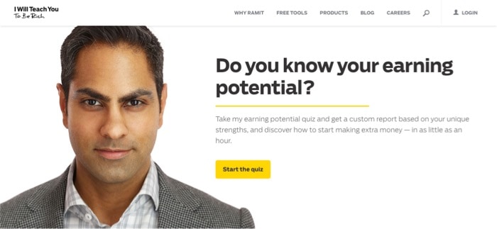
I Will Teach You To Be Reach – Homepage Headline
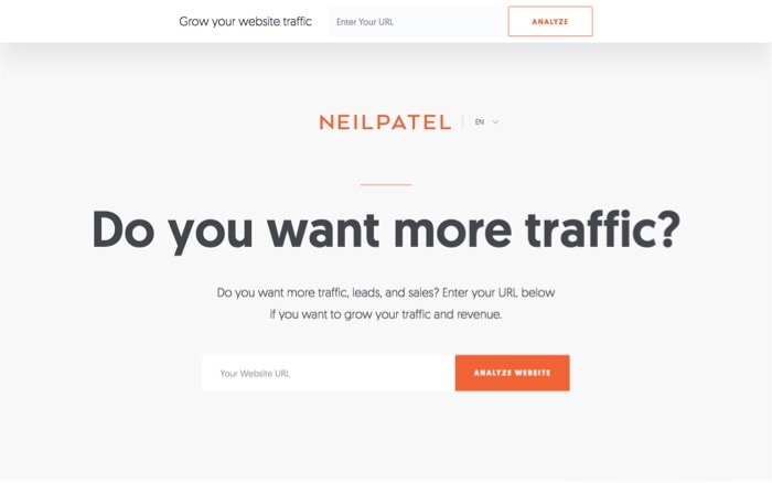
Neil Patel – Homepage Headline
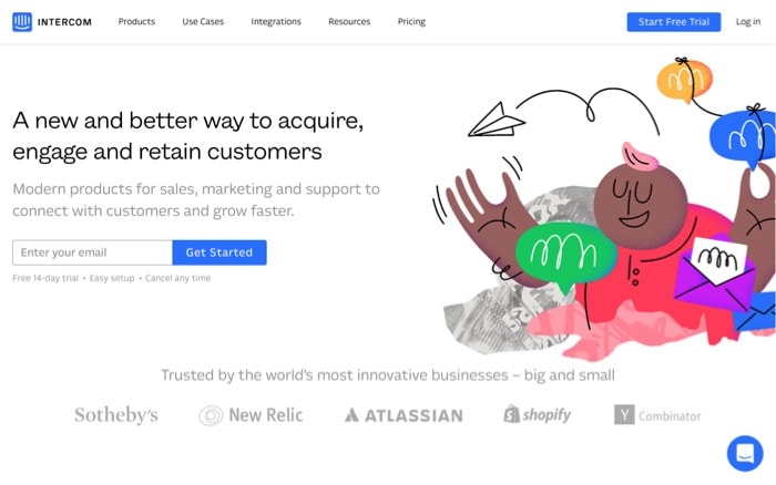
Intercom – Homepage Headline
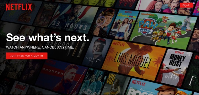
Netflix – Homepage Headline
OptinMonster – Homepage Headline
If you feel like you need to improve your headlines…
If you’re not sure what you’re doing with them…
If you know they fail in grabbing your visitors’ attention…
I recommend you to check out these resources:
- Copyblogger – Writing Headlines That Get Results and Magnetic Headlines
- Tracy Matthews’ podcast episode with Laura Belgray – How to Spark Ideas for Headlines that Sparkle with Laura Belgray
- SmartBlogger – 10 Ways to Exploit Human Nature and Write Amazingly Appealing Headlines
- Neil Patel – 9 Steps to Write Your Ultimate Home Page Headline
- OptinMonster – 700+ Power Words That Will Boost Your Conversions
P.S. Nope, “Welcome to my website” is not a good headline for your homepage. C’mon, you can think of something better.
7. Link to other content in your website
If you are an entrepreneur who doesn’t have a clue about web design and are looking to build a website with WordPress, and you don’t know which theme to choose or where to start, here’s a WordPress glossary that will get you started, especially if you feel stuck.
See what I did there?
Well, it was a bit exaggerated.
I went wild with the links with the purpose of showing you what I mean. That is: when you can, link to other content in your website, so readers know you also have information about these other concepts.
Just do it with care and good timing:
+ Don’t link every word as I just did.
+ Avoid linking to other stuff in your first paragraph or when you need readers to keep reading, take an action, buy a product, etc. It will distract them.
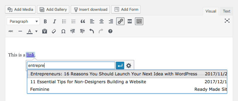
* Quick tip for linking internal content in WordPress *
When you write your content in the WordPress editor and select a word to transform it into a link, the link tool will let you paste a URL or search for a content in your website.
So to link to an internal content you don’t need to copy/paste the URL, but instead you just search for it in there and select the proper post or page.
8. Finish your posts with a question
A great way to encourage people to get involved with your content –and therefore stay in your website longer– is by finishing your posts with a question they can answer in the comments section.
I’ll be honest, it won’t absolutely assure you interactions. But if a visitor made it to the end of the post and you finish with a question, that increases the chances the reader leaves a comment, compared to when you don’t finish the post with a question.
And of course, the question should be related to what you just talked about.
Something like…
- What do you do when you ________? Tell me in the comments.
- Which tools do you use for ________? Share them in the comments.
- Leave a comment and tell us what have you tried for ________.
- What ________ strategy works best for you?
- Did you try what I said about ________? Tell me about your experience in the comments!
- Are you ready for ________? What’s stopping you?
- Did you discover something new about ________? Let me know over the comments 🙂
9. Add related posts
Sounds like an obvious thing to do buy yet many bloggers don’t add this soon enough.
If you want to keep readers browsing through your content then you need to offer them said content. It’s the same we mentioned before about guiding your visitors through your website: you should always tell them what to do next.
In the case of a blog post, one of the things that’ll do that is the related posts section at the end.
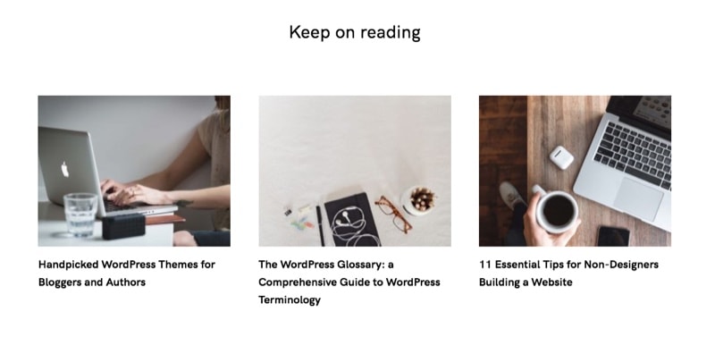
Related Posts at the end of the post
There are many plugins in WordPress for showing related posts and there’s a big controversy around them because of how each one works and how they affect your site’s performance.
The one we use on this site and like the most is Related Posts by Yuzo. It works pretty fast, goes light on the database, and it comes with several options to customize.
10. Offer a content upgrade
A content upgrade is a bonus content you offer your visitors that complements or extends a piece of content on your website. The only condition: they have to enter their email in order to get it.
So if you write a post with tips for parenting, you may offer them to download a complete free guide to parenting. Or the “5 most useful tips for bedtime” guide, or maybe a simple printable planner for organizing the kids’ week.
You can offer the content upgrade at the end of your posts, in a popup, in a welcome mat and also in the middle of the content.
Just like this one here:
(Yes, 👆 it’s real.)
Content upgrades are one of the most used strategies to grow an email list. And it works because… who doesn’t like free useful stuff? Especially if you just read another piece of useful information and the content upgrade will make it even more valuable.
Once you got the visitor’s email, you can keep your relationship going and make him come back to your website.
If you feel like you want to explore this content-upgrade world a bit more and start creating your own, here are a few useful links:
- How To Boost Conversions by 785% in One Day (The Content Upgrade) by Brian Dean
- 30 Content Upgrade Ideas to Grow Your Email List from OptinMonster
- 28 Ideas for Content Upgrades To Grow Your Email List from Sumo
11. Care for legibility and readability
Only your mother will keep reading your content if it’s not easy to read.
And even she may tell you she read it while she was actually playing Candy Crush.
(Is there a trendier game now? I’m totally outdated in that area. I could have said Tetris too.)
Legibility and readability are two key concepts in visual design. Legibility is actually a part of readability, but in short, they are both about making texts easy to: read, understand and follow.
What makes text readable?
How clear are the letters of the font you use
Is that a B or a P?
Is that a question mark or a snake coming after my words?
Are the letters too narrow? Too wide? Too weird?
The font size
Don’t make me read an article with a 12px font size. I’ll be mad.
The ideal font size varies according to several factors, but I’d say use something between 16px and 26px for your body text.
The contrast
The user shouldn’t make any effort to read your words. Having good contrast between the text and the background will help to that.
Use contrasting colors and also avoid using the thinnest weight of a font (100/200) if it doesn’t render well enough.
Shorter paragraphs
Here’s when you drop everything you’ve learned at school about writing texts.
“Texts are divided into paragraphs… a paragraph is a group of sentences with a common idea…”.
Well, not in the online content world. Online content is consumed in a different way, so writing for it follows different rules.
A paragraph can contain only one sentence.
Maybe
just
one
word.
The rule is what makes the text easier to read, more enjoyable, more friendly.
Use break lines a lot more often than you think. It will help your readers to read, and it will help you to convey an idea, stress a concept and tell a story.
The line length
Lines of text shouldn’t be too wide nor too narrow. The eye doesn’t like to travel too much to finish reading a sentence as it gets lost in the middle.
And it doesn’t either like to jump on to the next line every two words.
So if your text goes from edge to edge on the screen, try limiting the width to something like 45-90 characters per line. Usually, something between 500px and 740px wide should be safe.
(I’m talking about body text here, not headlines or special text elements).
Text elements
There’s nothing more boring and harder to follow than something monotonous.
Insert some dynamic to your texts by using headings, subheadings, bold, italics, lists, quotes. Whatever you feel like, pal.
(If this is the first time you find yourself thinking about these fundamental graphic design principles, Mai Knoblovits has a course called Zero to Designer which is a terrific resource to learn graphic design online.)
12. Care for performance
This one is simple. The longer your site takes to load the shorter your visitors will stay there.
Even if your website is the most gorgeous thing in the world and your content is so fabulous it deserves the Nobel prize to… well, website content… nobody will know that till it finished loading.
And nobody is going to wait for it to load.
1 + 1 = 2, so…
People no seeing your website’s wonders + People no liking to wait = People leaving your site.
There’s plenty you can do to improve your website’s performance in WordPress.
Start with…
- Installing a plugin for cache
- Optimizing your images
- Getting a good hosting (we like and always recommend SiteGround)
Oh, and please don’t use one of these fancy-shmancy non-native scrollbars. I know it’s my first reason to leave a website without even knowing what it is about. They make scrolling so annoying and don’t perform well at all in most devices.
13. Make your website pleasant to the eye
You like coming back to places you love, staying longer at parties where you’re having a good time, watching an entire season of a TV show when you enjoy it, and eating again and again your favorite food…
Your visitors will stay on your website as long as they enjoy being there.
And what makes a website enjoyable besides its content? Its appearance.
The human-user-race has a natural thing for aesthetics.
And I’m not saying every website has to be the next design award winner, nor be beautiful in a princess-crystal shoe way.
The aesthetics of a website are not something to define carelessly. They should match the identity of the business behind and talk to its target audience.
But… no matter your specific style, there are some basic things that will make any design more pleasant.
So that people don’t enter your website and think “Yikes!”.
Use a WordPress theme that’s well designed, that makes good use of white space and margins. One that will let you choose solid Typefaces.
Don’t overload your website, give each piece of information its own space.
Maintain a color palette.
Make sure texts over images have enough contrast to be readable at a glance.
When you’re not sure, go with the simpler option. A clean black text on a calm light background is good enough.
Look for balance.
For example, if you create a section in your website with a picture on the background, big white text popping up and a colored button… maybe in the next section avoid using an image on the background. Your visitors will thank you, but I’ll thank you even more.
Want to make sure you’re making good design choices?
Read this post with 11 essential tips for non-designers building a website that you can easily follow.
14. Use gifs, memes, graphics, and proper imagery
Who doesn’t like a funny well-timed meme? Or a gif that captures a precise feeling?
Adding proper photos and graphics to your content will make it a lot more friendly and easy to consume to your readers.
Images help make a complex idea simple. They help visitors to feel identified with your message.
And they make your content more attractive.
So give it a try and invest some time in choosing the proper imagery for your website and posts content.
Do it with taste and common sense.
15. Remove unnecessary elements that distract
If your content’s good it’ll make your readers keep reading… unless, of course, you distract them with other things.

(Yeah, why would you do that?)

(Oh, because distractions are fun.)

Sorry… what was I saying?
Oh, right: distractions.
When you try to walk your visitor through an idea, avoid putting obstacles and exit signs in the way.
I’m talking about unnecessary ads, popups, links to other things. Do you really need that sidebar or did you put it there just because?
If you walk into a restaurant they won’t show you first where the restroom is and then tell you the specials.
They will first welcome you and take you to your table. Then they’ll probably give you a menu and tell you about the restaurant.
They may offer you something to drink before you order. But they won’t say anything about desserts at this point, even though they may serve the most exquisite desserts.
You’ll order, you’ll wait, you’ll eat.
Then when the time is right they’ll recommend you some dessert.
Finally, you’ll ask for the restroom. And the check.
Everything in a restaurant journey has its very precise time and place. That’s what lets you focus on each part and keep moving to the next step.
The same goes for your website.
Try placing in the road only the elements that will serve your purpose. And get rid of those that will hurt that purpose.
16. Add an exit intent popup
Ok, so if nothing worked so far and your visitors are leaving your website… there’s one more thing you can do to at least try to convert them into leads and make them come back.
That’s what exit intent popups are for. It’s a popup that appears when the visitor moves his mouse towards the close tab button. The exit-intent technology recognizes that mouse movement and triggers a popup.
In that popup you will offer something that will convince your visitor to not leave your website yet.
It can be:
- an exclusive discount offer
- an attractive deal
- a freebie to download (a product, a guide, a cheatsheet, etc.)
- the possibility to register for a webinar
- an invitation to join a group
- a mailing list subscription form
Whatever it is, it should be irresistible.
And it should include a field that the visitor will fill with its email to get access to your offer.
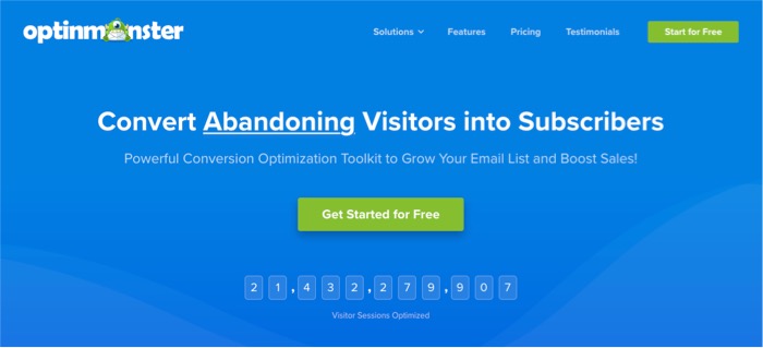
Adding an exit intent popup in WordPress is actually very easy. We use and recommend OptinMonster for that, as it is a complete solution for creating popups. It comes ready to connect with your email marketing provider and it has a plugin to integrate the popups into your WordPress site.
It works pretty straight forward. And it lets you setup different popups so you can make A/B tests and see which one performs better.
So think about what will make your visitors give you their emails before they close your site, and add your exit intent popup.
———
Measure results
Before you apply any of these changes, take a look into your analytics and see how long do visitors stay in your website and where is your current bounce rate at. (If you haven’t yet, open a Google Analytics account and connect it to your website so you can start collecting user stats.)
Then apply the changes you need to and check the stats again every month to see if you get better results. According to your how much traffic you have on your website, you may see results pretty soon or rather after a few months.
Keep tracking and improving frequently.
And share with us your insights in the comments!
Did any of these techniques bring you better results?
One comment
Comments are closed.